
|
|
|
|
by Editor Miro Susta
Edited and published by Yvette Depaepe, the 10th of April 2026
The aim of photo composition is to make an image as harmonious and appealing as possible.
Various techniques are employed to achieve this, which are considered the 'rules' of photography.
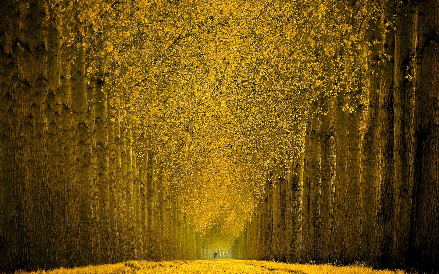
‘Cycle in Gold’ by Lars van de Goor †
However, there are no unbreakable rules in photography. After all, who likes following rules, except perhaps your old school headmaster?
Nevertheless, there are several principles that should be observed to improve photographic composition.

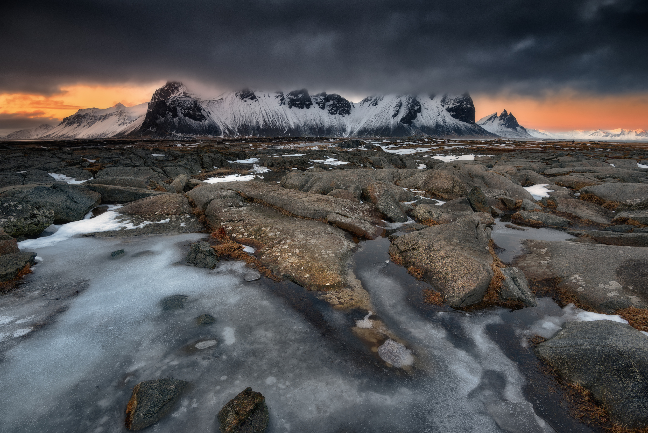
‘Golden Peak of Lake Louise’ by Yongnan Li
This article lists thirteen summarized recommendations, supplemented with typical photos from the 1x photo gallery to better illustrate the given subject.
‘Lanthanum’ by Holger Glaab
It starts with the simplest options and then moves on to more intricate design choices. Many of these composition techniques are enhanced by clear, practical recommendations. First, however, we should define what is meant by the term 'image composition' in photography.
‘The Crossing of Shadows ...’ by Yvette Depaepe
It refers to the arrangement of the various elements within an image. These principles have been used in art for a long time and have been proven to create more appealing compositions.
‘Rokoko’ by Mike Kreiten
Let's explore how the rules of composition in photography can help us to create memorable, high-quality images.
We will start with the best-known design technique: the rule of thirds.
The Rule of Thirds
The Rule of Thirds is considered the simplest formula for image composition. It involves dividing the image into nine equal parts using two horizontal and two vertical lines to create a 3x3 grid. According to this rule, the main subject should be visible in the left or right third of the image, while the remaining two-thirds of the space should be left empty. This technique is quick to implement and ensures a symmetrical and harmonious visual composition.

‘snowbound by Rolf Endermann
The beauty of the Rule of Thirds in photography is its versatility! This image composition technique helps to create well-balanced photographs, regardless of the subject — whether it's nature, architecture, portraits or wildlife.
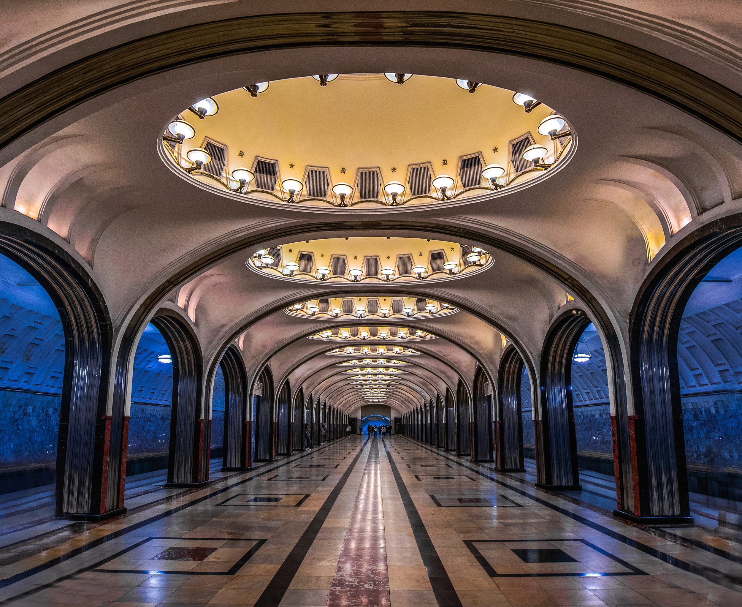
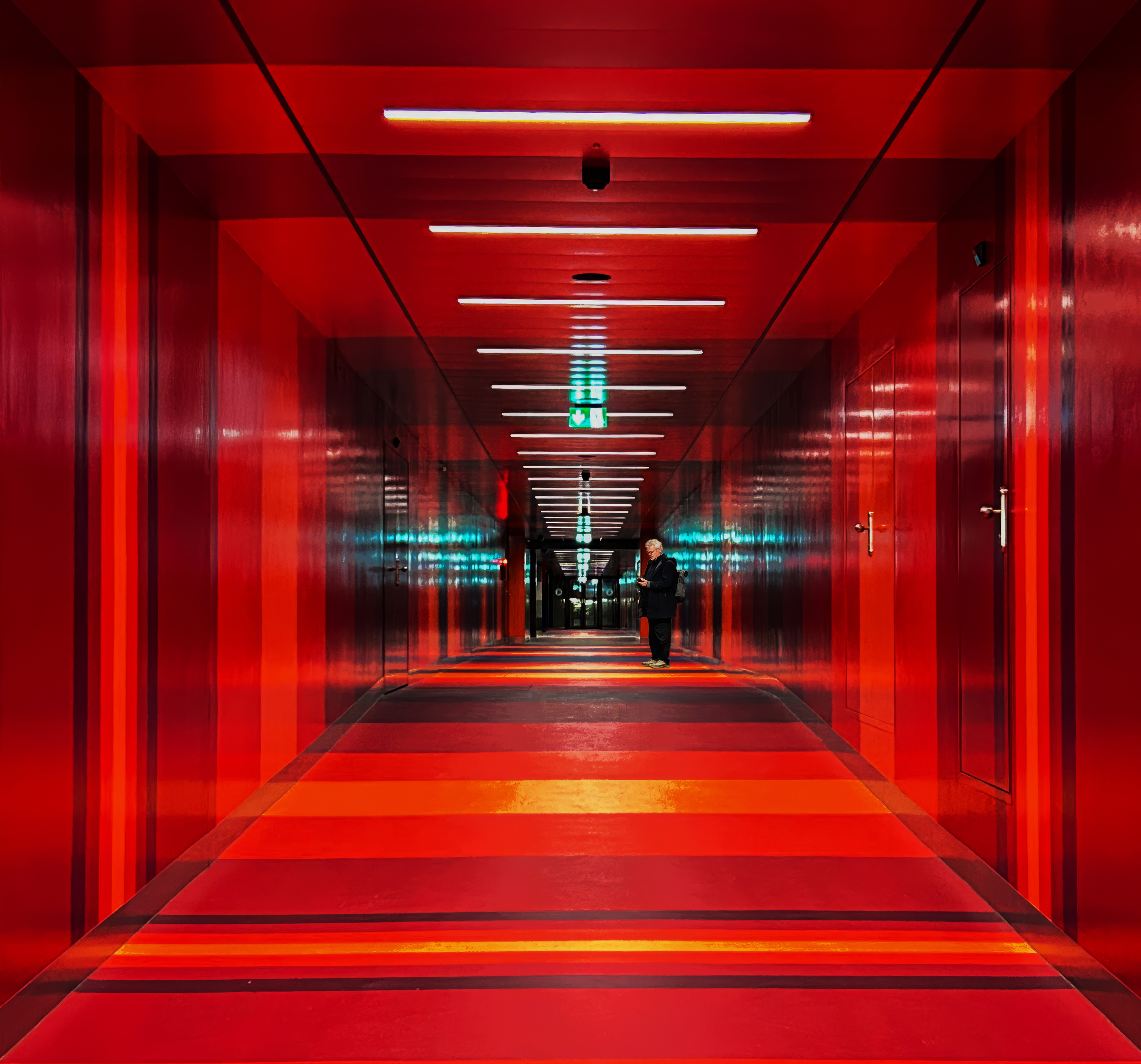
Centred Composition & Leading Lines
Centred composition and leading lines are often excellent techniques for placing the subject in the centre. For example, symmetrical subjects are ideal for centred composition. Symmetry can add beautiful depth to an image. Architectural features, field and forest paths, as well as streets, railway lines and waterways, are ideal subjects for this type of composition.
‘Repeat’ by Rana Jabeen
Leading lines help viewers to focus on the important parts of a photo by showing them where to look. Leading lines do not have to be straight; curved lines can also be effective.
‘A Starry Night’ by Catherine Lu
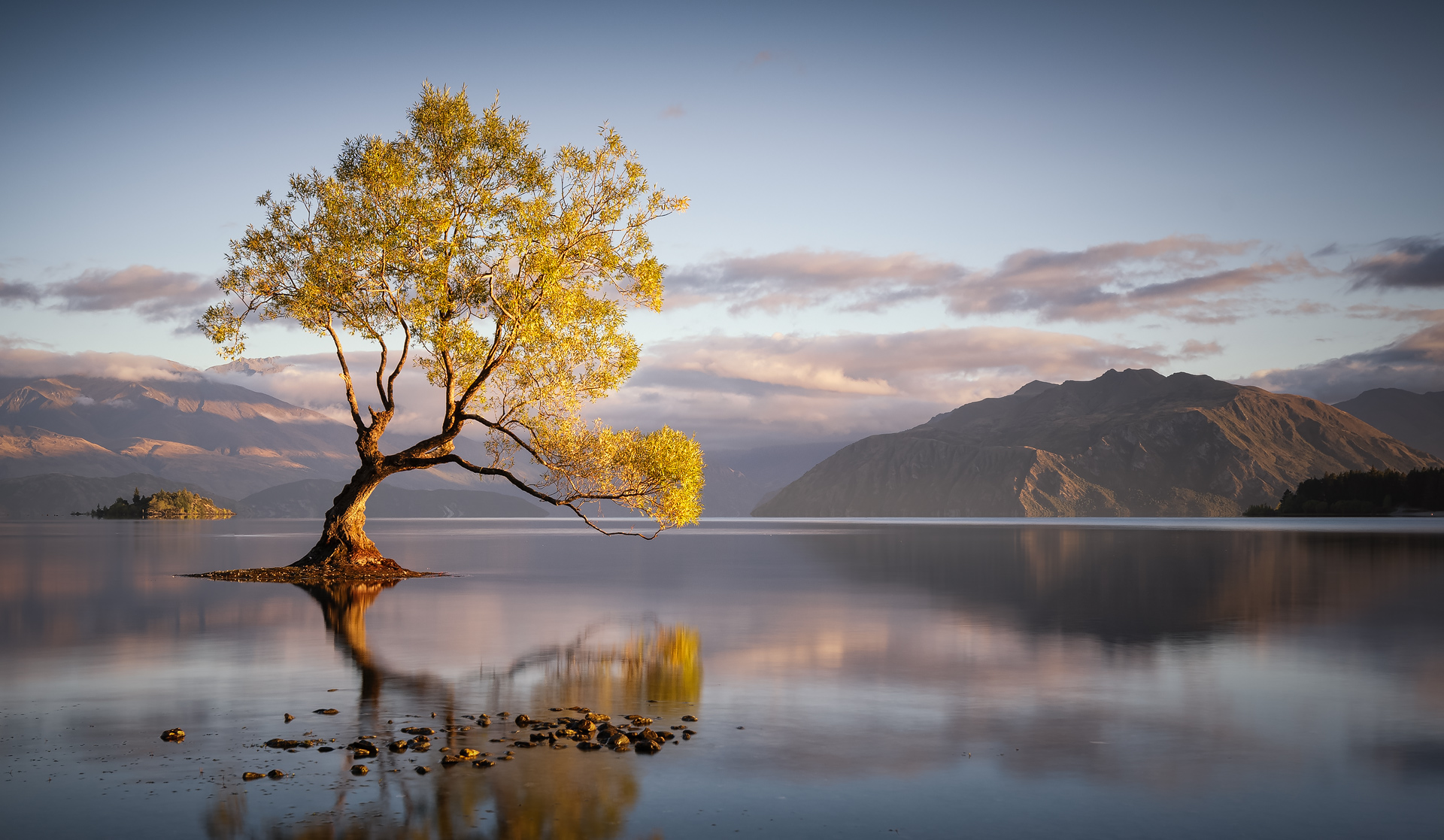
Another wonderful way to incorporate symmetrical shapes into your image is to include landscapes with reflections. The rule of thirds involves dividing the sky and horizon into a 2/3 to 1/3 ratio.

‘Reflections’ by Lisa Holloway
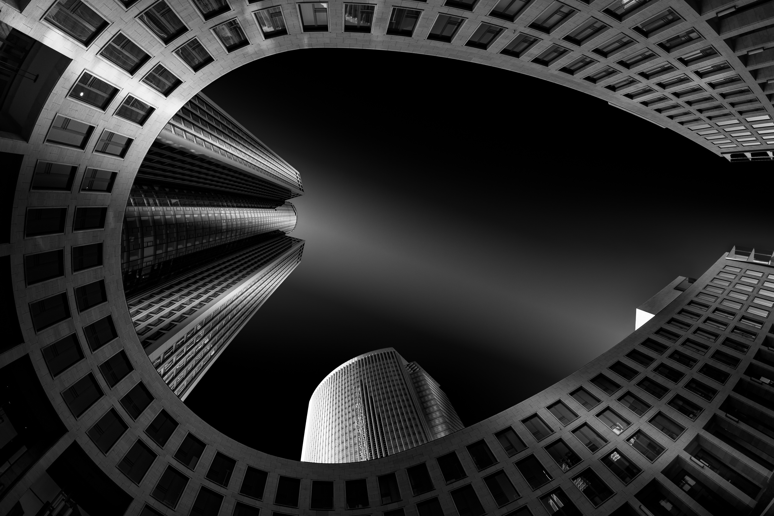
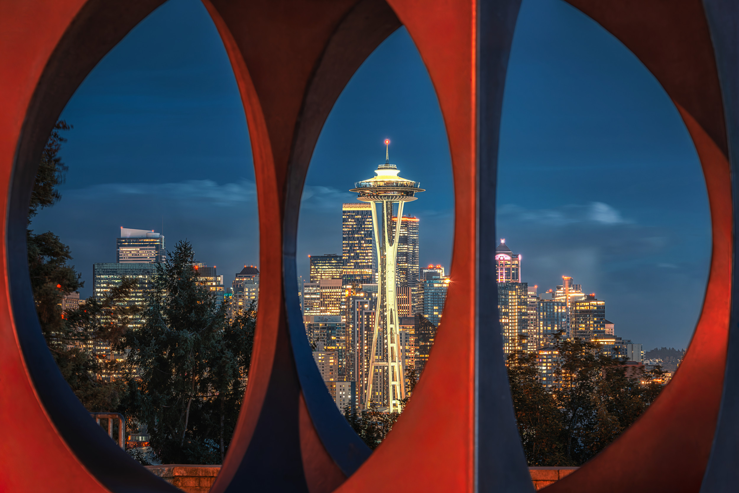
Framing: Picture-in-Picture
The 'picture-in-picture' technique is another effective way of creating depth. Objects such as rock formations, windows, arcades or overhanging branches are ideal for framing the subject. It is not necessary for the frame to surround the entire subject in order to be effective.

‘Window Arch -Arches NP’ by Wanghan Li
Using the 'picture-in-picture' technique is a great way to incorporate your surroundings into an image.
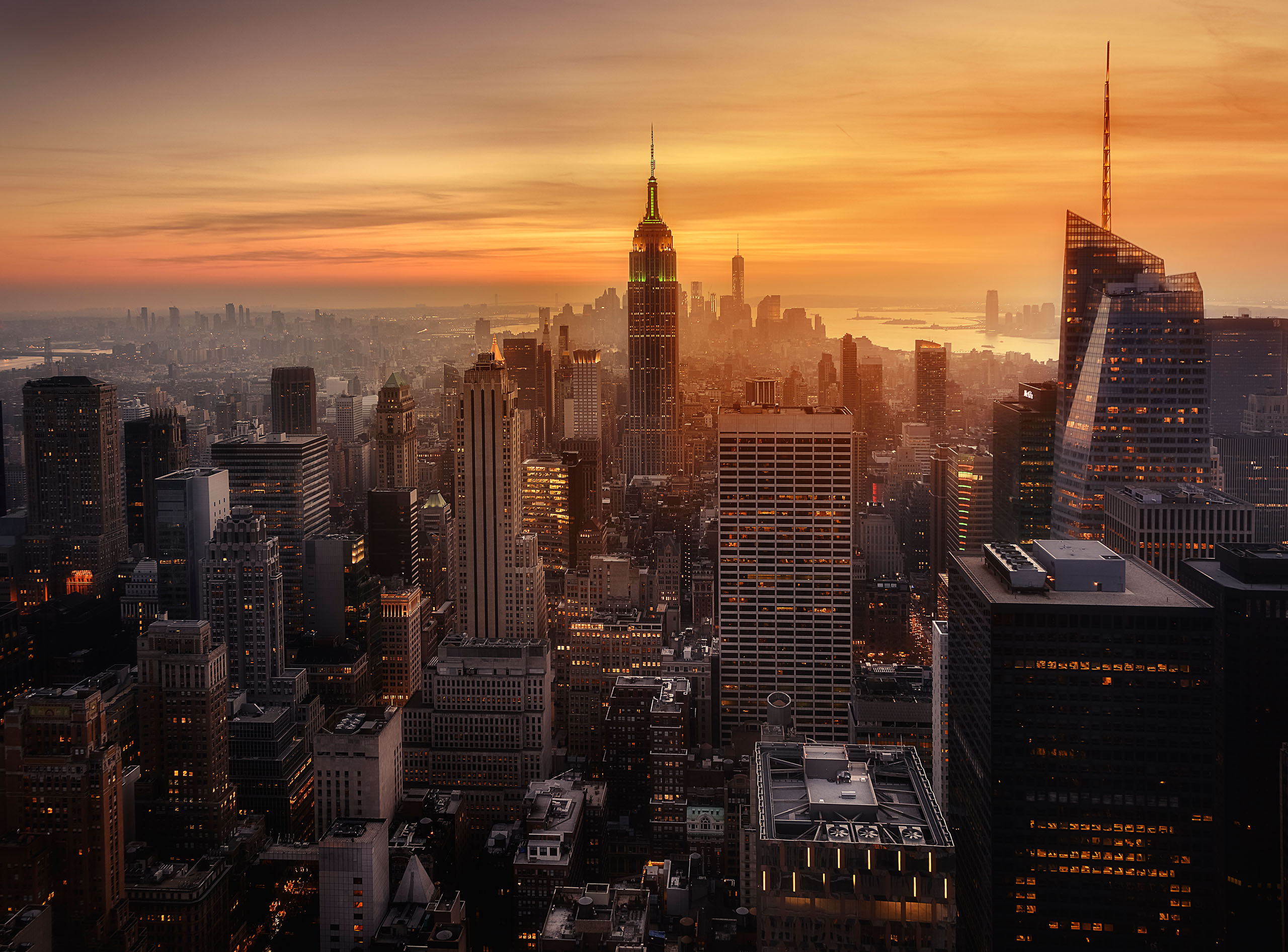
‘A View of Seattle Skyline’ by Mei Xu
In summary, once the subject has been found, you can start looking for ways to frame it within the picture. For example, there may be trees curving around the subject or a hole in a rock or wall that could be used as an interesting frame. Alternatively, parts of an old building, window or gate could be used to frame the subject.
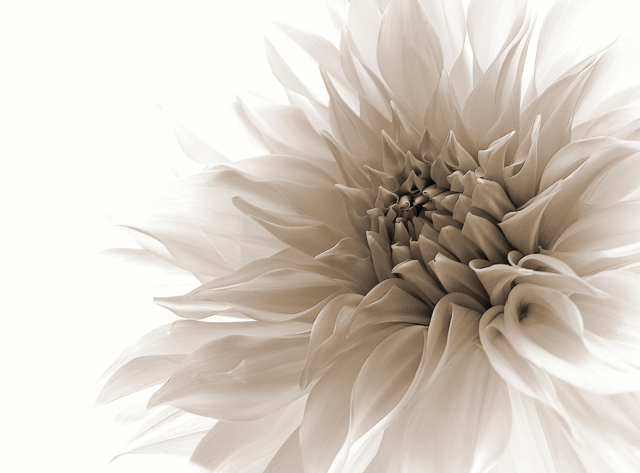
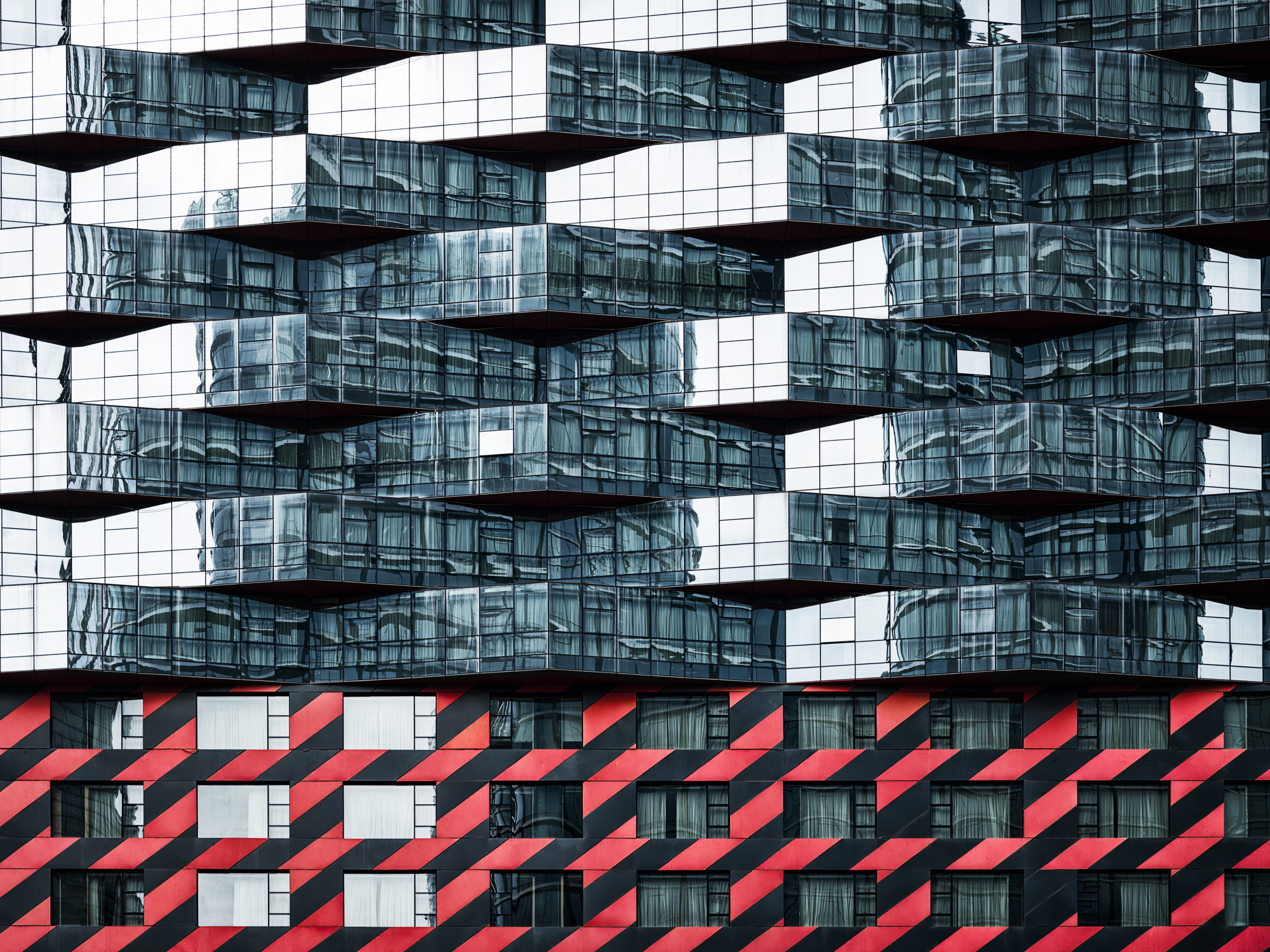
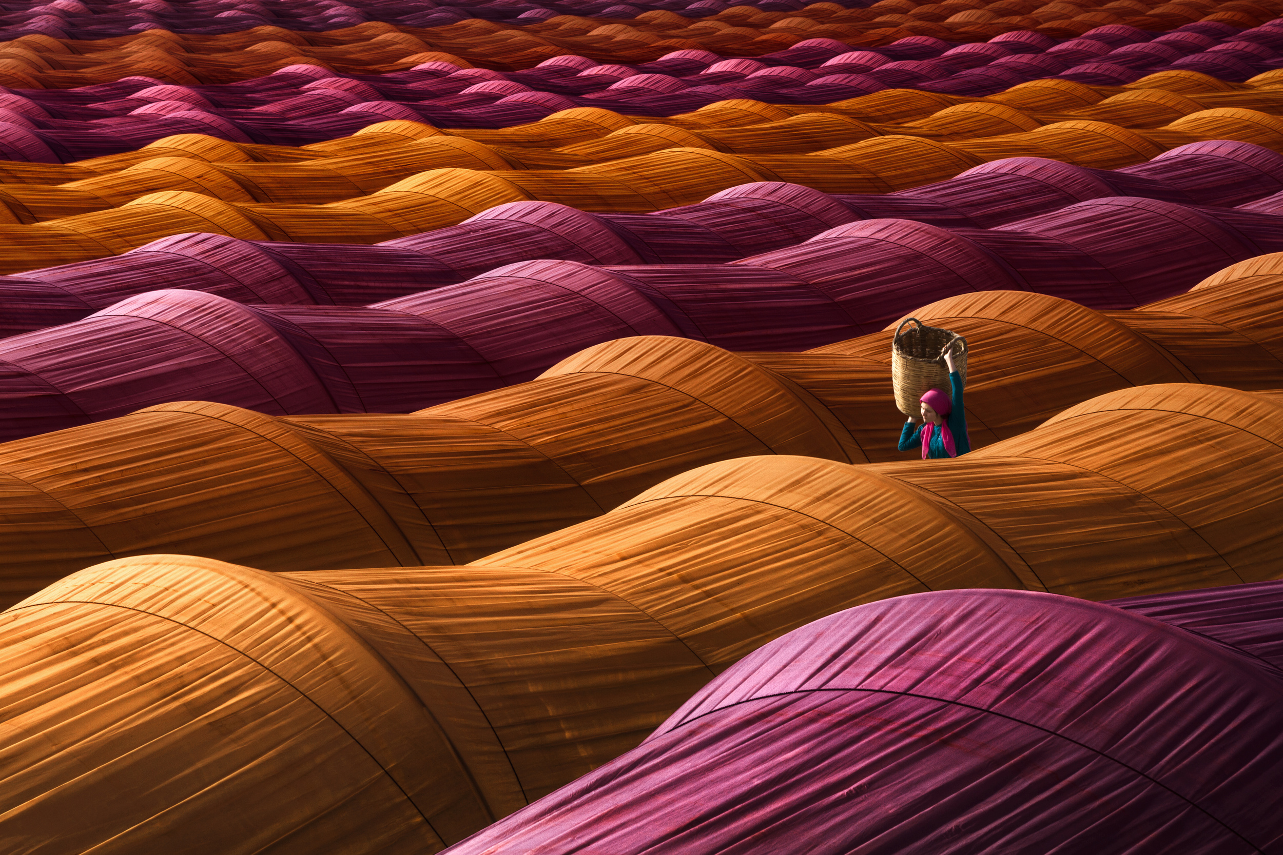
Patterns and Structures
Patterns and structures are visually appealing and suggest harmony. They can be created artificially, for example through a series of arched vaults or town structures, or naturally, as seen in the petals of a flower. Incorporating patterns into photos is an effective way to make an image more appealing. Unusual structures can also be pleasing to the eye.
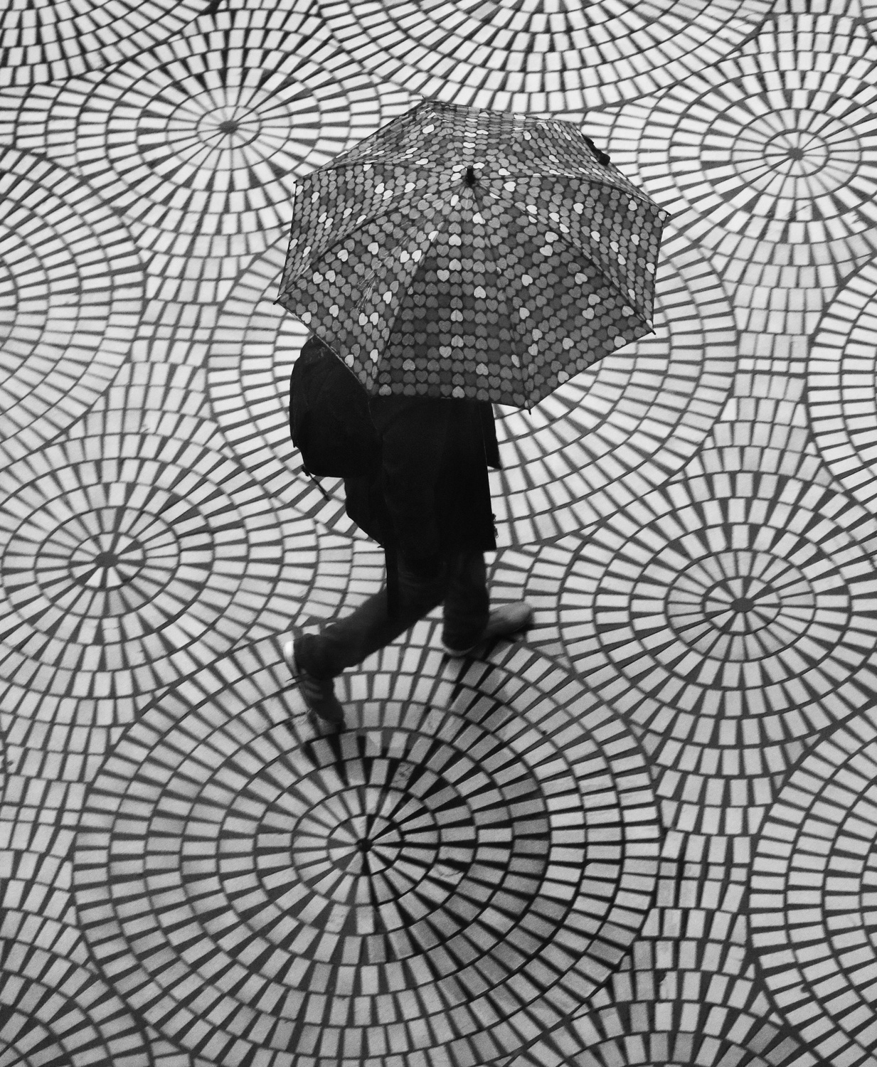 ‘Rainy day patterns on the Embarcadero’ by Robin Wechsler
Textures and structures can be found almost everywhere. Whether we are in the city, the forest, a meadow or on the water, they are all around us. The beauty of natural structures lies in their irregularity and unpredictability.
Another interesting aspect is the way structures within structures are revealed through reflection, whether in windows or on the surface of the water.
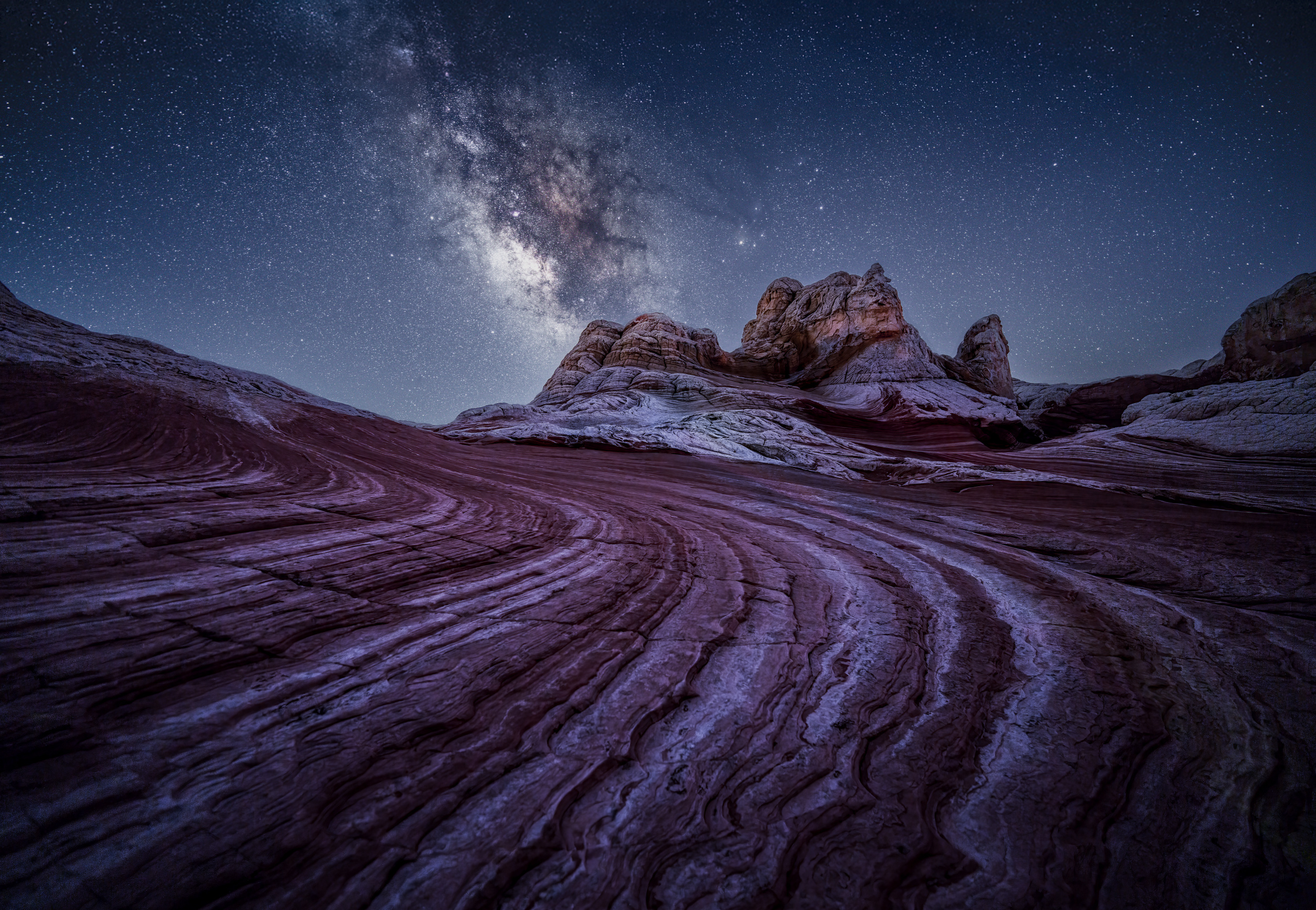
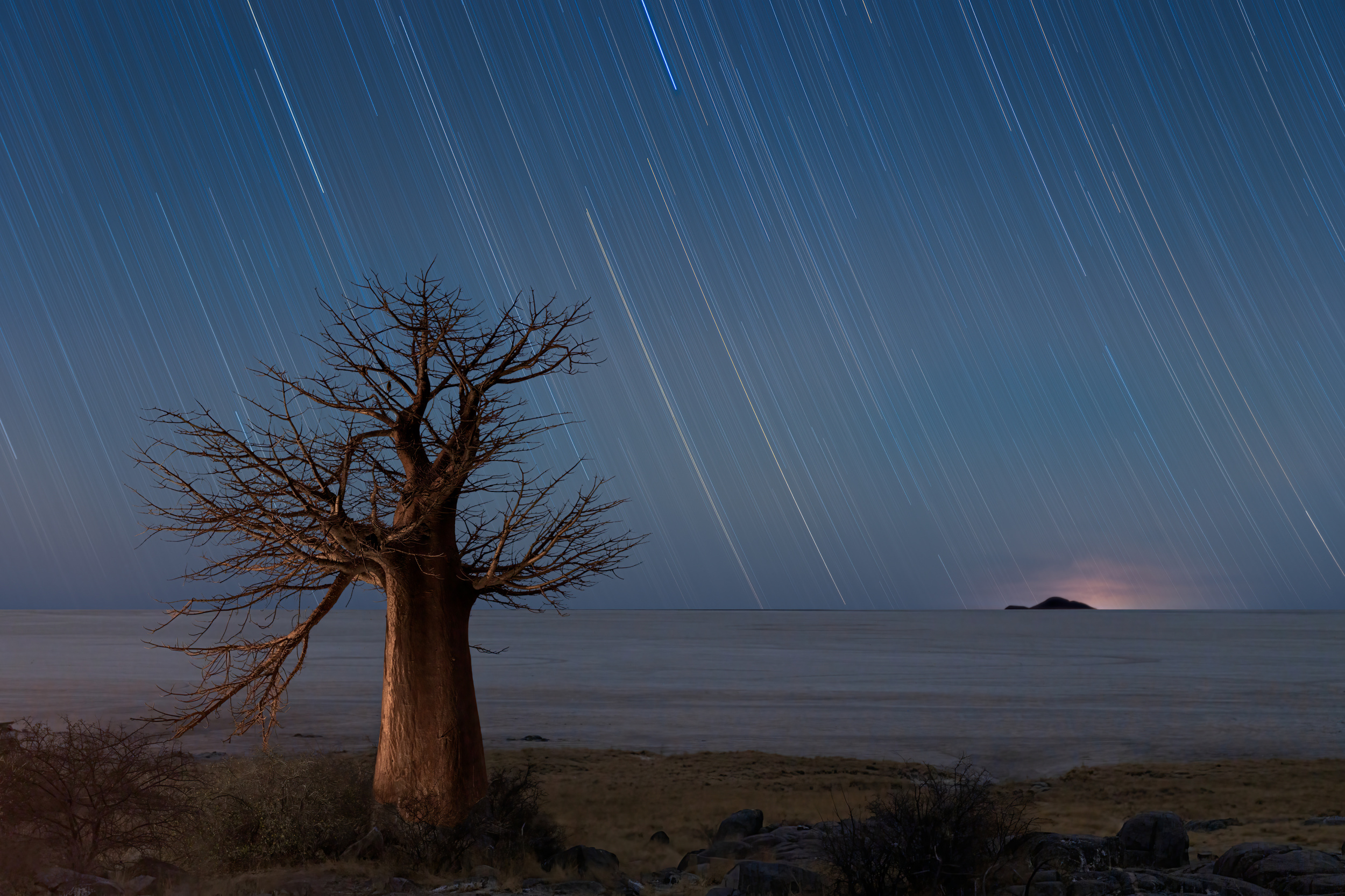
Foreground and Depth
Adding elements to the foreground of a scene creates a sense of depth in the photo. Although photos are two-dimensional, adding creative elements to the foreground can make them look more three-dimensional.
'LAND OF FLOKI' by Adam Pachula
It is particularly important to note that other objects, such as buildings and trees, are positioned in the background, away from the main subject of the photo.
‘Tree of Light’ André Koschinowski
Once motifs have been positioned in the foreground, it is important to make sure that the background is also in focus.

‘Dryland Twilight’ by Lydia Jacobs
Foreground and depth are two essential elements of photography. They establish a connection between the viewer and the scenery, creating a lively atmosphere.
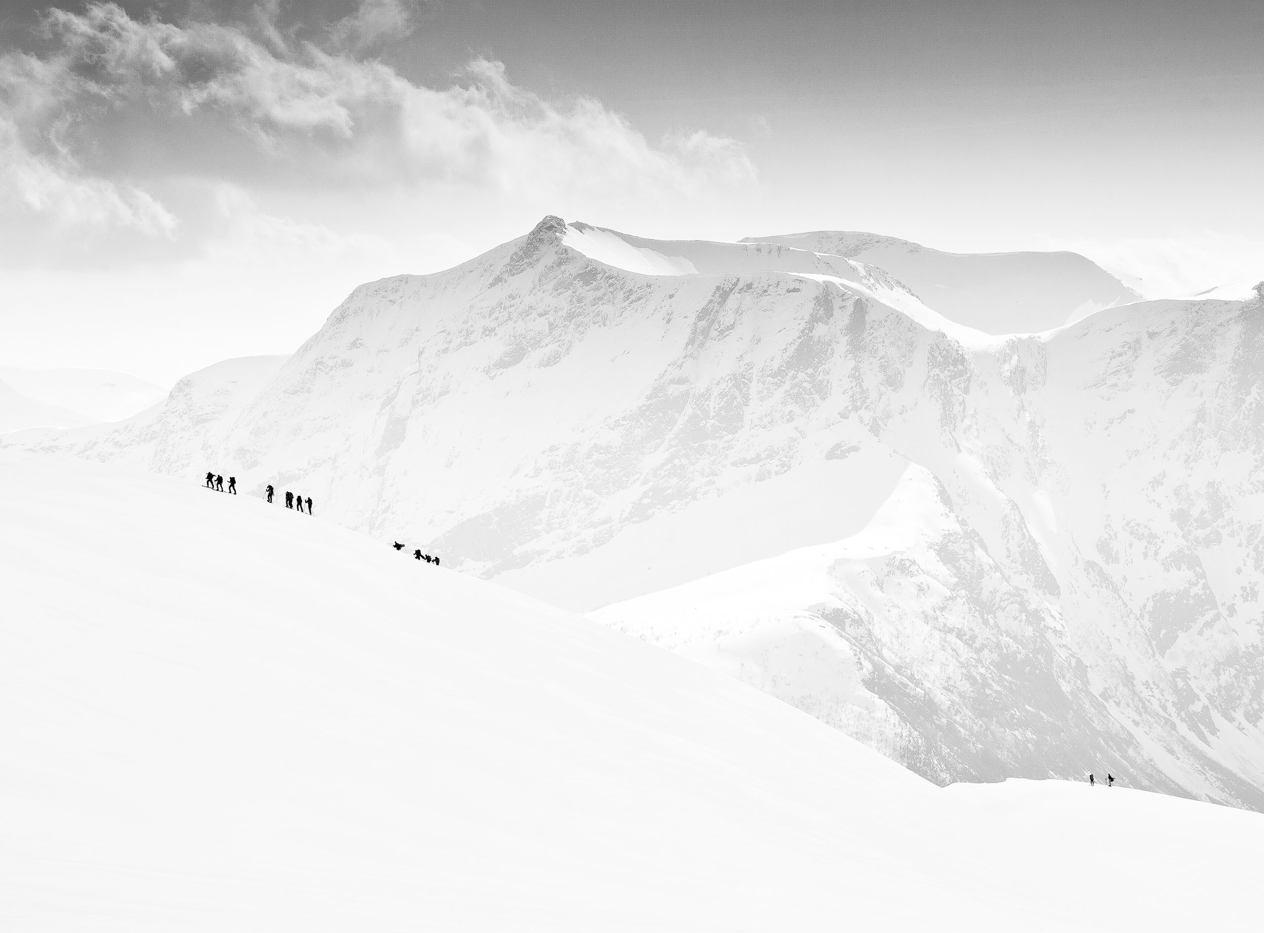
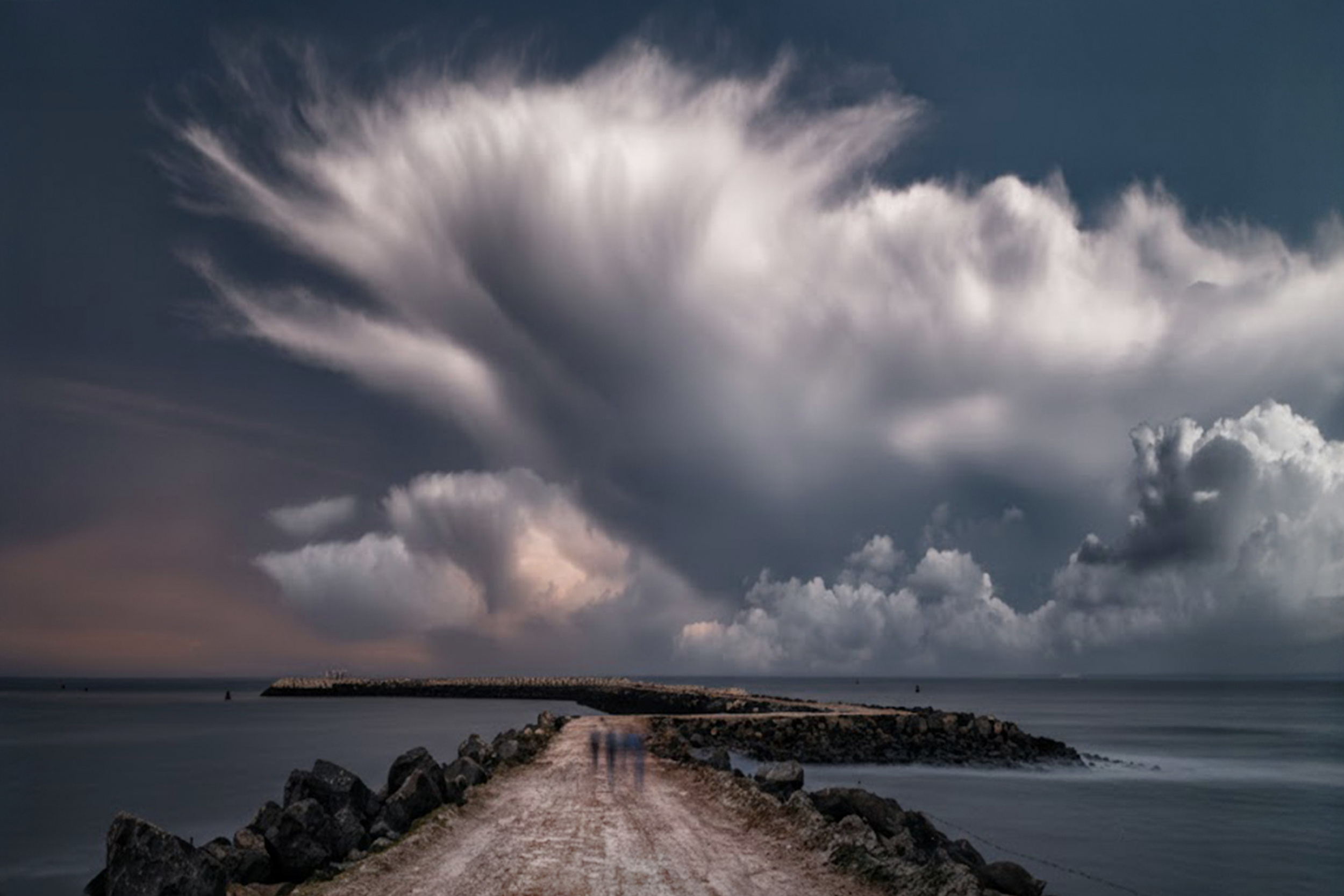
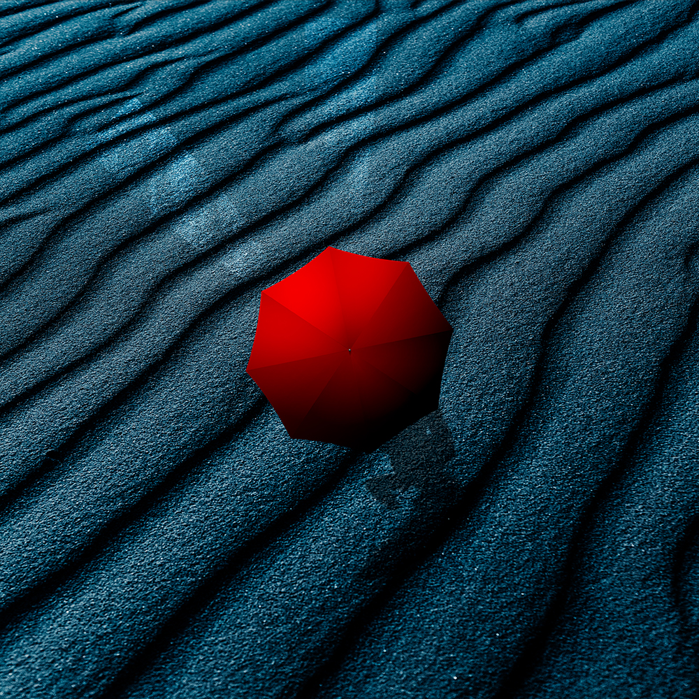
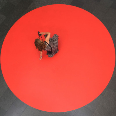
Negative Space
Open or empty spaces often have a strong aesthetic appeal. They create a feeling of simplicity and minimalism. Just as filling the frame helps the viewer to focus on the main subject without any distractions, so too does an open space.
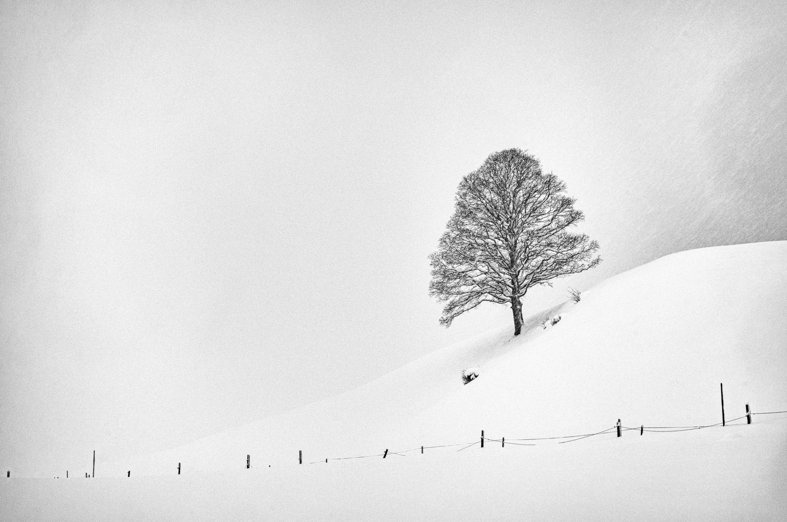
‘Solitude on the Slope’ by Arne Jansen
Negative space is often more important than the main subject of a photograph because it helps to create atmosphere, determine the image's splendour, and emphasize the mood of the positive space.
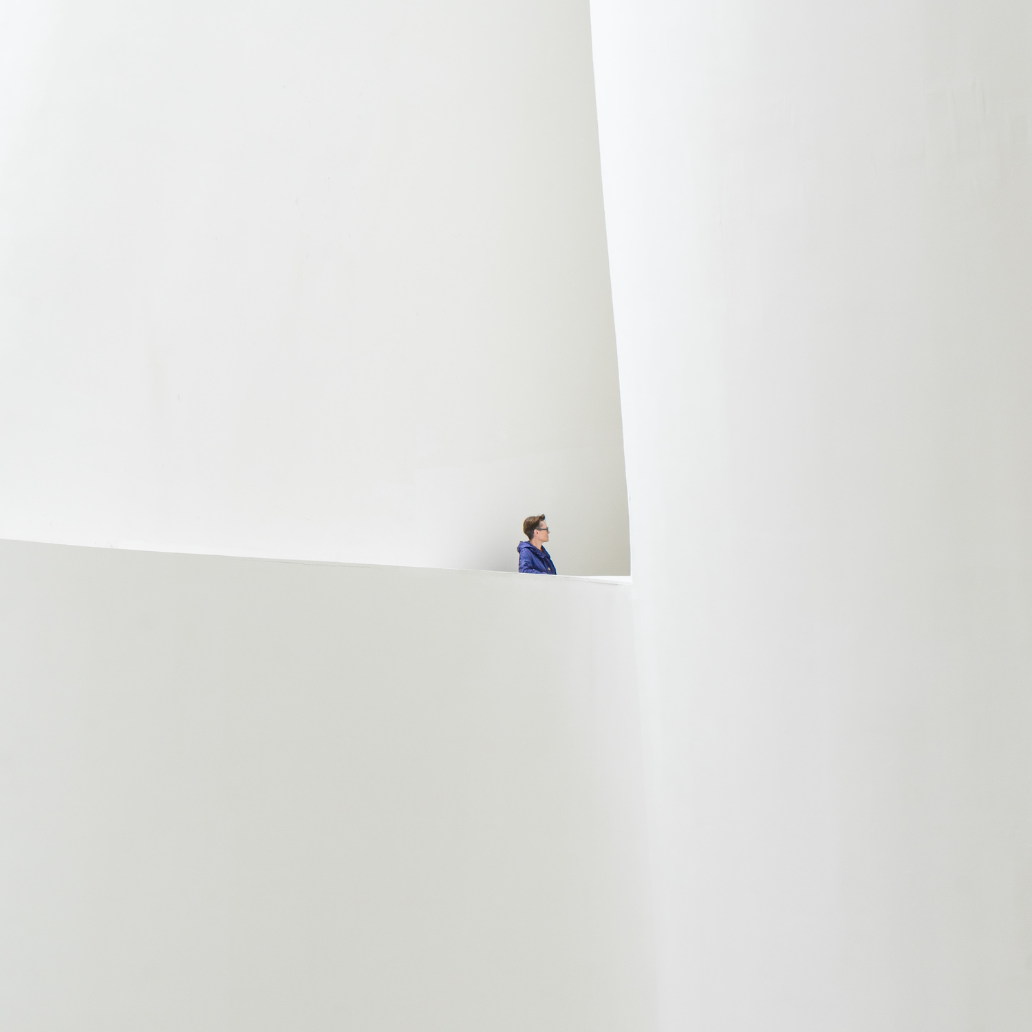
‘White room - blue coat’ by Luc Vangindertael
Spacious rooms and expansive areas can have distinctive qualities in this regard. However, it is not easy to skilfully stage this because negative space can drastically change the mood of a photo and the story we are trying to communicate.
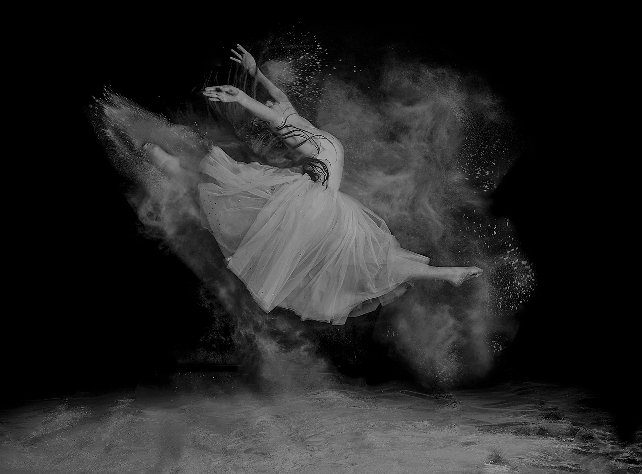
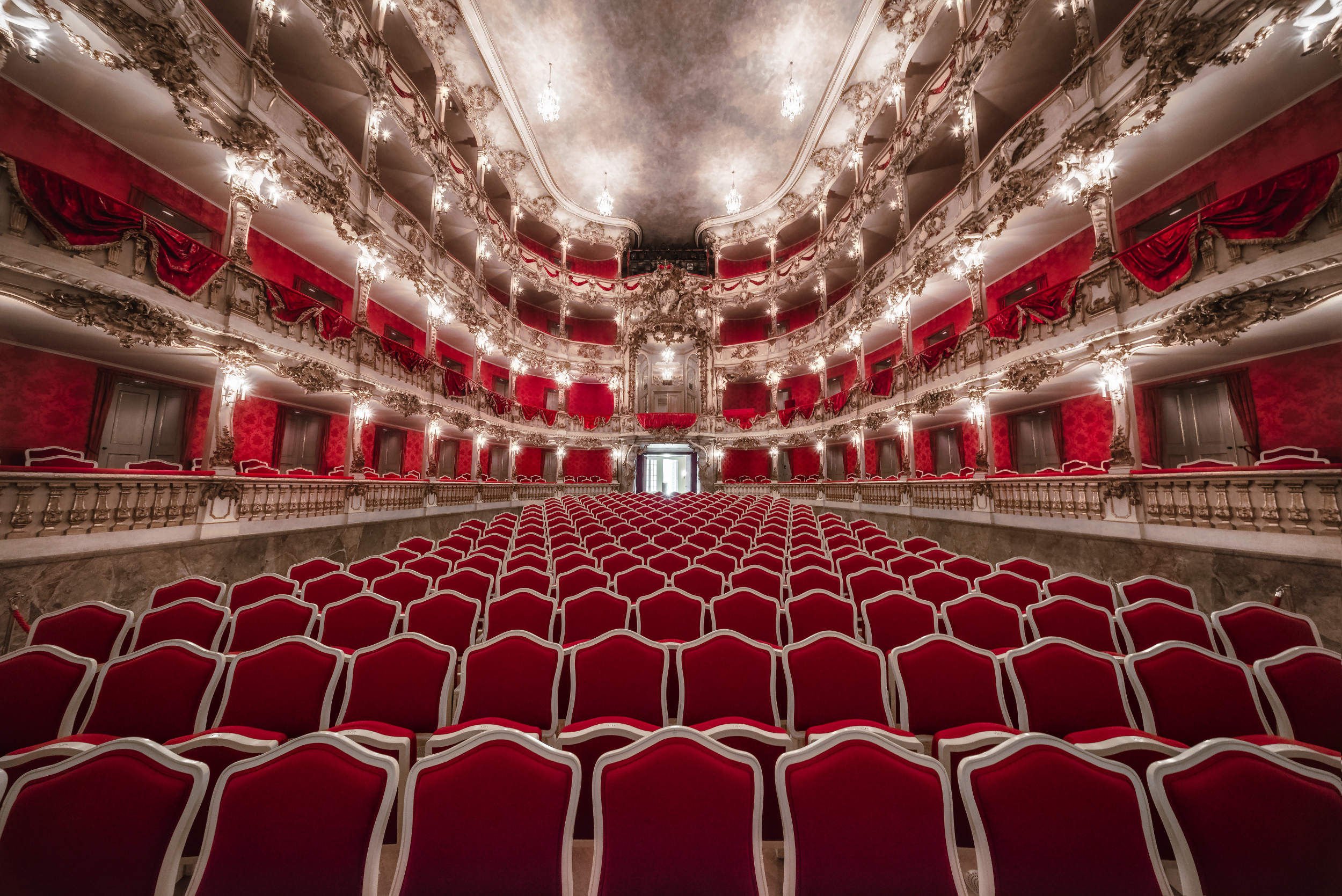
Filling the entire Frame
In some cases, filling the frame with the subject and leaving little empty space can create a strong impact. This composition technique helps the viewer to focus entirely on the subject.
‘Contrast and Reflection of Windows’ by Mei Xu
This allows for a more detailed and prolonged examination of the subject. This would not have been possible if the photo had been taken from further away.
‘Velvet Strings’ by Peter Aczel
In the photo of the yellow house, only the façade is visible, with the lower part and the street excluded from the frame. This enables viewers to focus entirely on the patterns and lines, for example. I have also left little space around the sides of the building. The aim of the photo is to showcase the architectural features at the front of the building.

‘Yellow house with red roof’ by Miro Susta
Balance
The first image composition guideline covered in this article is the rule of thirds. This means that the main subject of the photo is often positioned off-centre, which can sometimes result in an imbalance in the scene and give the image a sense of emptiness.

‘Sail Away’ by Azriel Yakubovitch
To balance out empty space in an image, it can be composed by placing a smaller, less important object on the opposite side. This creates a balanced composition without distracting from the main subject of the photo.
‘Lone tree Kubu’ by Vikas Chander
In summary, visual balance is one of the many compositional techniques available for designing images in photography. It should not be confused with the rule of thirds; it is a technique in its own right. Practising how to achieve the best possible balance in any location is essential to creating a balanced image.
The Rule of Odds
The "Rule of Odd Numbers" is one of the most notable compositional techniques in photography. According to this rule, an image is more visually appealing when it contains an odd number of main elements.
The theory states that an even number of objects distracts the viewer because they are unsure which element to focus on. In contrast, an odd number of elements appears more natural and is easier on the eye.

‘Three Trees’ by Martin Rak
To be honest, this principle of image composition is not always true or applicable. However, this principle of image composition may prove beneficial in certain contexts.
Unique Colour Combinations
Colour is often overlooked as a tool for creating images. However, experienced photographers and graphic designers have a strong grasp of colour theory.
Untitled by Leyla Emektar La
Certain colour combinations complement each other perfectly, which can greatly enhance an image.
Untitled by AGNIRIBE
Red and blue are wonderful complementary colours on the circle of colours.
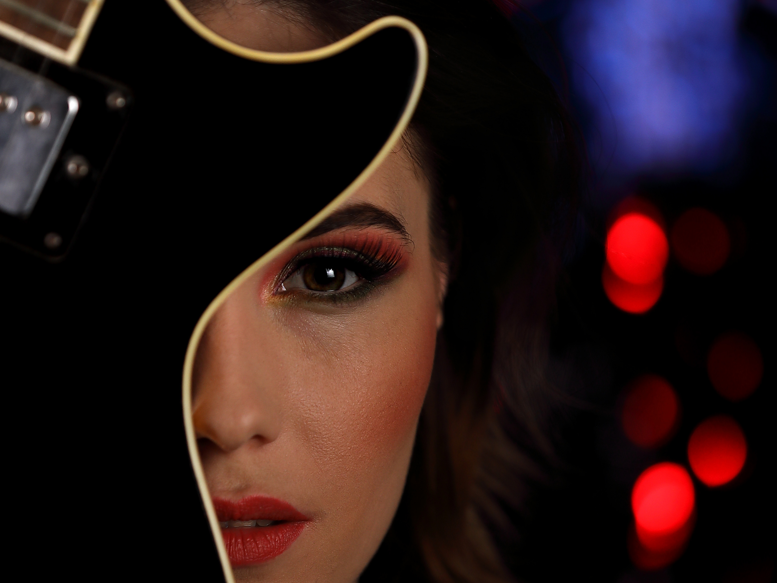
Contrast
Contrast is a highly effective compositional technique. It involves combining two or more elements within a scene to either differentiate or complement each other. Both approaches can be highly effective in enabling a photograph to tell a story.
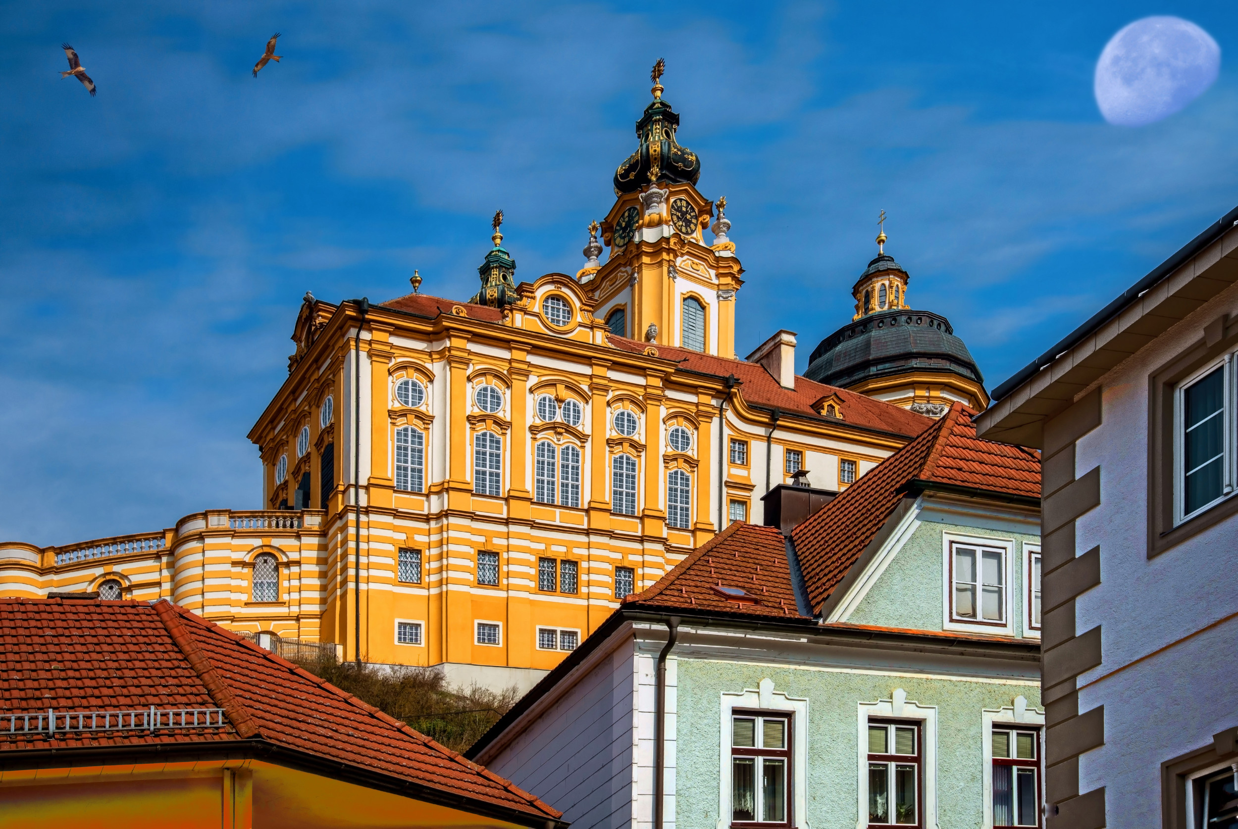
‘Melk Abbey’ by Miro Susta
The next picture shows a colourful vintage car against the backdrop of the old town's houses. The two elements complement each other perfectly.

Boulevard of broken dreams by Eddy Verloes
From Left to Right
Arranging photos or image elements from left to right follows the natural reading and viewing habits of Western culture. The eye starts at the top left and moves towards the details on the right. Diagonal lines from the bottom left to the top right create a sense of dynamism, whereas descending lines convey calmness.
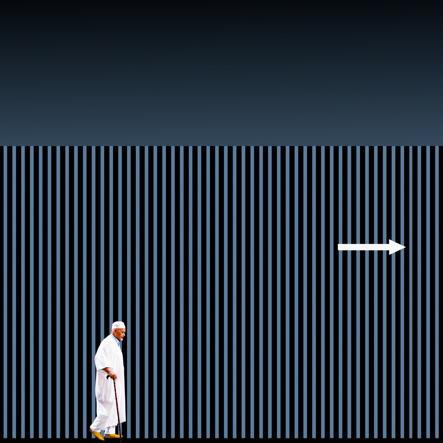
‘Follow the white arrow’ by Inge Schuster
From Right toLeft
A photo composition from right to left is often used to create visual tension or draw the eye in the opposite direction to the usual reading flow. This technique is often used in images to tell a story in reverse or to create an artistic effect.
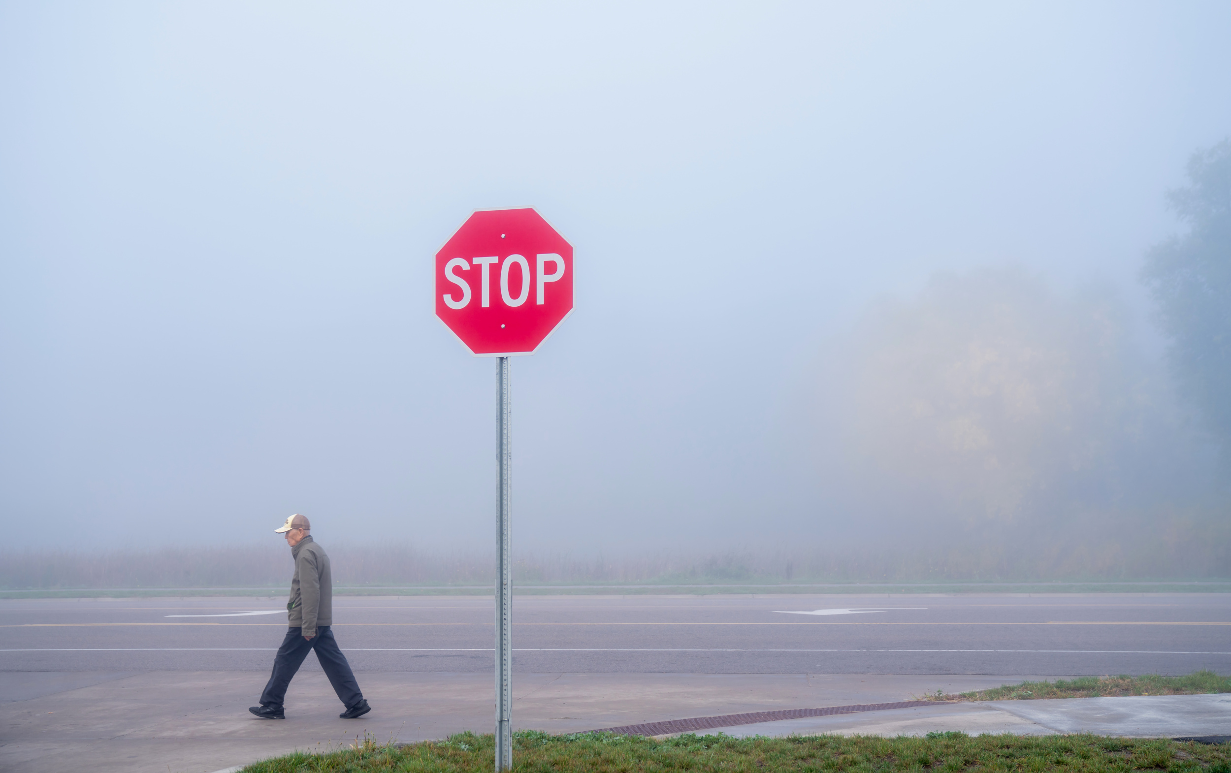
‘Goes on ...’ by Anna Wan
In summary, we can say that all rules are made to be broken. Once you have mastered these thirteen composition techniques, you can start experimenting with them. Remember that positioning the subject in different areas of the image can completely change its impact.This can help to develop a personal style and achieve the desired creative effect.
‘Transit Paradox’ by Ash Camas
A well-thought-out image composition is key to adding more excitement and liveliness to the photograph.
 | Write |
 | Lourens Durand CREW First class Miro! |
 | Miro Susta CREW Many thanks dear Lourens |
 | Sandro Sardoz PRO Splendid ... !!! |
| Miro Susta CREW Thank you Sandro |
 | arunaasingh PRO Wow so wonderful images |
| Miro Susta CREW Thank you Arunaa |
 | Rana Jabeen PRO A superb article explaining various aspects of visual elements, you have selected such beautiful images Miro, thank you for including one of my photos. Thank you so much Yvette for your work. |
| Miro Susta CREW Dear Rana, thank you so much for your lovely comment on our teamwork (Yvette’s, our contributing photographers’, and mine)—it is very meaningful to us. |
 | Francisco Villalpando PRO Excellent article and content, very well presented and illustrated with beautiful images, congratulations, Miro! |
| Miro Susta CREW Thank you very much for your wonderful words of praise dear Francisco |
 | Elizabeth Allen CREW Superb article and collection of images. Thank you, Miro and Yvette. |
| Miro Susta CREW Thank you Elisabeth |
 | Ash Camas PRO Thank you dear Yvette and Miro for the wonderful article and for including my photo. The way you curated these images really highlights the beauty of visual rhythm and geometry. A very inspiring collection! |
| Miro Susta CREW Many thanks for nice words of appreciation dear Ash. |
 | Wayne Pearson PRO Thank you to all of the outstanding works of the individual photographers and to Yvette for all of her outstanding editing and also her stunning work too! |
| Miro Susta CREW Many thanks Wayne. |
 | Gian Corrado DONATI PRO Interesting article ! Thanks a lot, Yvette and Miro !!! |
| Miro Susta CREW Thank you Gian, nice to see that you like it. |
 | Eduardo Blanco García PRO Excellent. Thank you so much |
| Miro Susta CREW Many thanks Eduardo. |
 | Greetje van Son PRO Very interesting interview with beautifull and strong composition. Thank you for shearing! |
| Miro Susta CREW Thank you very much for nice words of praise dear Greetje, glad to see that you like it. |
 | Robin Wechsler PRO Inspiring! And many thanks for the inclusion of one of my photographs Miro and Yvette. So appreciated. |
| Miro Susta CREW You are most welcome Robin |
 | Yongnan Li (李永男) PRO Thanks for select my image, nice file.
|
| Miro Susta CREW Thank you Yongnan |
 | Peter Aczel PRO Oh, what a pleasant surprise to have my photo featured among such excellent pictures in this interesting and educational article! Thank you, dear Yvette and Miro for the article, and congratulations to the creators of these great photos! |
| Miro Susta CREW Great thanks for your lovely comment dear Peter |
 | garyholman PRO Congratulations! to all Photographers and a Big thanks! to dear Miro and Yvette for this interesting and enjoyable article. |
| Miro Susta CREW Many thanks for nice words of encouragement dear Gary |
 | Agustín Brugera Moreno PRO Excelente artículo, muy claro y bien desarrollado. |
| Miro Susta CREW Thanks very much dear Augustin |
 | Eiji Yamamoto PRO Dear Miro, thank you so much for the inspiring article with great photos! Dear Yvette, thank you so much as always! |
| Miro Susta CREW You are most welcome dear Eiji, glad to see that you like it |
 | Jane Lyons CREW Thank you, Miro. Great article! |
| Miro Susta CREW Many thanks Jane |
 | Robert Žumer PRO Bravo lepo predstavljeno. |
| Miro Susta CREW Chvala lepo Robert |
 | Hemanta Swain PRO Nicely presented. Thank you. |
| Miro Susta CREW Thank you Hemanta |
 | Luc Vangindertael (laGrange) CREW It fine to see the theory illustrated by so many fine photos. Thank you for this article Miro ! |
| Miro Susta CREW Great thanks for nice words of praise dear Luc, glad to see that you like it |
 | Izabella Végh PRO Bellissimo articolo. Congratulazioni agli autori. |
| Miro Susta CREW Grazue molto bene cara Izabela |
 | Eric Chatelain Photography PRO Excellent examples, as usual on this platform ! |
| Miro Susta CREW Thank you very much Eric |
 | Vladimir Funtak PRO Thank You for sharing this outstanding images with us. Rolf Endermann is definitely a photographer to learn from. |
 | Rolf Endermann PRO Thank you so much dear Vladimir for your warm command |
| Miro Susta CREW Thank you very much Vladimír |