
|
|
|
|
by Yvette Depaepe
Published the 8th of July 2026
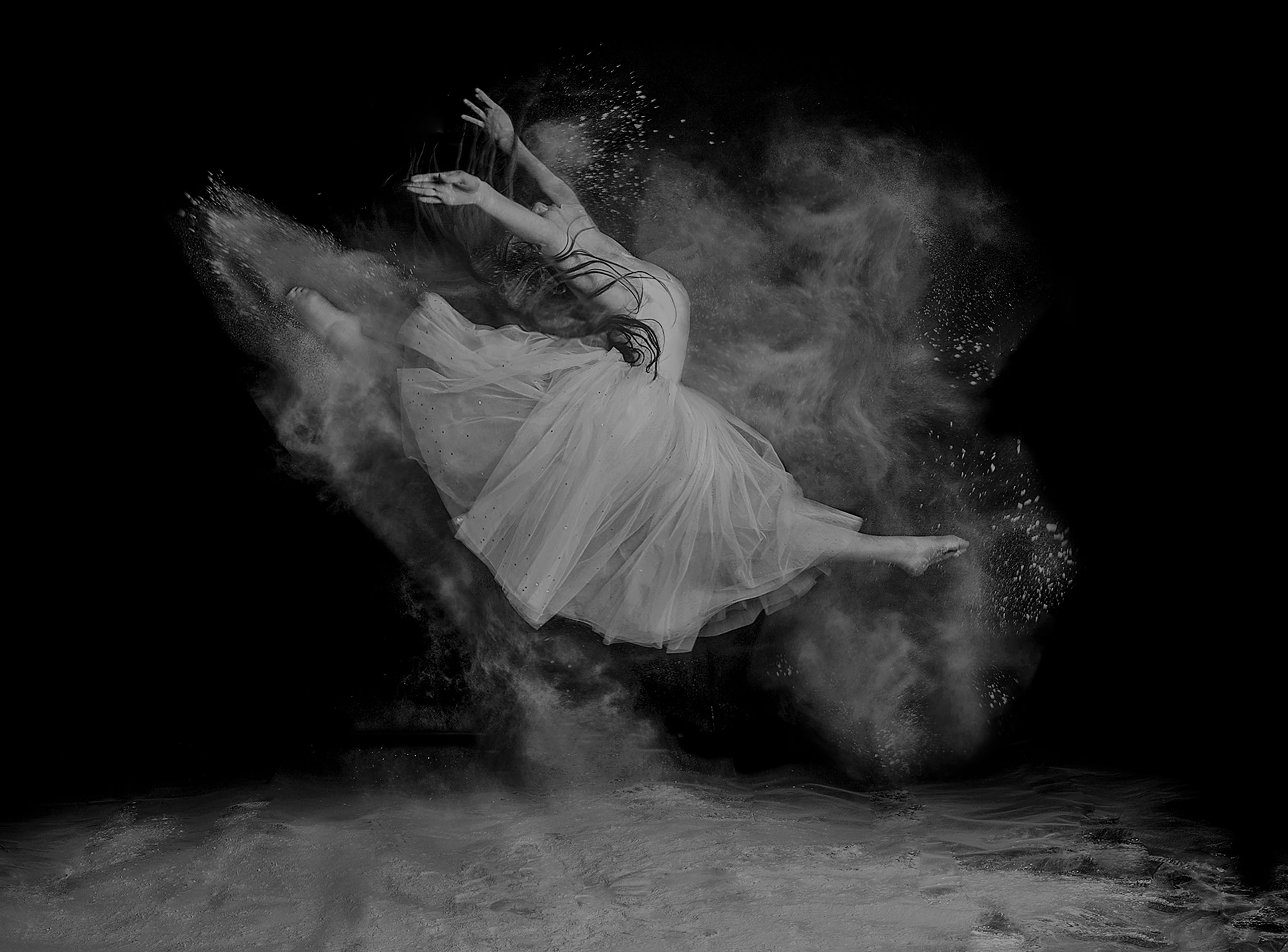
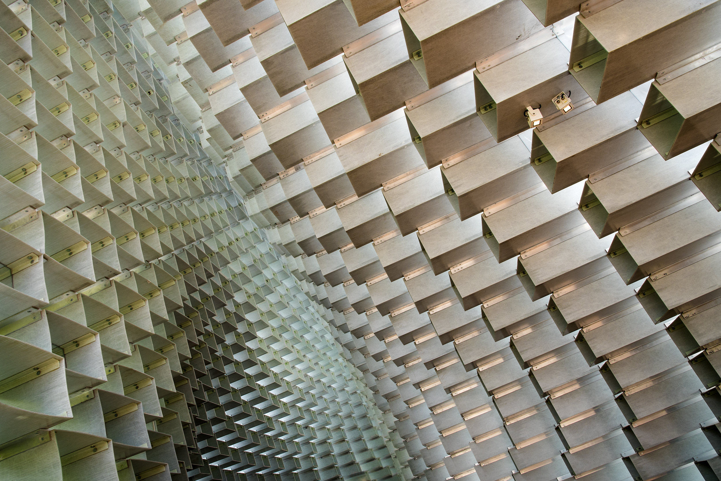
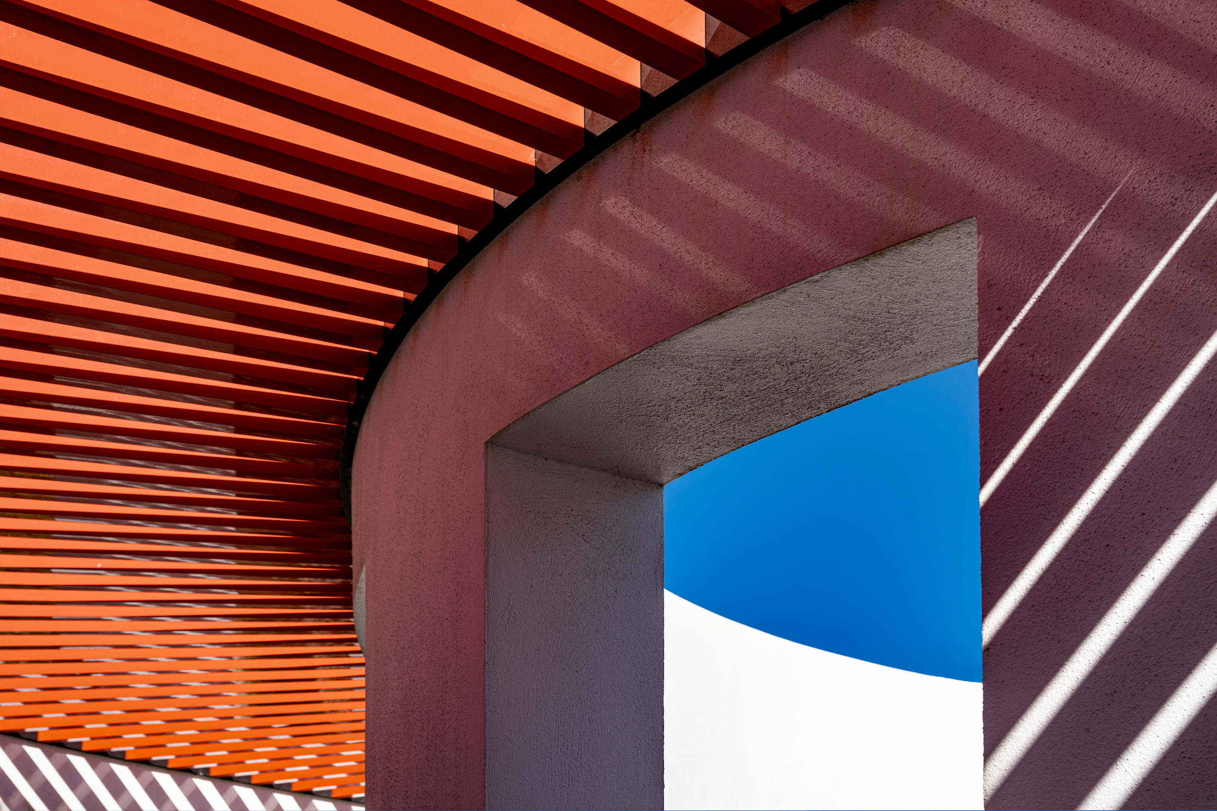
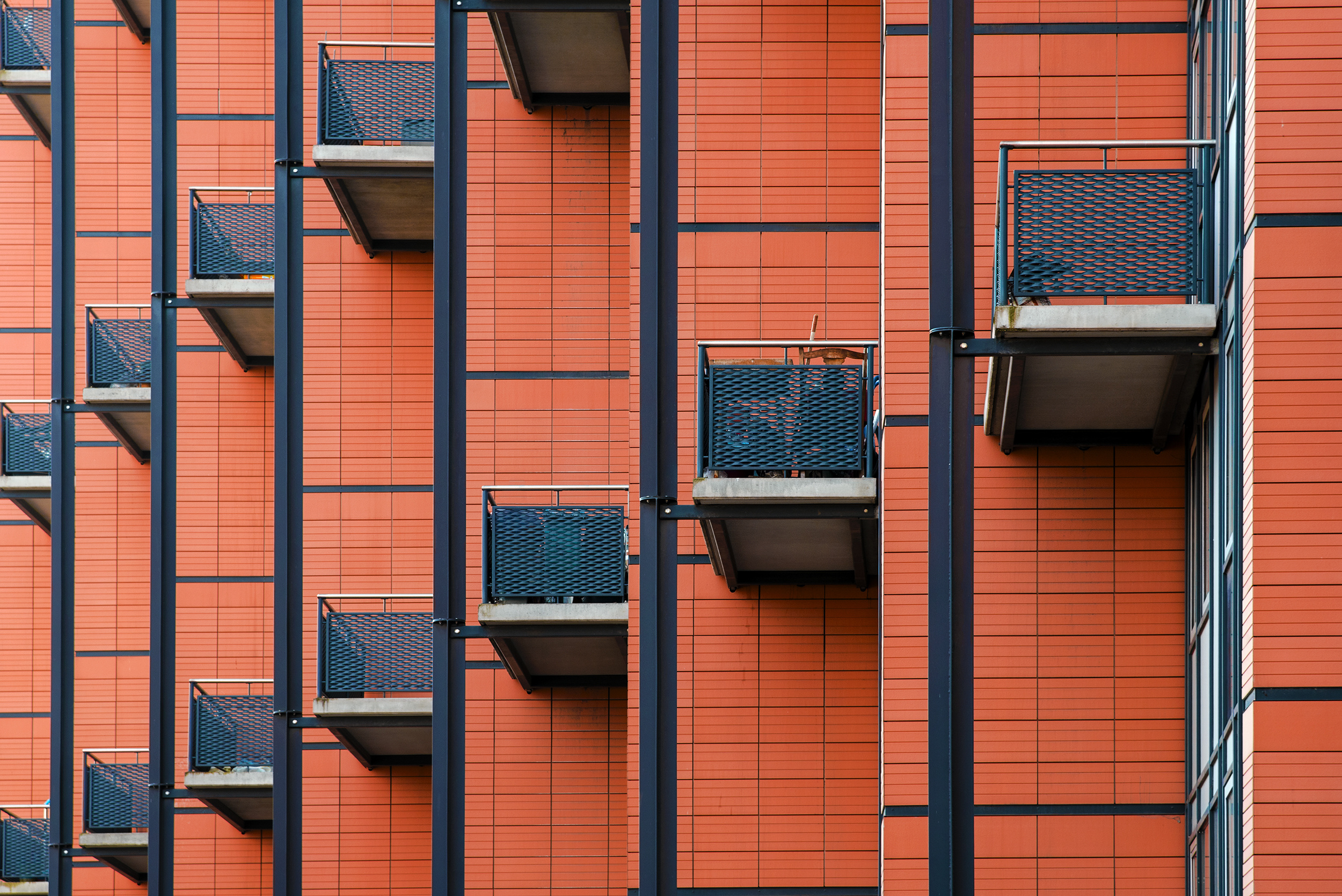
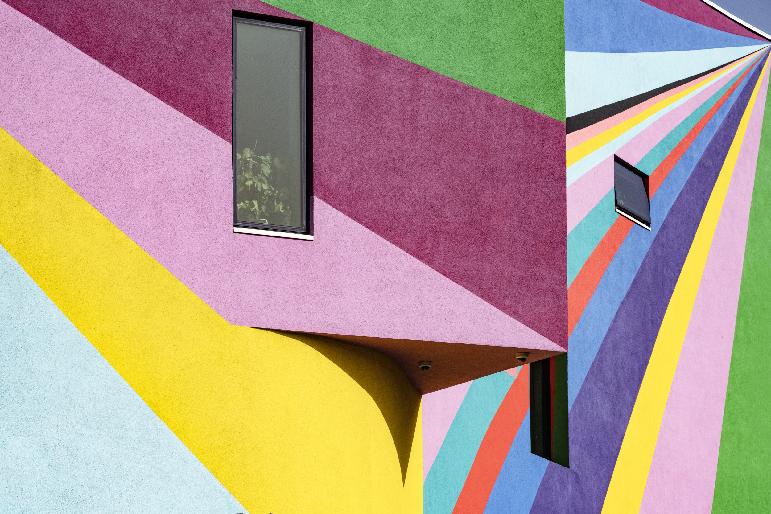
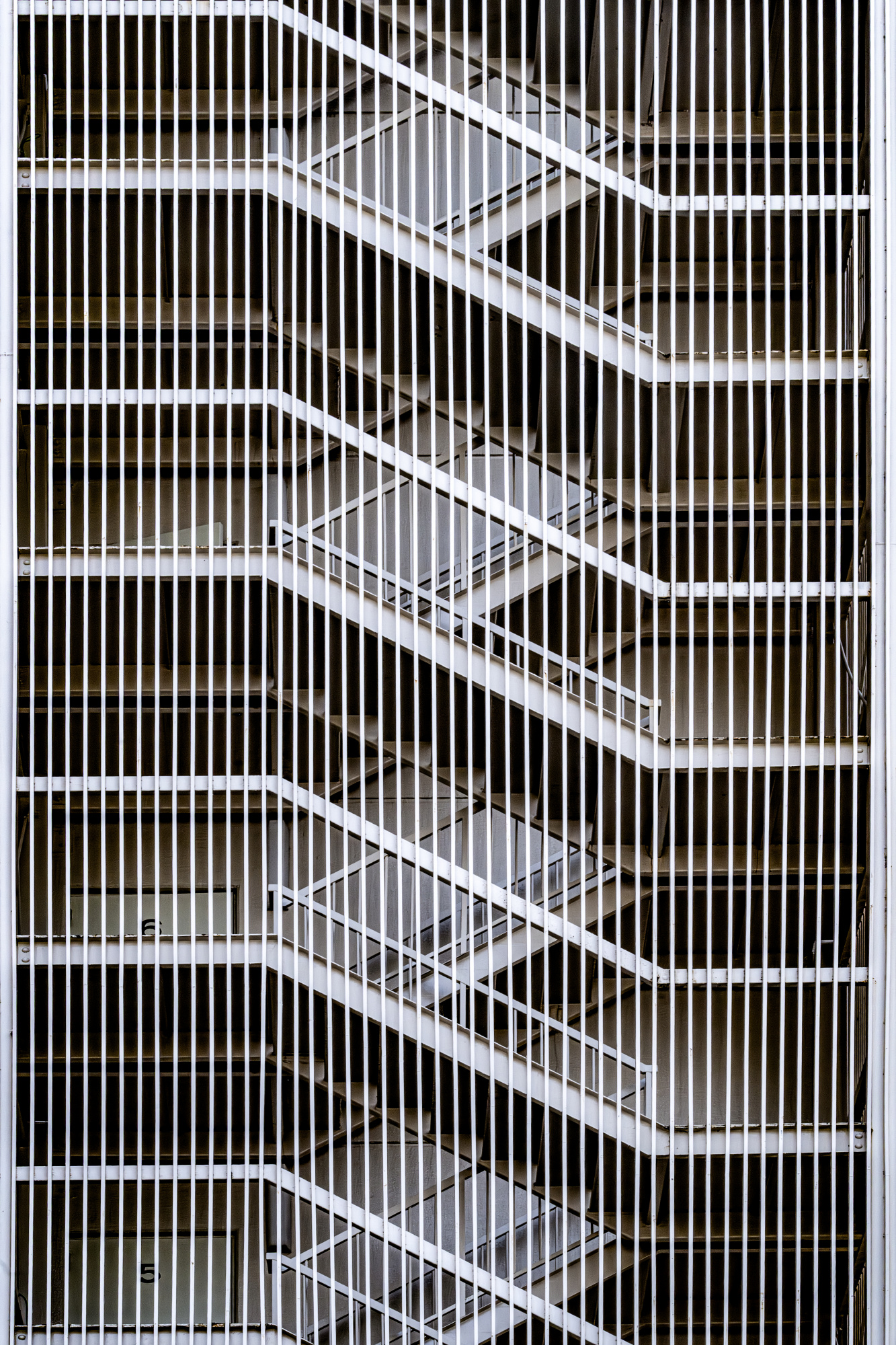
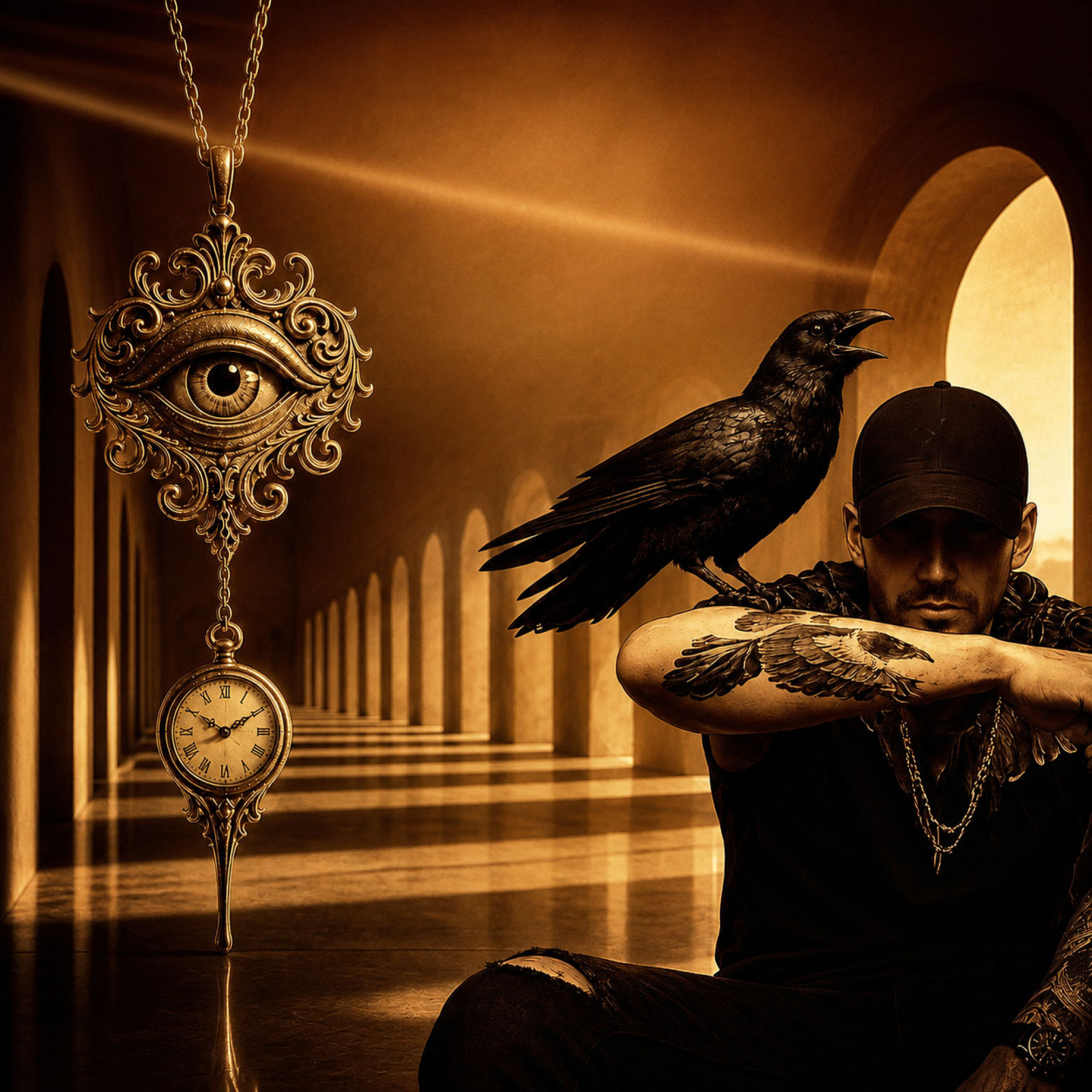
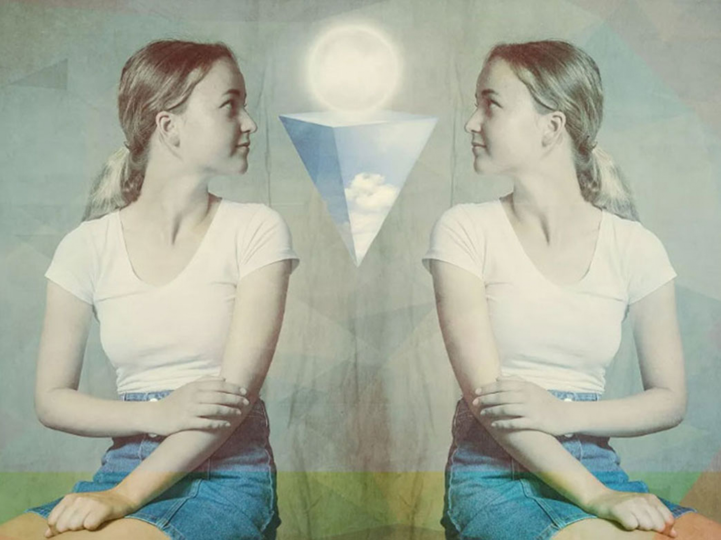
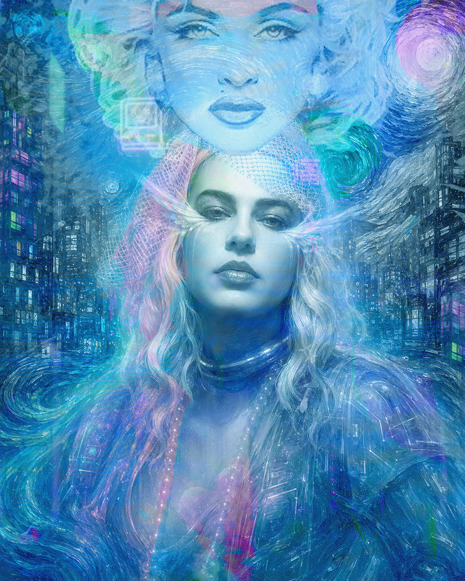
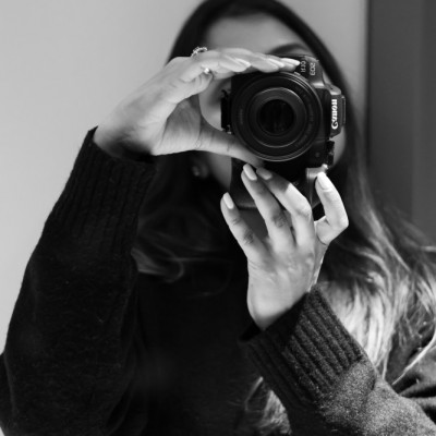
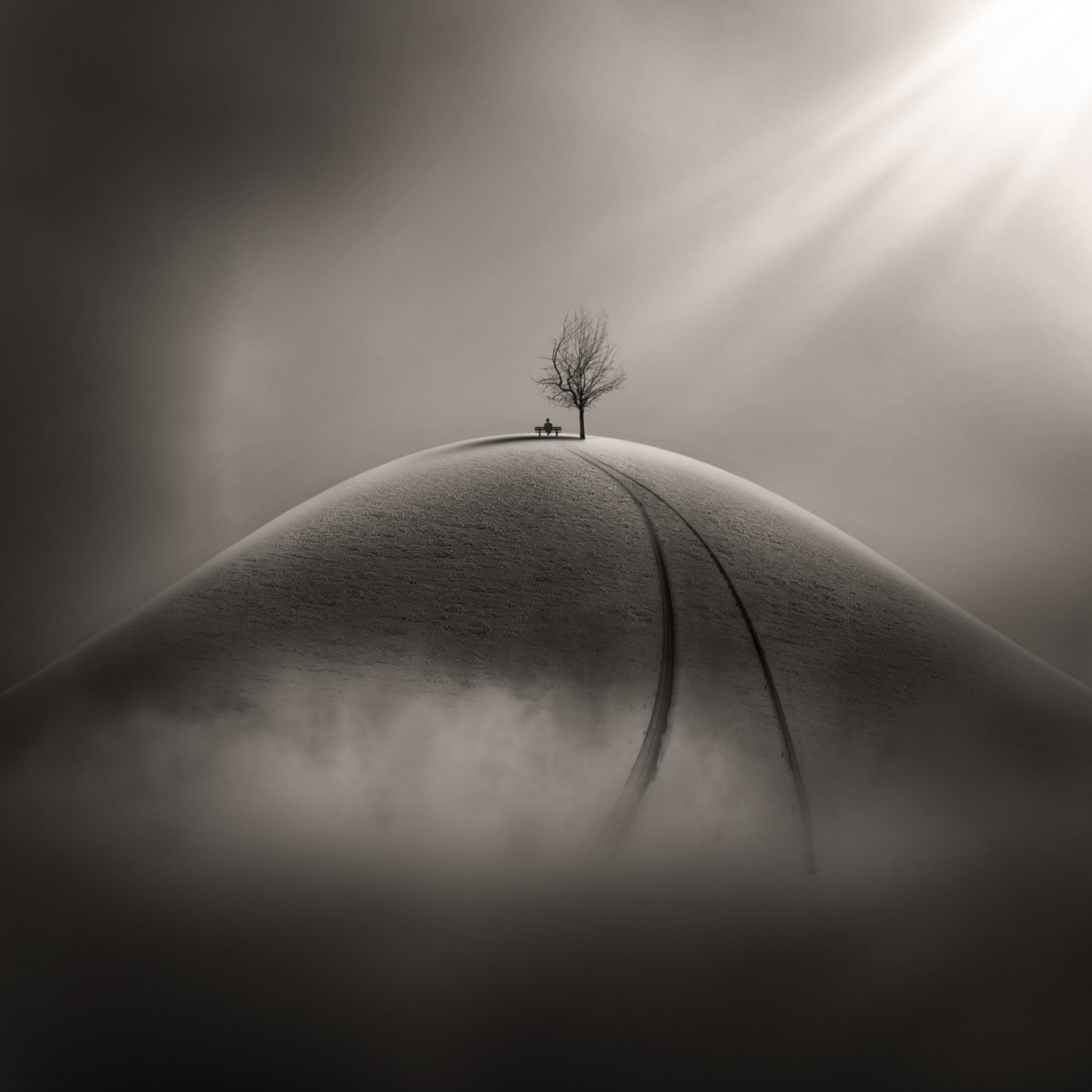
This months' featured exhibition is titled 'Archiometry' by Linda Wride
Linda introduces her outstanding exhibition to us as follows:
"As a photographer, I am fascinated by shape, form and pattern. As a city dweller, I often take photographs in the built environment. Unsurprisingly, my portfolio includes many architectural subjects. The geometry of architecture - the angles, lines and shape of buildings, their 3D form, facade design, and individual elements such as windows and stairs - has inspired many of my images, including those in this exhibition. "Archiometry" is a blend of architecture and geometry. I don't aim for verisimilitude. My images are often graphic in character, with compositions frequently using symmetry or repetition to draw attention to patterns which might otherwise be overlooked. I hope you enjoy!"
I invite you to explore the geometry of architecture for inspiration, just as Linda did.
This exhibition which will be exposed on our opening page / Gallery throughout July 2026.
Click here to see the entire exhibition: [228] Archiometry by Linda Wride
To trigger your curiosity, here is a short selection of images ...
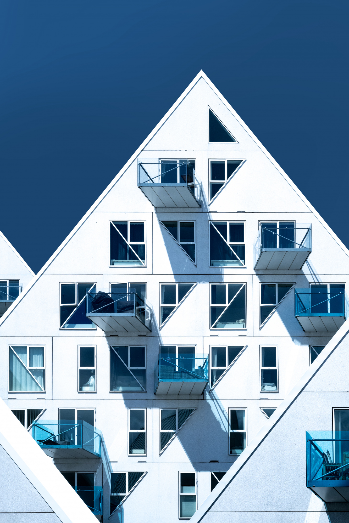
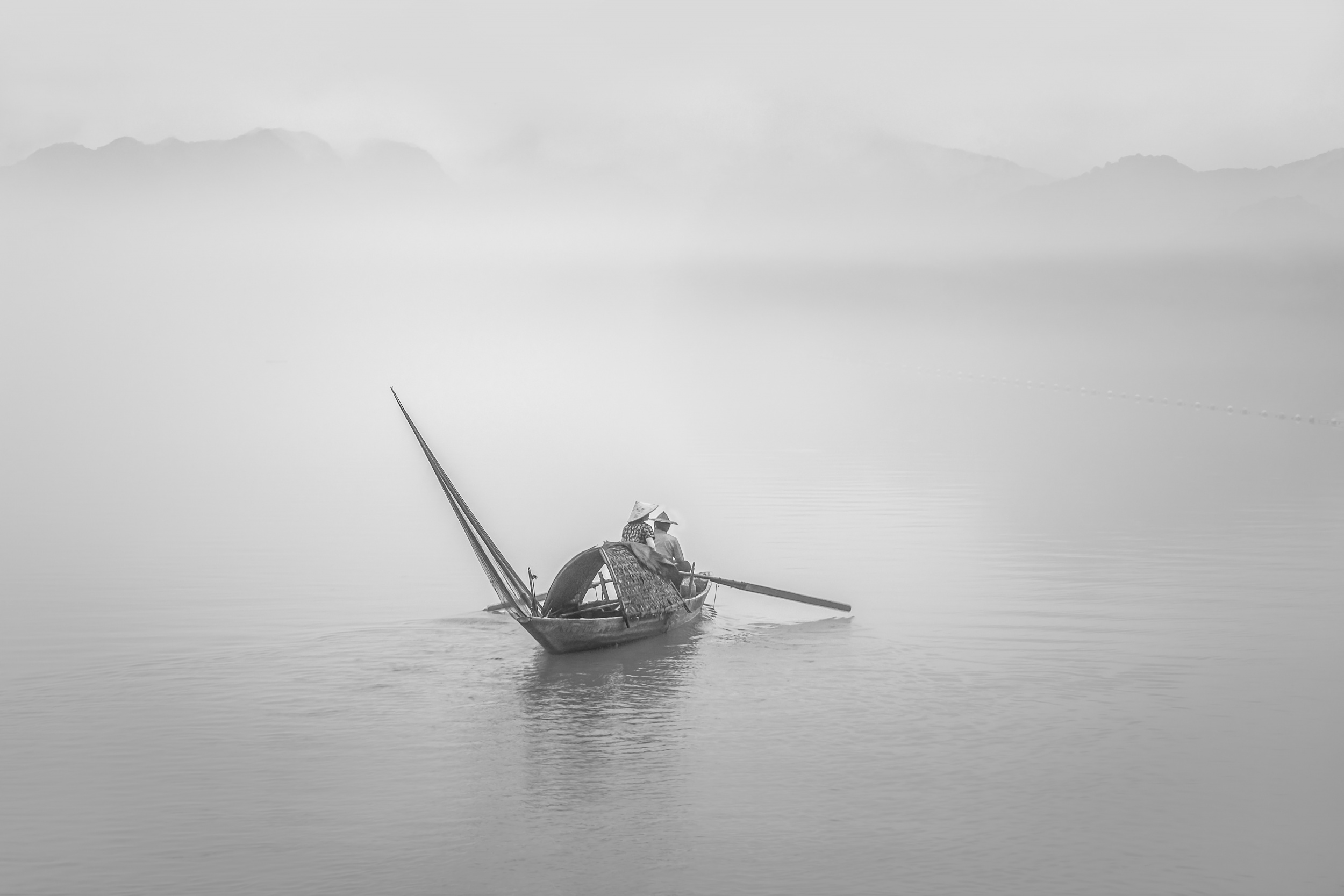
'Iceberg #5'
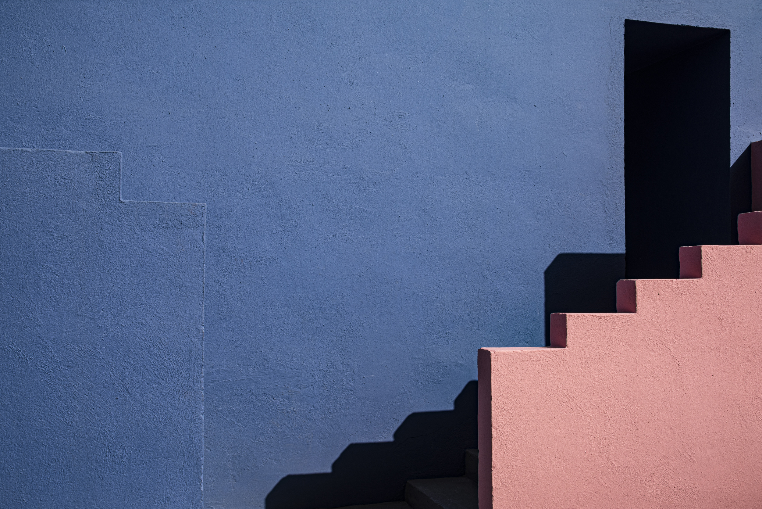
'Muralla Roja #3'
'A space of your own'
 | Write |
 | yein PRO There are so many different patterns in architectural structures. Congratulations, gallery! |
 | Wayne Pearson PRO An outstanding and dramatic portfolio of shapes, colours textures with an architectural abstract effect, congratulations Linda. We see the world around us in a very similar way. Thank you too Yvette, for your tireless effort in organising these editorial features. |
 | Patrick Compagnucci PRO Wonderful work Linda, Many compliments! |
 | Giampiero Maffulli PRO True frames, congrats for your work! |
 | Les Forrester Congratulations on the feature Linda, you’re exhibition of images shows what a classy photographer you are, beautiful architecture in everyone of them |
 | DonnaHom APA PRO Architecture is one of my favorite subject. Good collection of exhibition. Congratulations to author and editor. |
 | Miro Susta CREW Dear Linda you are a gifted photographer, your creative architectural photos are perfect, may I congratulate you on excellent photo work, and many thanks Yvette for introducing Linda in the way to us. |
 | Elizabeth Allen CREW Congratulations on your well-deserved feature, Linda. Your work is so inspiring and beautifully presented. Thanks as always to Yvette. |
by Editor Michel Romaggi in collaboration with the author Agnes
Edited and published by Yvette Depaepe, the 6th of July 2026.
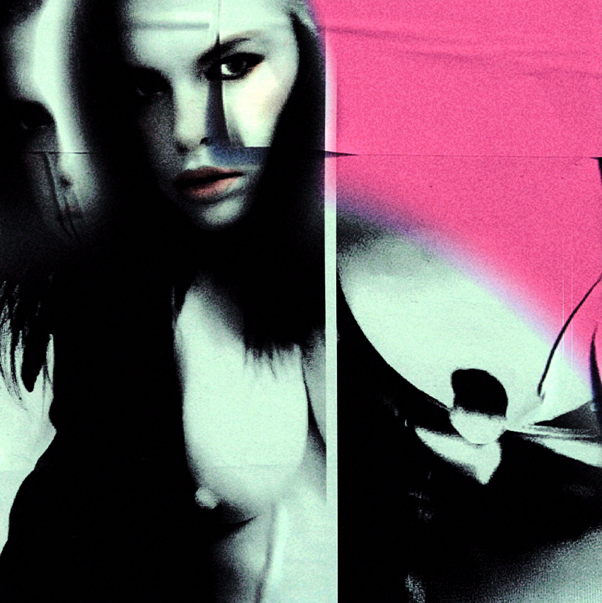
‘Xerox Saint’
Dear Agnes, could you tell us how you came up with the idea for Xerox Saint?
Xerox Saint was created using my own photographs, a found texture and a series of visual decisions made during the editing process. I came up with the idea for Xerox Saint first. I already had a diptych from a previous nude photography project, as I am interested in fine art nude photography. The image is based on two black-and-white self-portraits taken with my mobile phone. Both photographs are simple selfies: one shows my face and the other shows my breast.
First, I combined the two images to create a diptych, then I added a texture that I found on Snapchat. I then adjusted the colours and intensity until the image looked right. My process is usually more intuitive than technical. I experiment with simple elements and follow the image until it achieves the desired atmosphere.
My creative process often involves a combination of photography, collage, digital manipulation, found materials, textures, typography and experimentation.
‘Zeitpunkt’
My work with photography takes many forms, including digital cameras, mobile phones, analogue photography and pinhole cameras.
For instance, I have a substantial collection of colourful analogue photographs taken with a plastic toy camera known as the Diana Multi Pinhole Operator. Although it is a €50 camera from China, it has a long and fascinating history.
Many of those photographs were technically unsuccessful. However, I loved the colours, the grain, the imperfections and the analogue aesthetic. Rather than discarding them, I scanned the images and breathed new life into them using colour filters and digital manipulation. Today, they work perfectly as textures and visual layers in my work.
I call this approach 'No-Waste Art'.
Photoshop is my main creative tool. As I am largely self-taught, I don't always achieve exactly what I imagine, so I'm always looking for alternative solutions. I use phone and Snapchat filters, mobile apps, and experimental software — basically, I use filters everywhere!
The final image often has very little in common with the starting point.
‘Virtual Insanity’
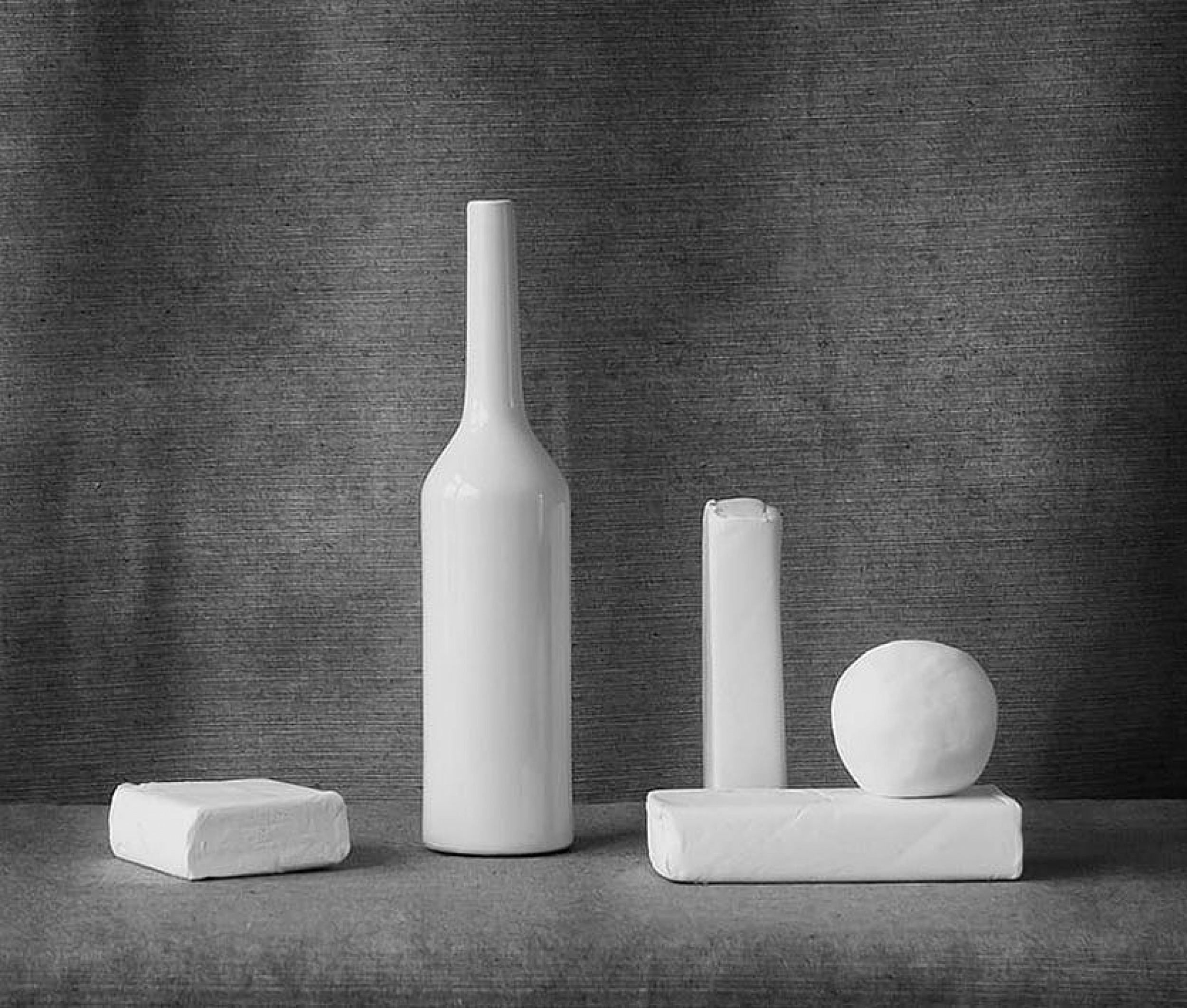
‘Still Life, White’
‘LOL (Legions of Love)’
What does photography mean to you?
To me, an image is a means of communicating with the outside world.
I want to connect with the observer and provoke a reaction. For me, photography is not about documenting reality. It's about translating ideas, emotions, questions and stories into a visual form.
I use and combine every technique I can think of to express myself.
Sometimes I succeed immediately. Other times, I have to give up for a while because what I want to create seems impossible at that particular moment in time. Then I keep searching.
I am not particularly interested in how an image was made.
What interests me is whether it works.
Does it communicate?
Does it touch someone?
Does it make someone stop scrolling for a moment and actually feel something?
The technique is never the goal.
It's the idea that matters.
The image simply finds the tools it needs.
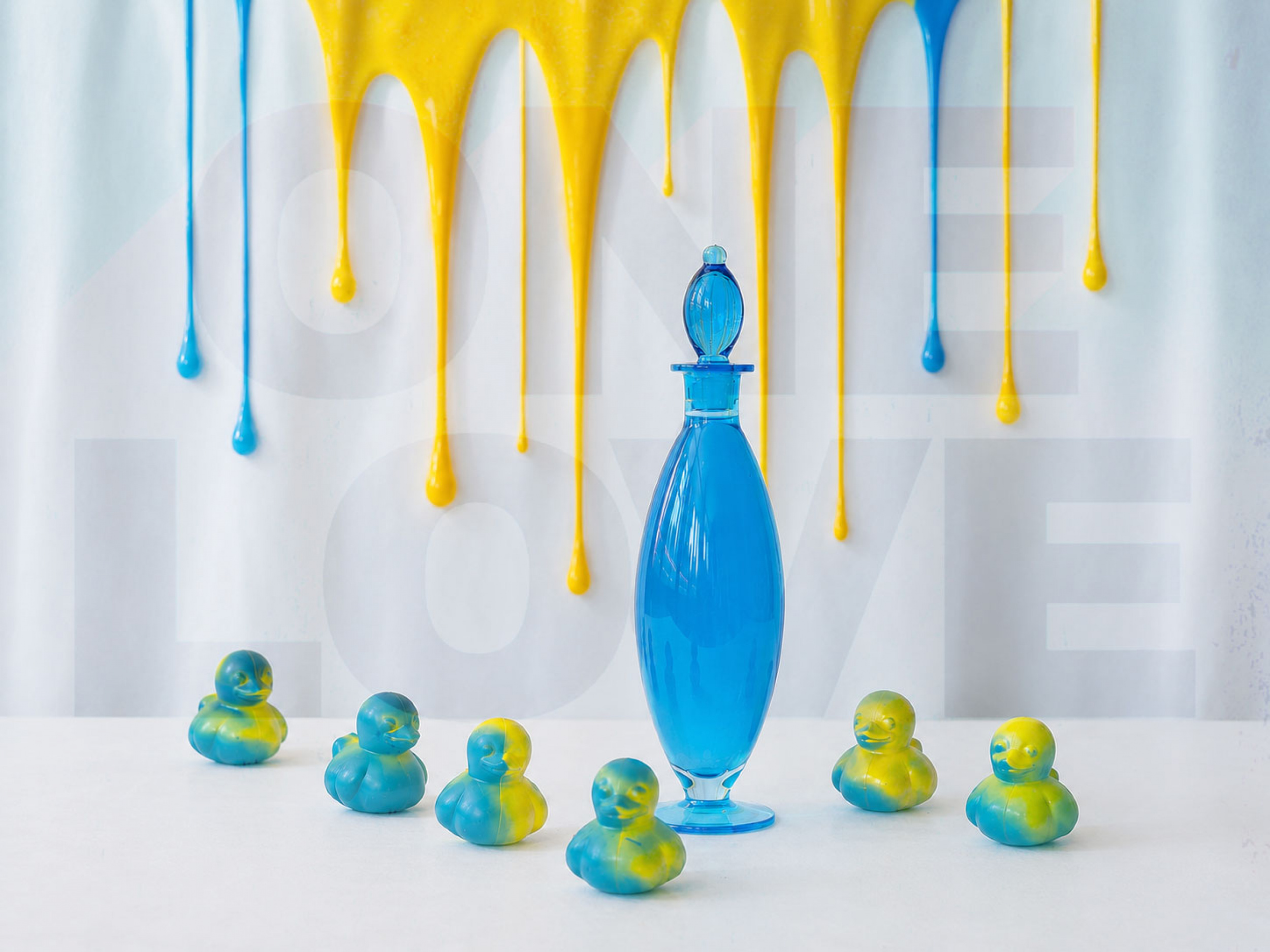
‘TRUE BLUE’
|
| | DonnaHom APA PRO A collection of very creative images. Congratulations Agnes. Thanks to the editor for putting this magazine together. |
 | Agnes PRO Thank yoy. One 💙 |
 | Bu tarzı seviyorum. Tebrikler Agnes |
| Agnes PRO Merci. 💙 |
 | FranzStaab PRO For me great photo art! Congratulations Agnes! |
| Agnes PRO Tjank you very much. One 💙 |
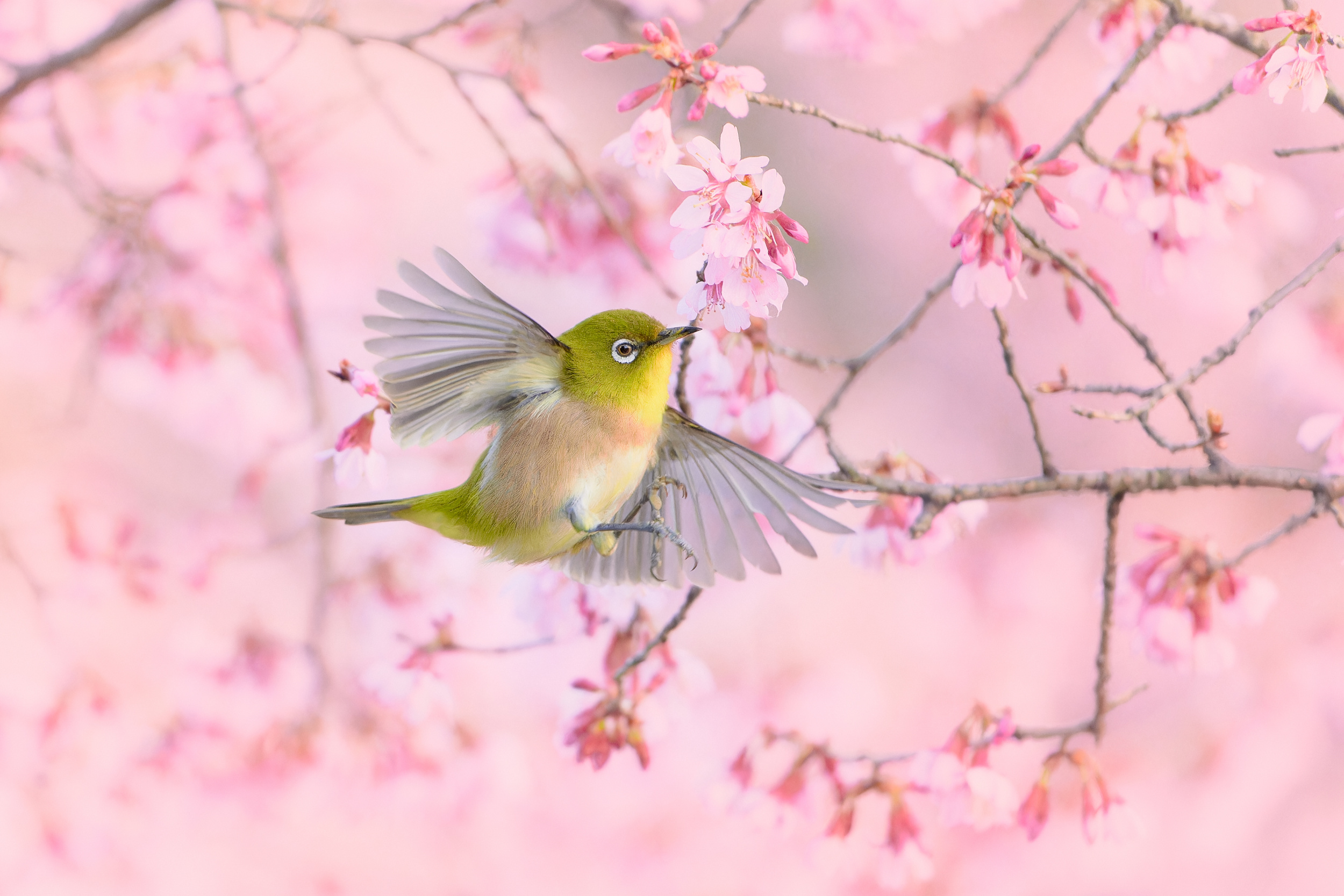
by Editor Jacob (Jian) Xu
Edited and published by Yvette Depaepe, the 3rd of July 2026
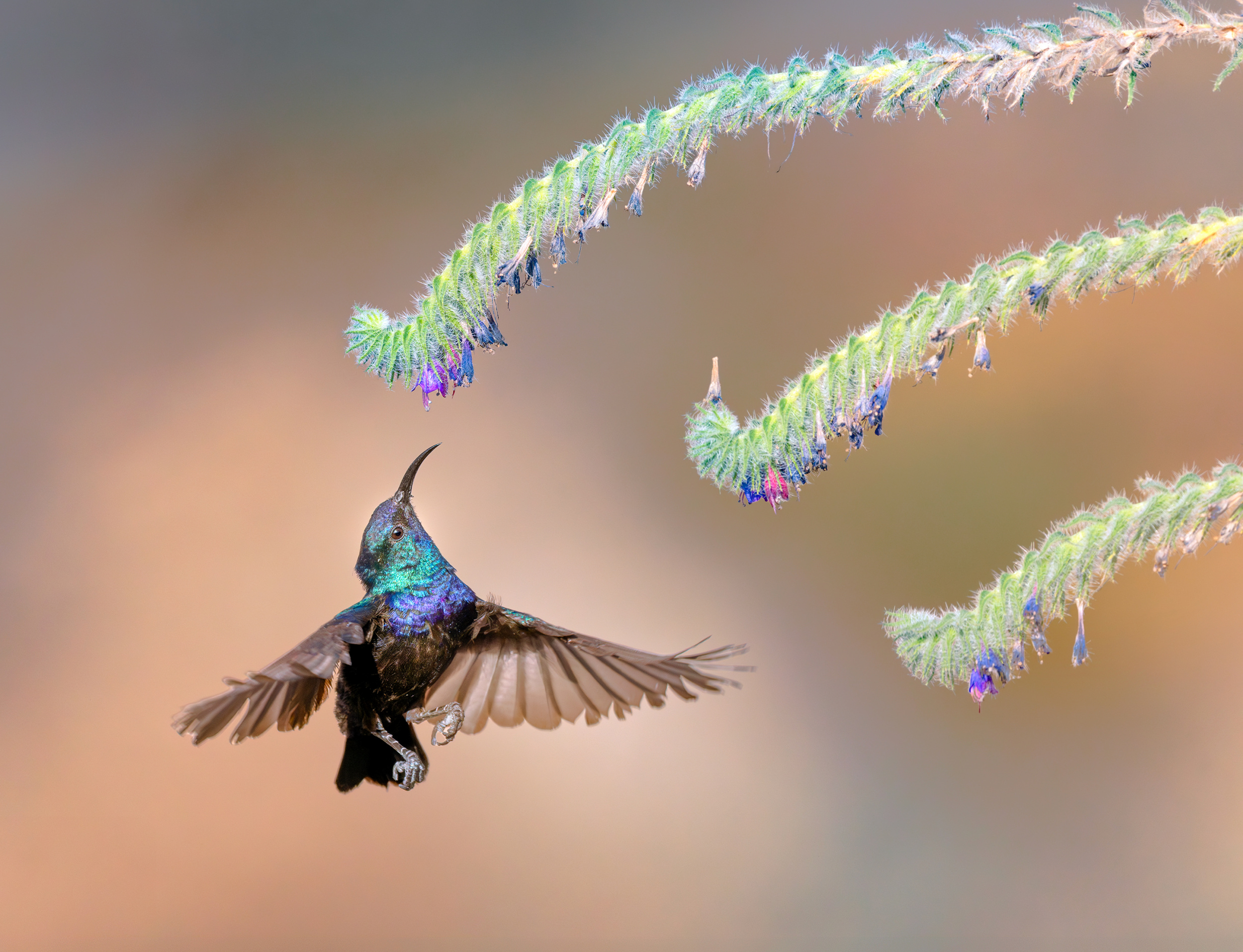
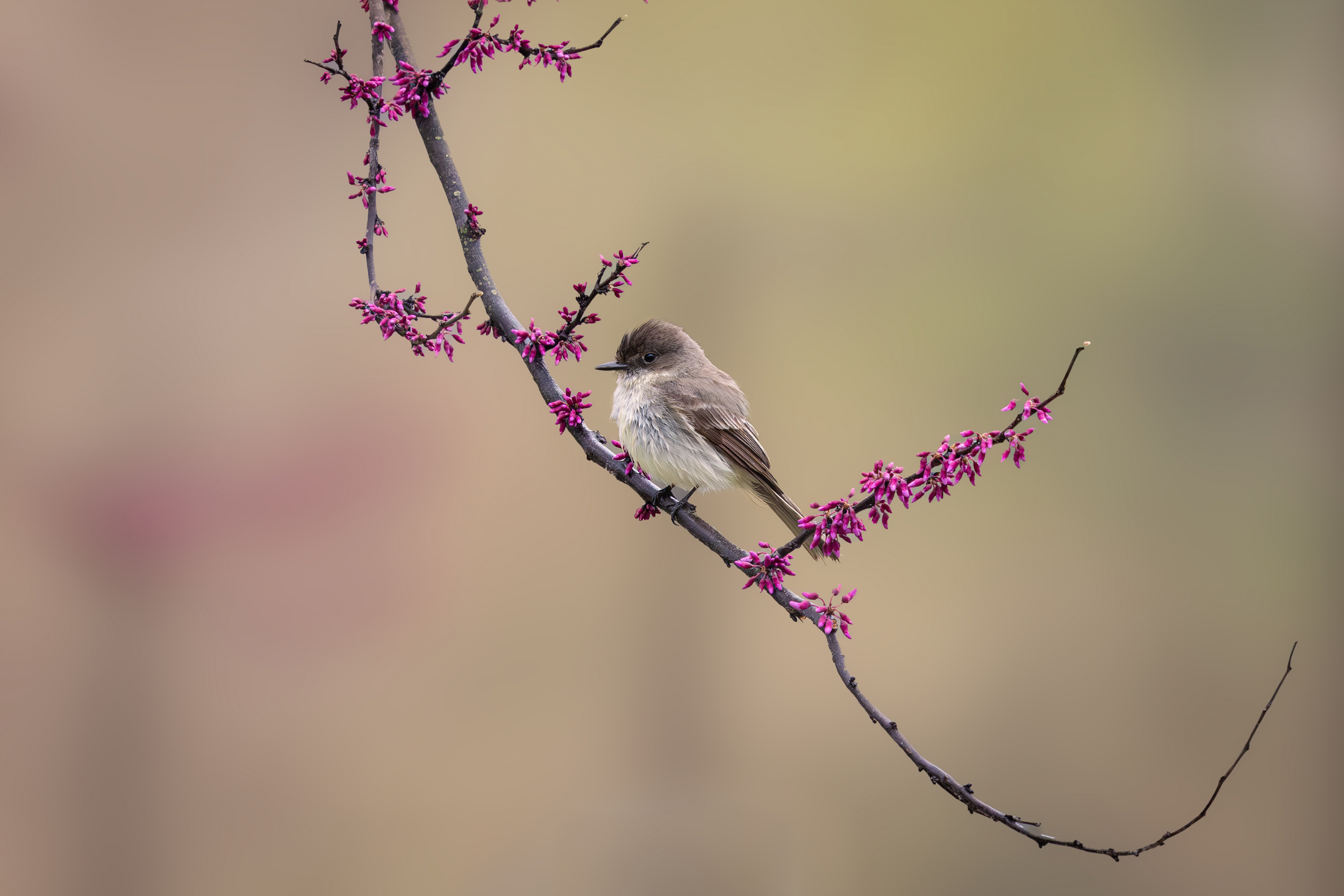
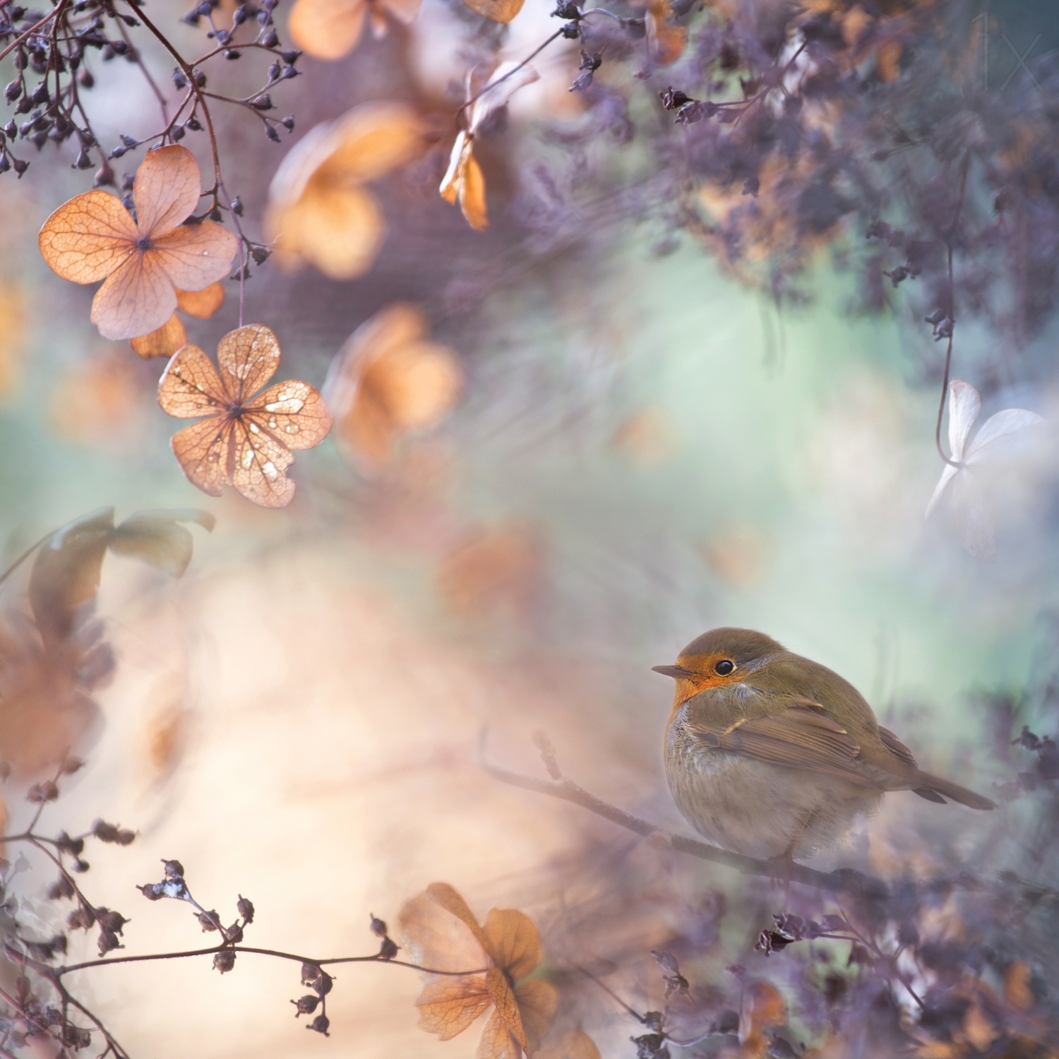
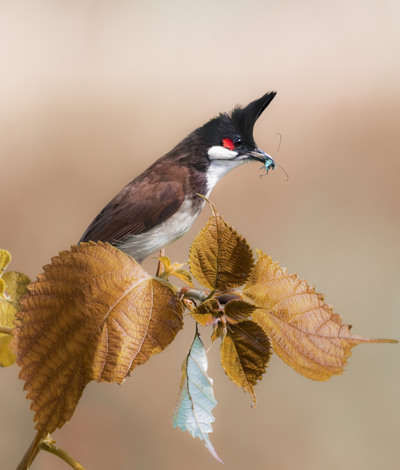
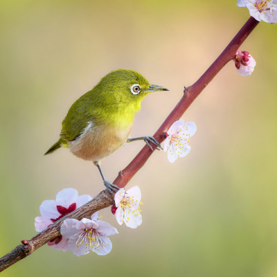
Birds have long been a favorite subject for many photographers. Their beauty, behavior, and connection to the natural world offer endless opportunities for creative expression.
Traditional wildlife photography often seeks to document these moments faithfully through sharp detail, natural surroundings, and authentic action & behavior. Yet photography can be more than documentation. It can also be interpretation.
This article explores a different approach: creating bird photographs that evoke the feeling of a painting. Through thoughtful composition, harmonious color, atmosphere, and creative processing, photographers can transform a fleeting encounter with nature into an image that feels less like a record and more like a visual poem.
‘Swayed by the Spring Breeze’ by Hiro Tanaka
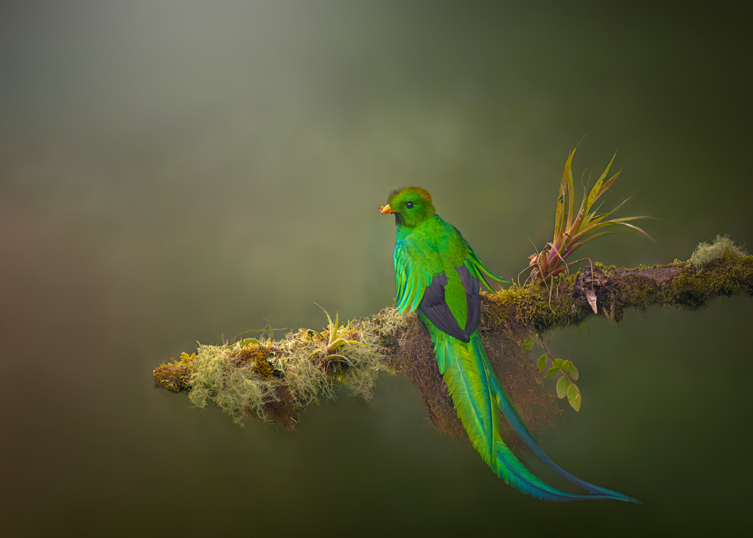
‘Quetzal o Pharomschrus 2 7R58678’ by joanaduenas
‘Winter colors’ by Andres Miguel Dominguez
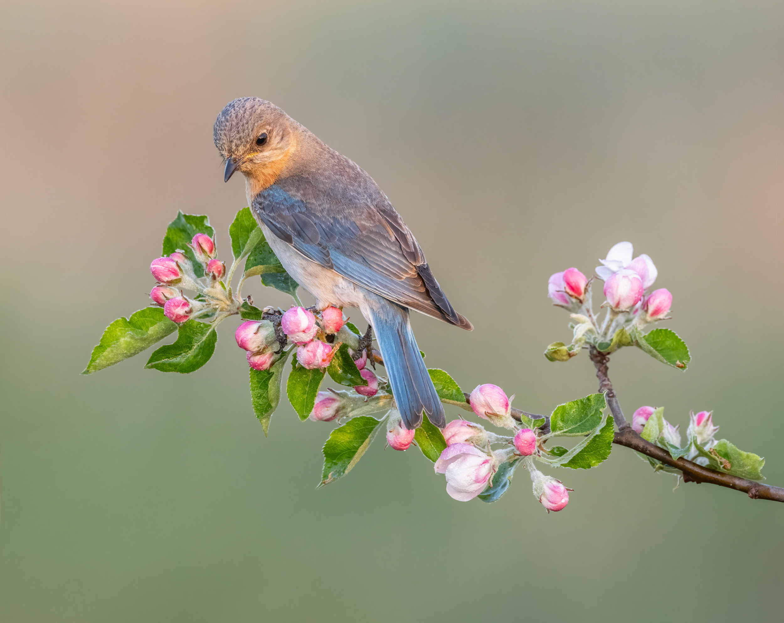
‘Eastern Bluebird’ by Donald Luo
Delicacy and Refinement
Painterly bird photography often begins with a search for delicacy. Rather than emphasizing action or dramatic behavior, these images celebrate grace, beauty, and subtle detail.
A bird among blossoms, the curve of a branch, or the texture of feathers can become the focus of an image. Through simplicity and restraint, photographers reveal the quiet beauty that is often overlooked.
‘Great Tit in love’ by Massimo Chiodini
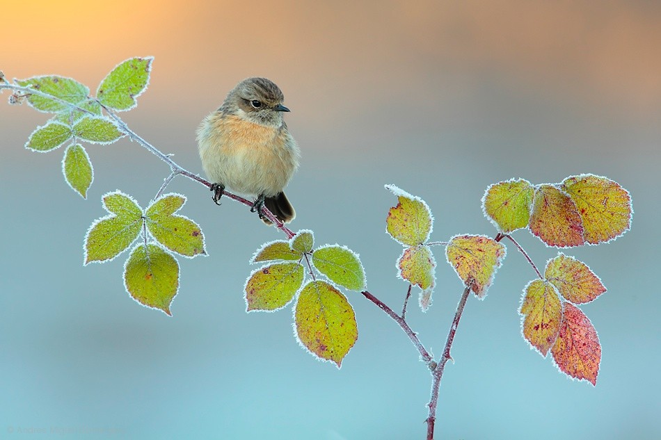
‘Prickly Bird’ by Greg Barsh
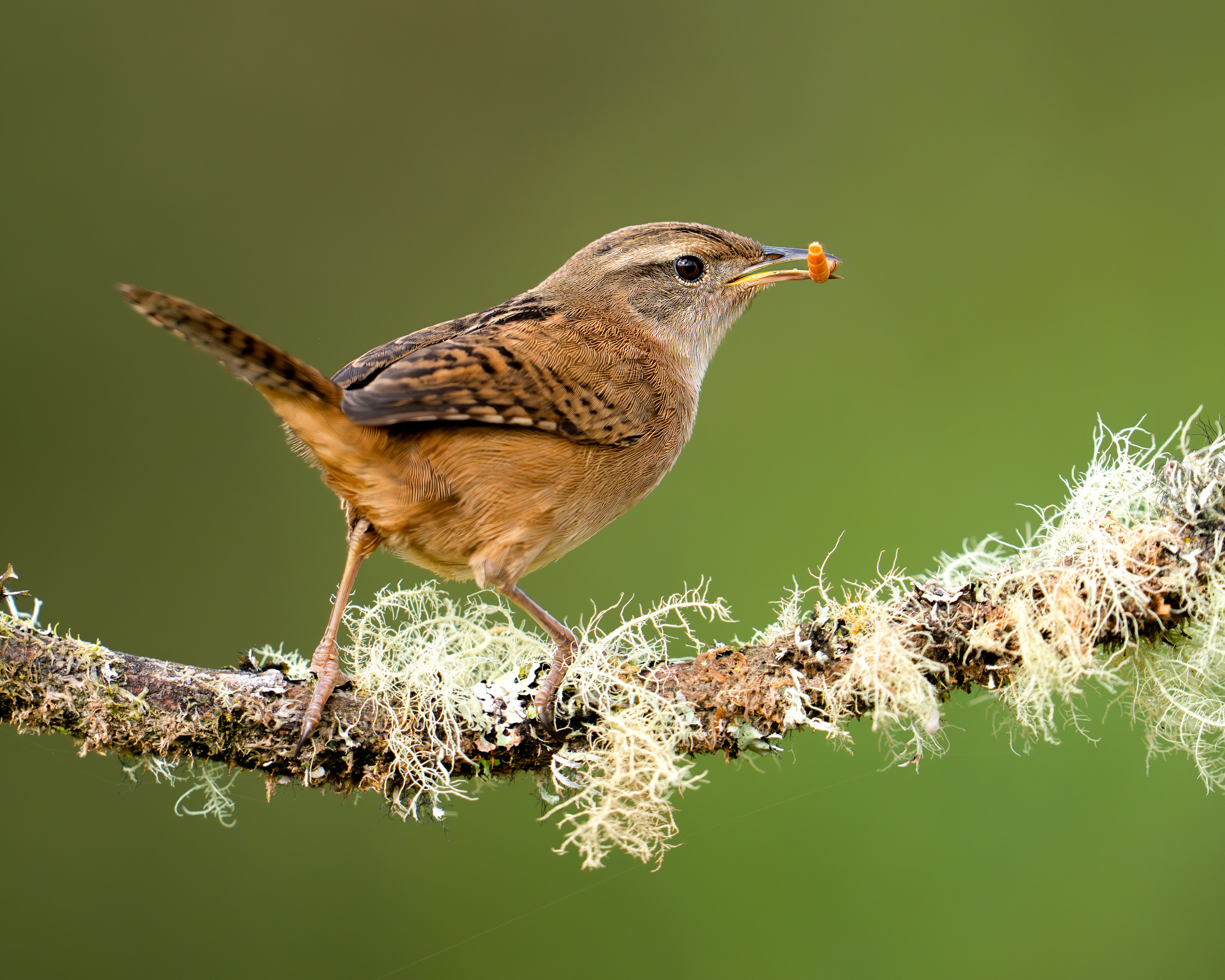
‘Grass wren’ by Lisandro PEREZ
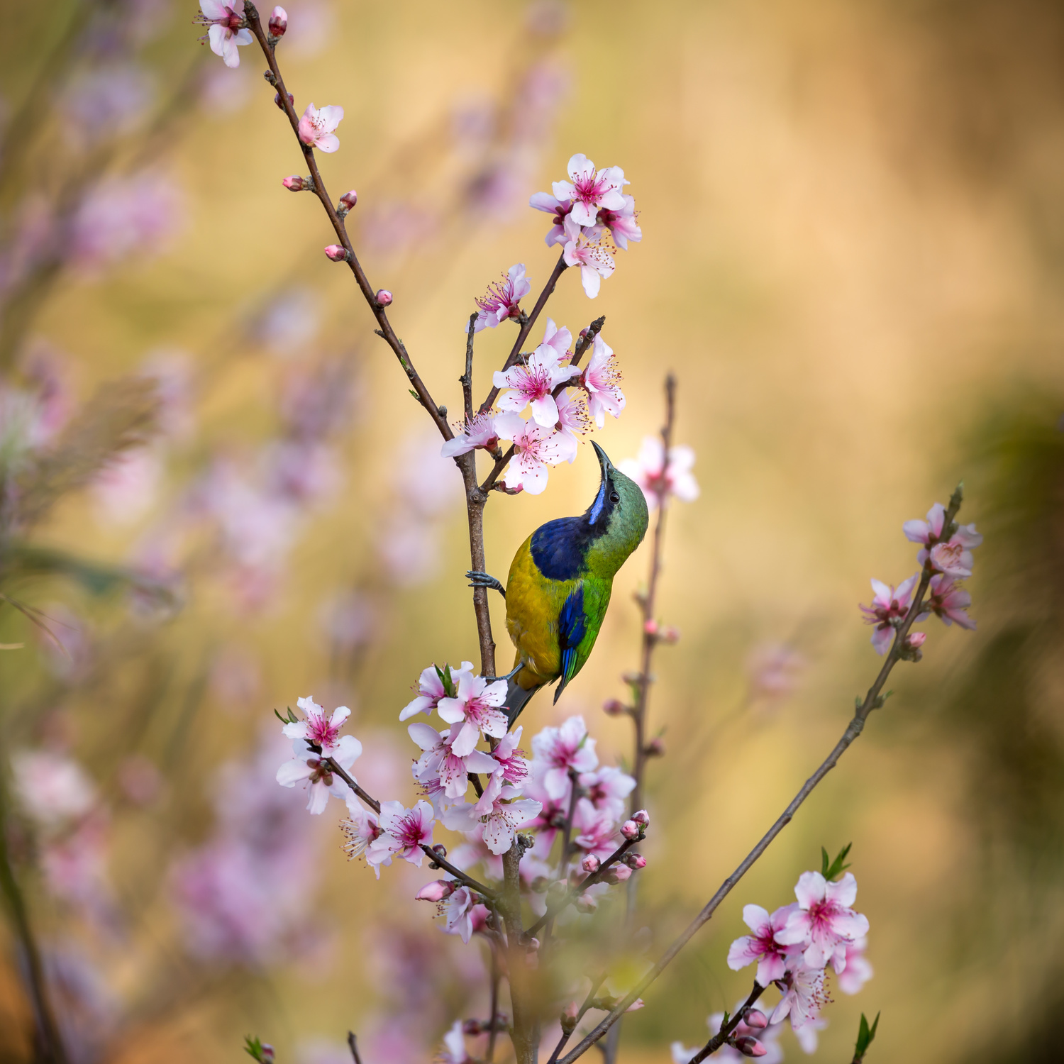
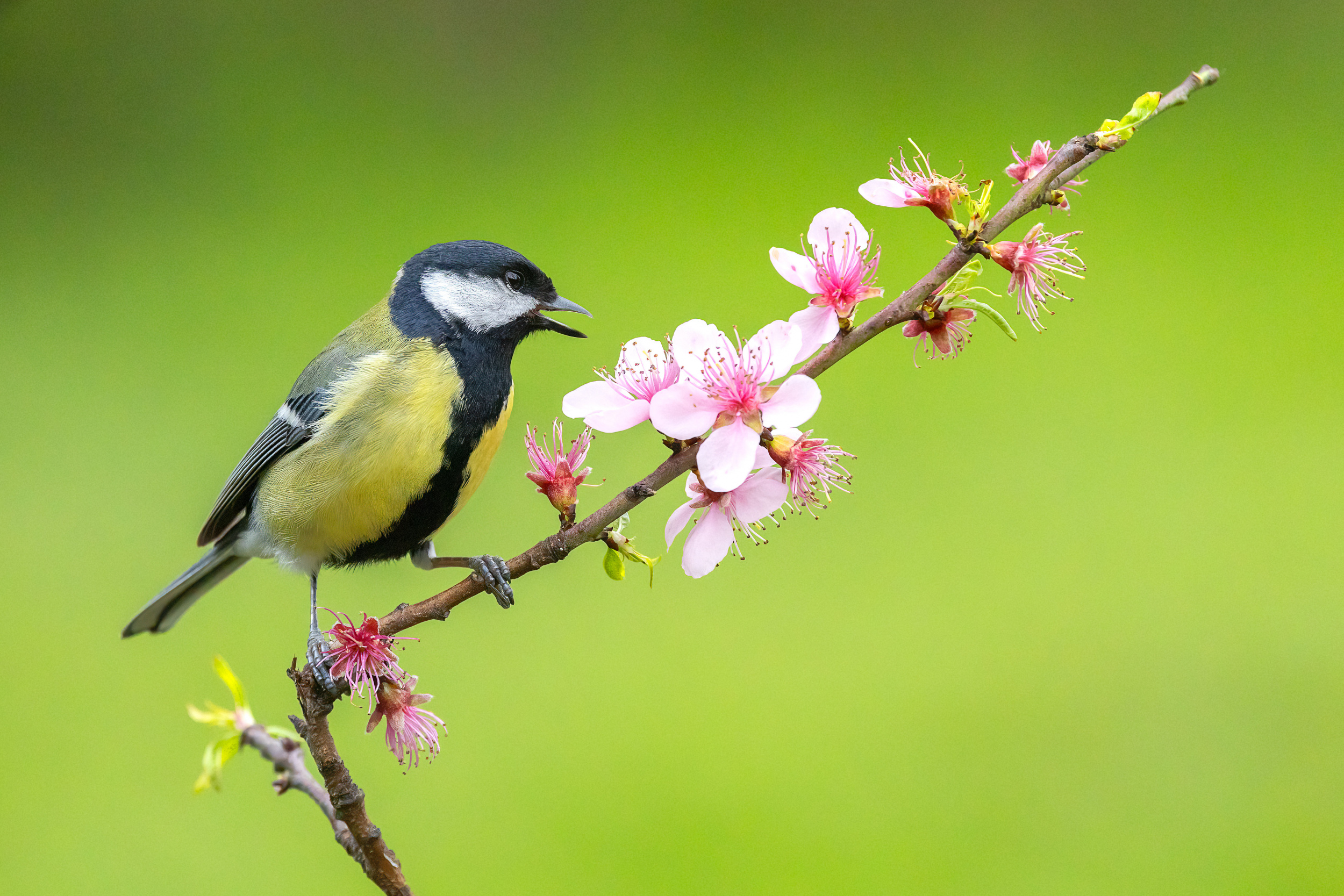
‘Bird Whispering to the Peach Flower’ by Jianfeng Wang
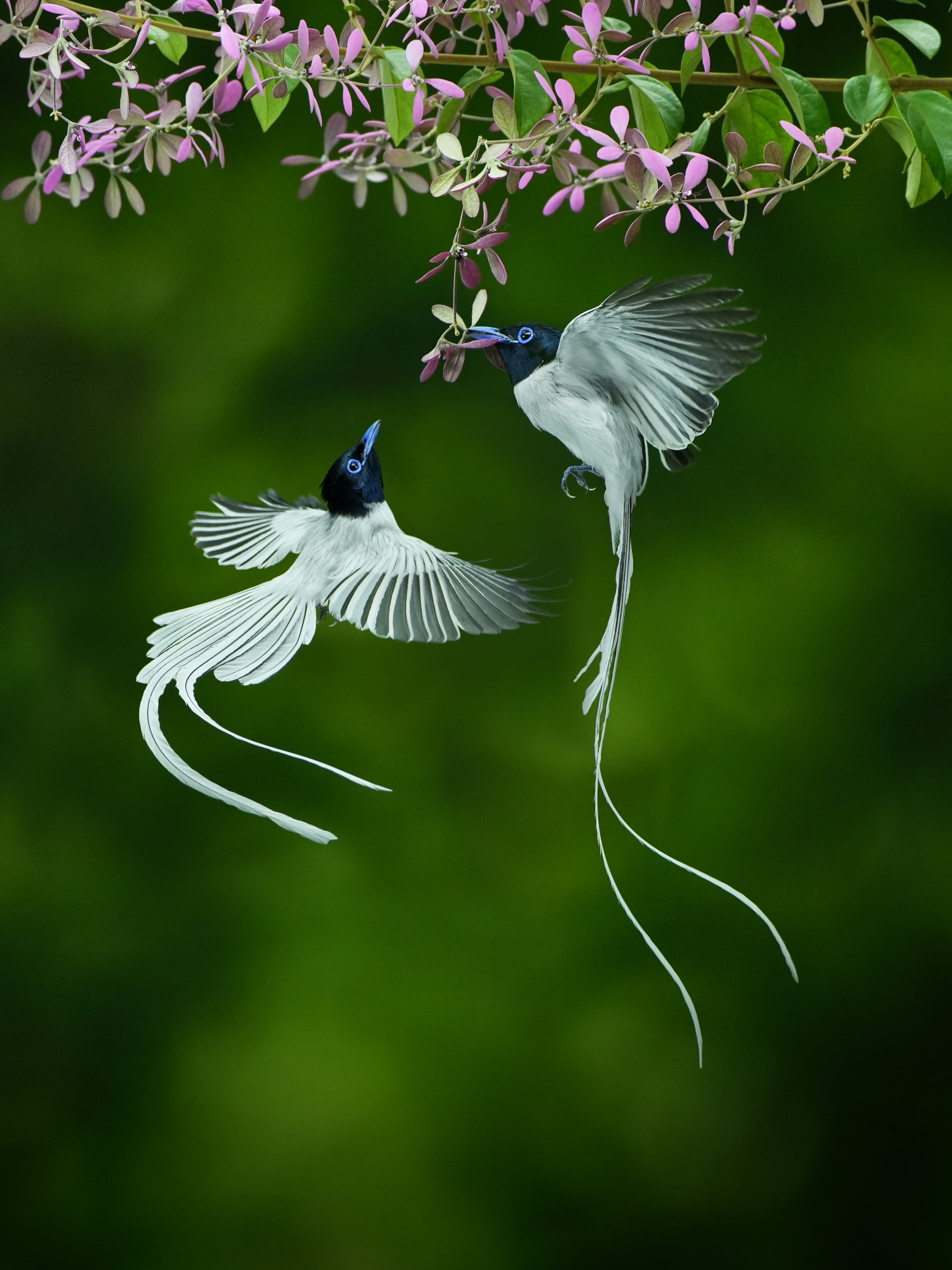
Composition, Space, and Harmony
In painterly photography, composition extends beyond the subject itself. The placement of a bird, the direction of a branch, and the relationship between positive and negative space all contribute to the image.
Rather than filling every corner of the frame, these photographs allow space to play an active role. The result is a sense of balance that guides the viewer's eye and gives the image room to breathe.
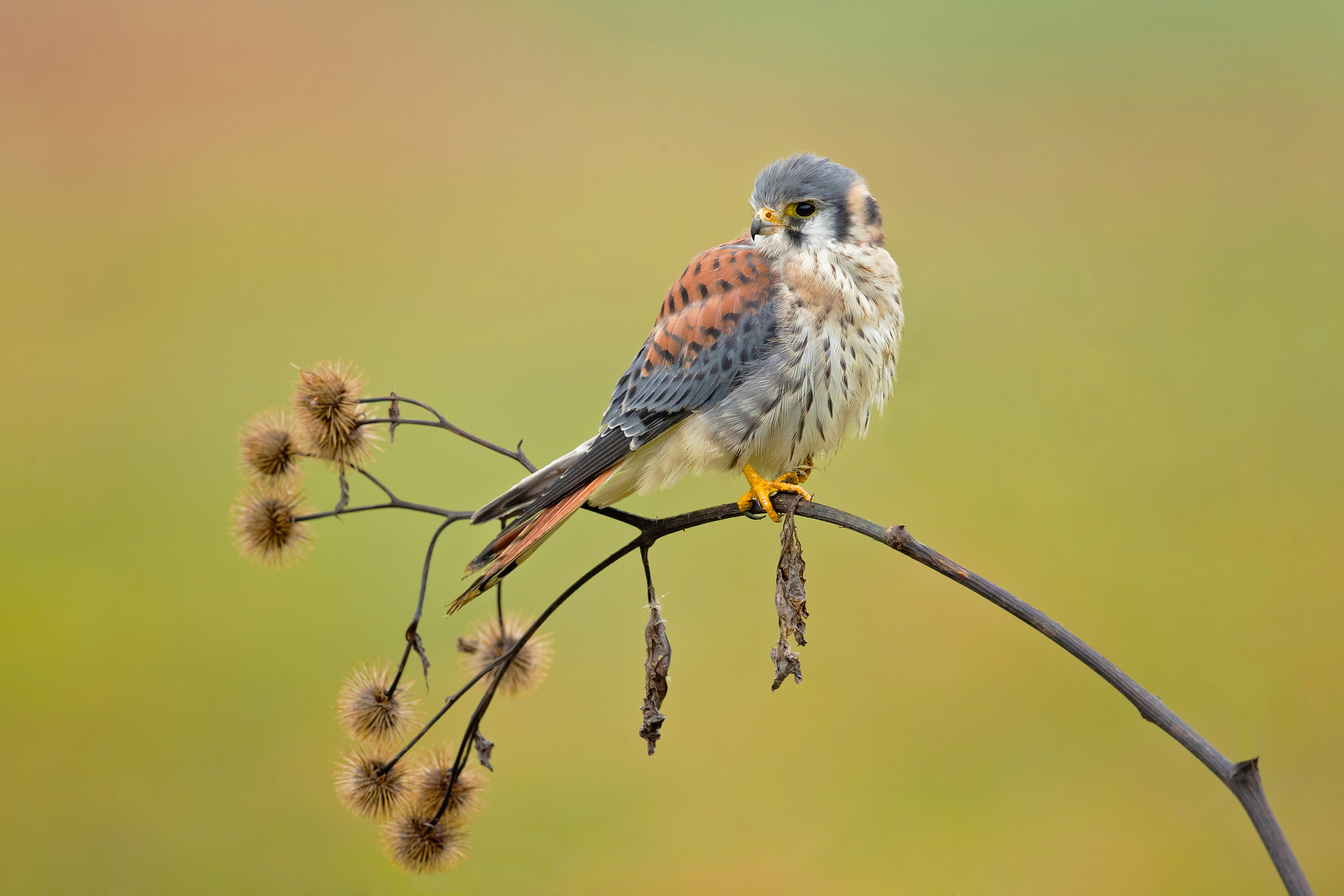
‘American Kestrel’ by Milan Zygmunt
‘Stretch’ by Greg Barsh
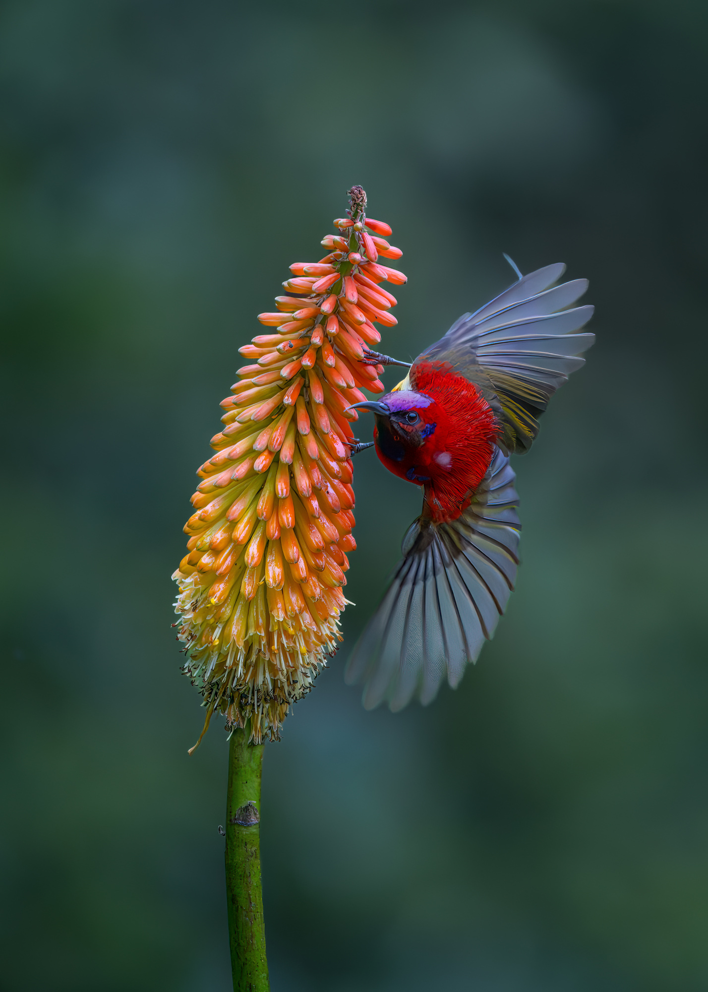
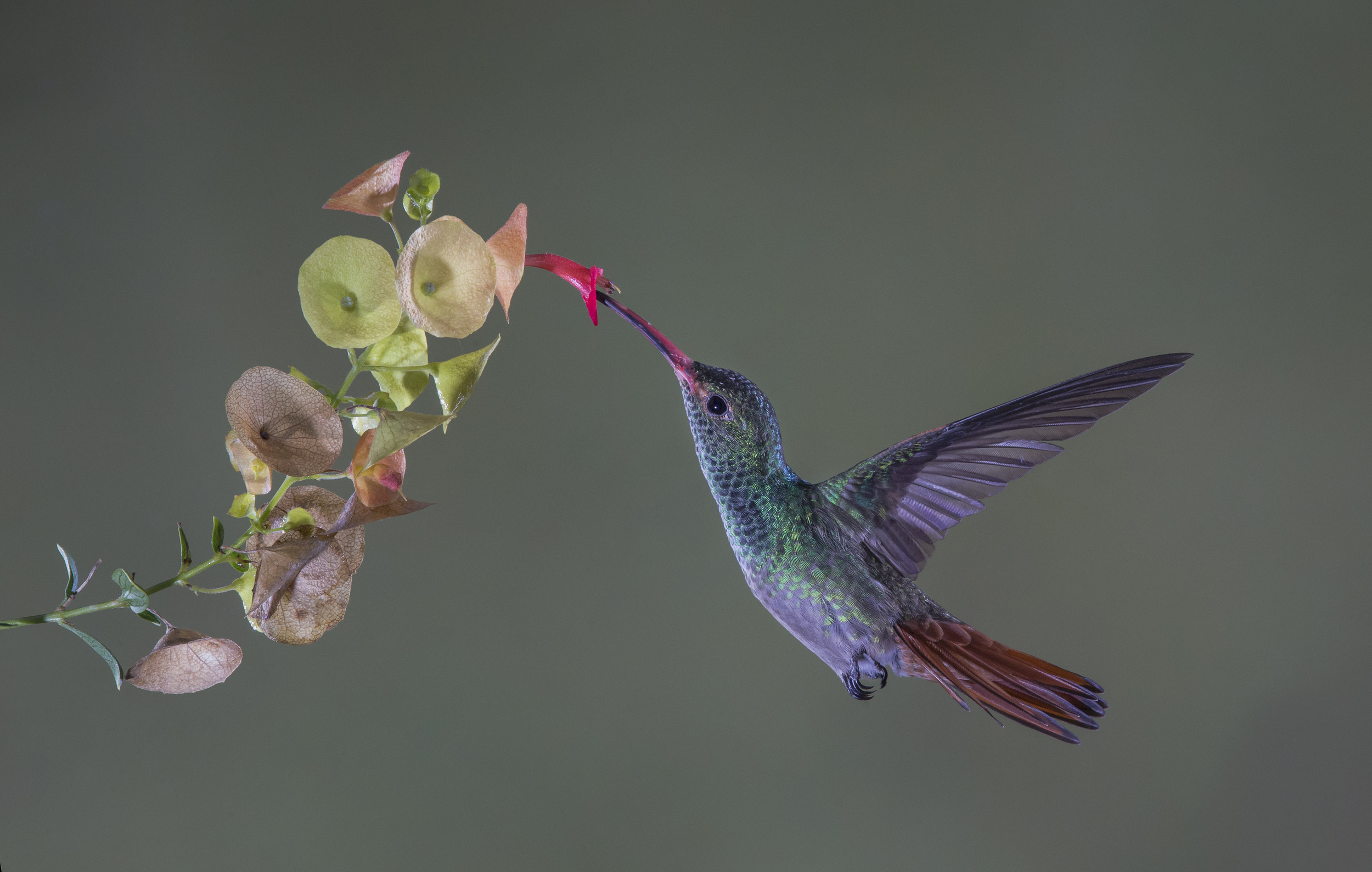
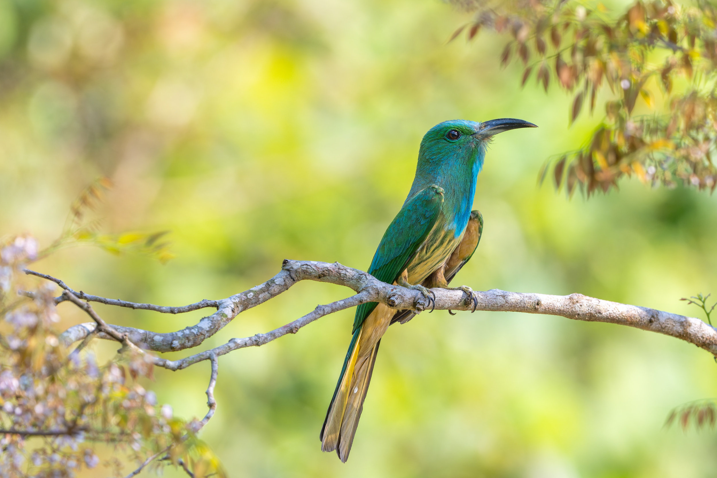
‘Sunbird’ by Alex Li
‘COME TO ME’ by Raad Btoush
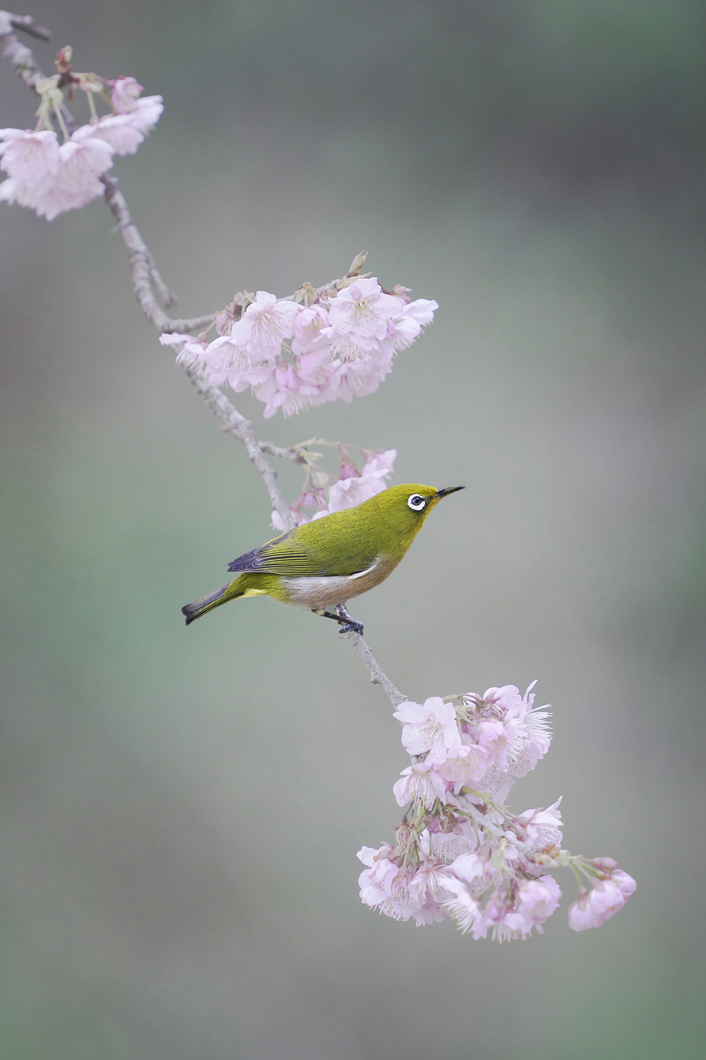
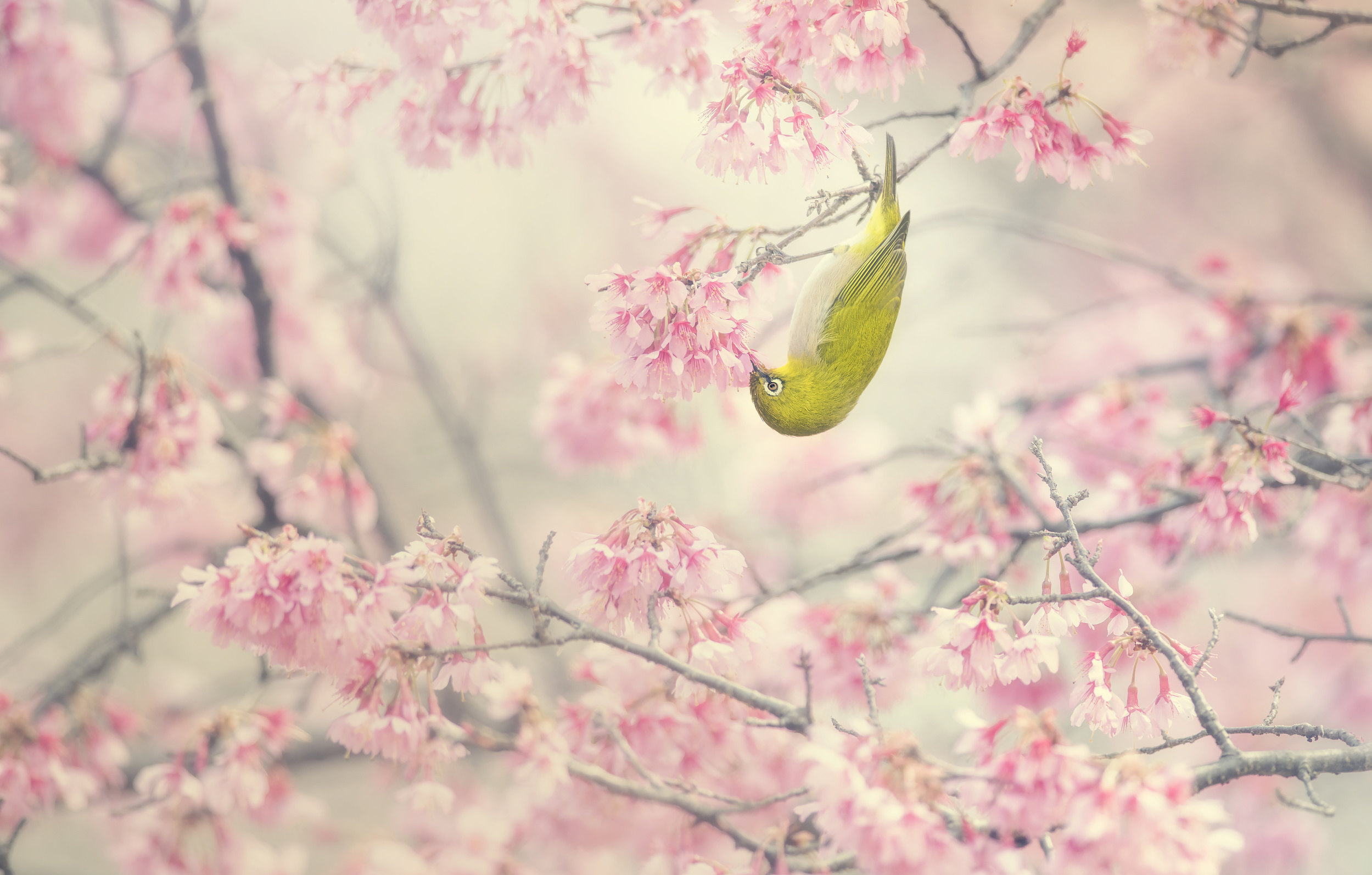
‘Cherry blossoms and white-eye' by Yoshikazu Wada
‘Tenderly vibrant’ by ZY Zhang
Color, Atmosphere, and Elegance
Mood is often created through color and atmosphere. Soft tones, gentle transitions, and carefully controlled palettes can transform an ordinary scene into something timeless.
Again, these images rarely depend on dramatic action. Instead, they invite viewers to slow down and appreciate a quiet moment. The combination of color, light, and atmosphere helps create an emotional connection that extends beyond the subject itself.
In painterly photography, color is not merely descriptive but expressive.
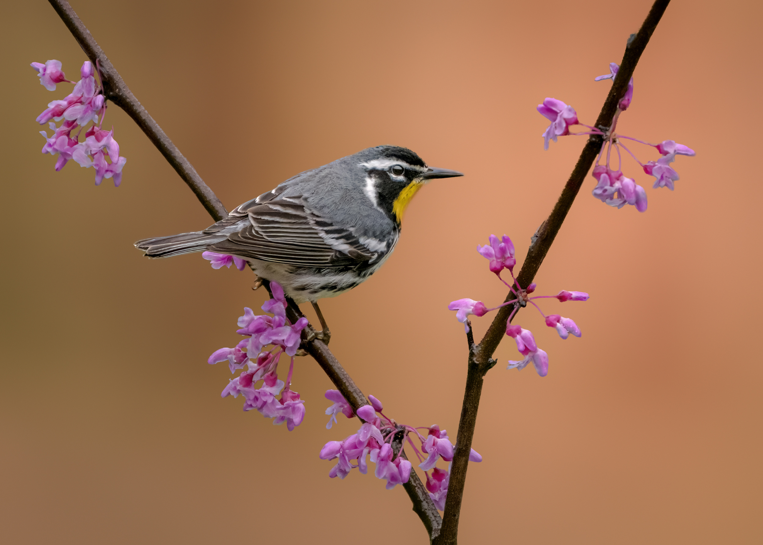
‘Cherry-blossom color’ by Takashi Suzuki
‘Perch of Calm’ by HuongHoang
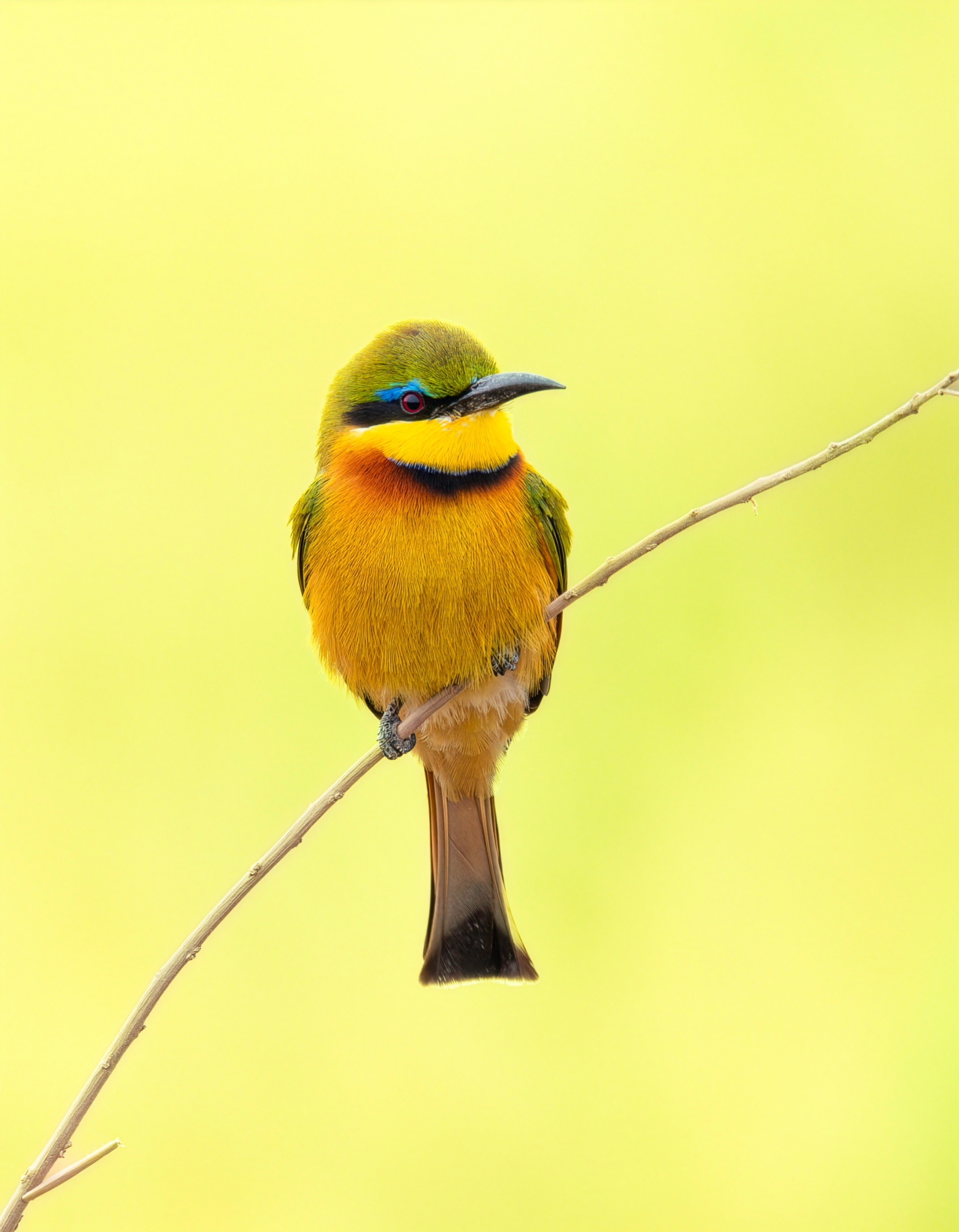
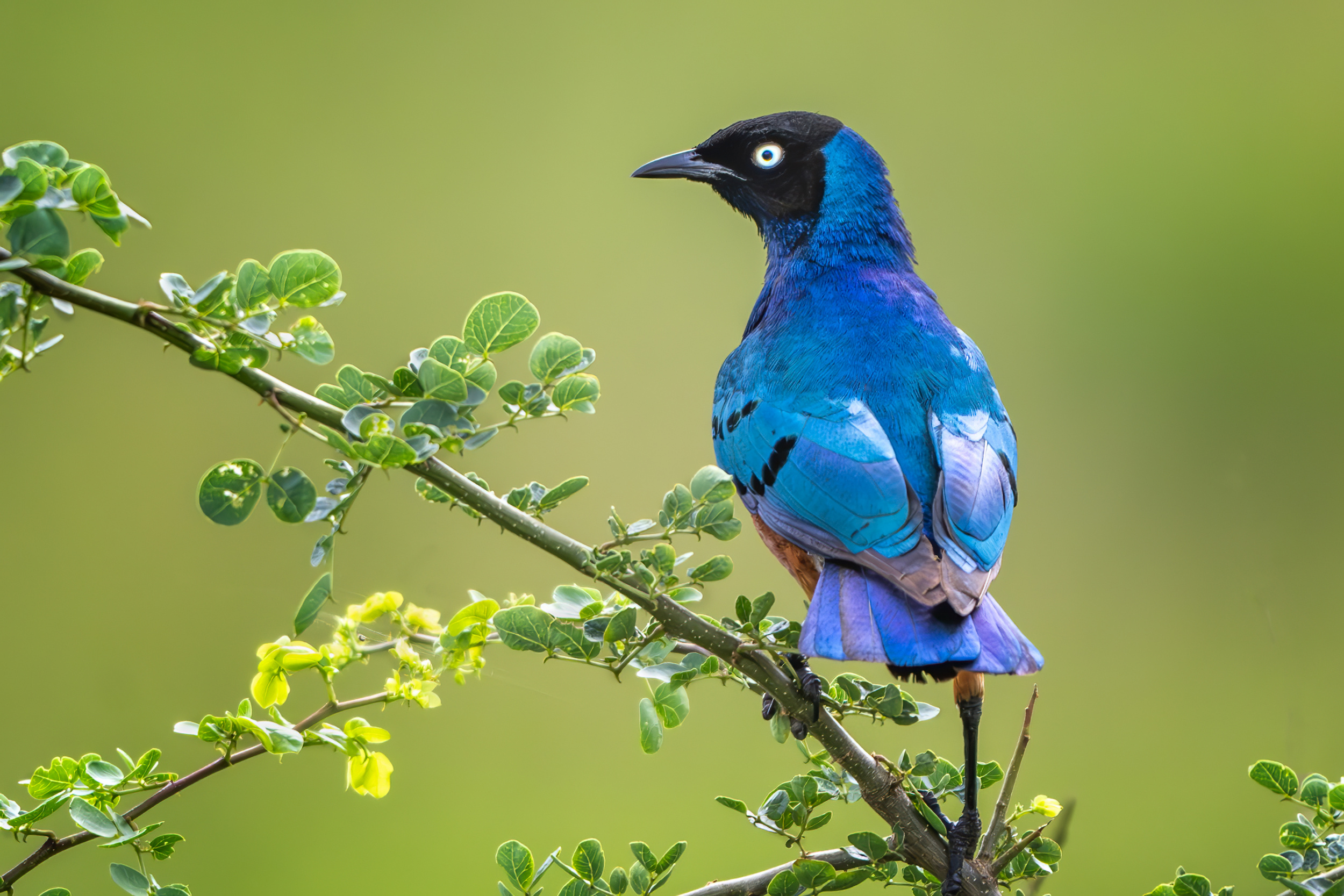
‘Bee eater’ by Yanny Liu
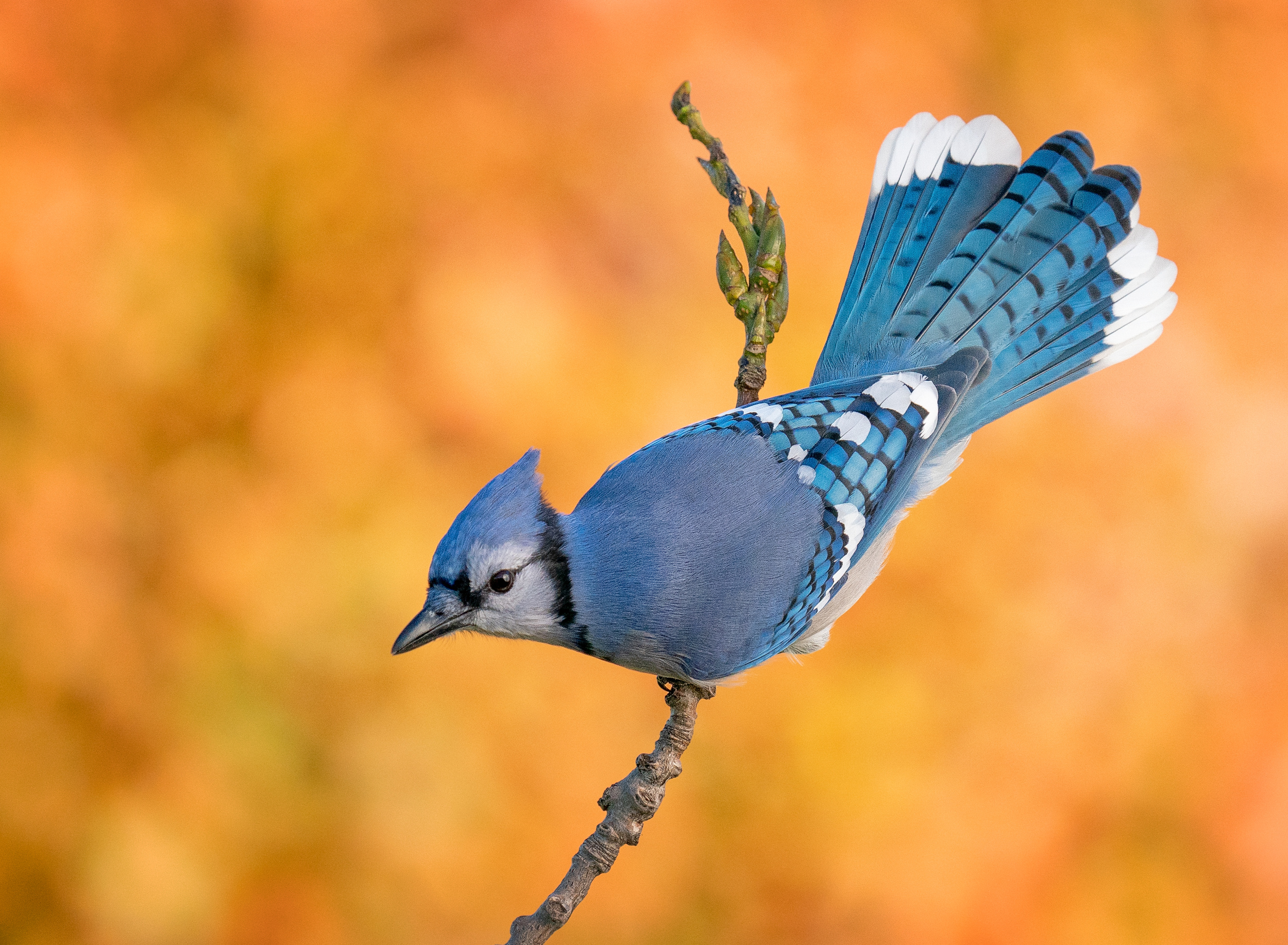
‘Hanging on by a limb’ by Christopher Schlaf
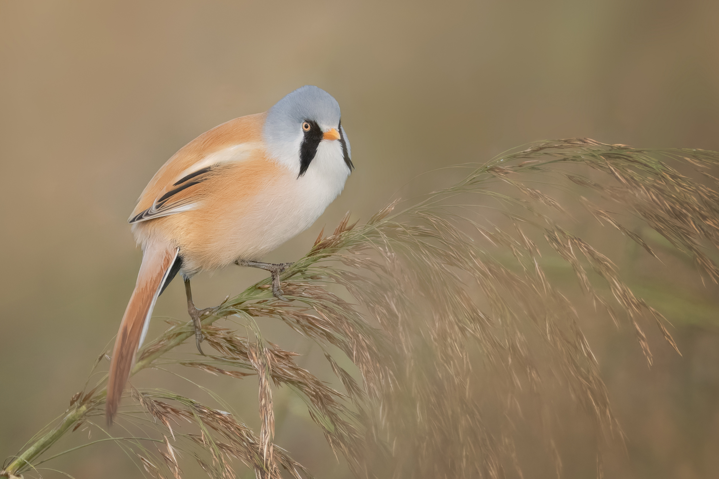
‘Bearded Reedling’ by Tom Meier
‘A Symphony of Color and Light’ by Jianping Yang
Creative Interpretation
Unlike traditional wildlife photography, which often prioritizes faithful documentation, painterly photography embraces interpretation.
Through selective editing, tonal control, and artistic vision, photographers can move beyond recording nature and begin expressing their personal response to it. The goal is not to alter reality, but to emphasize mood, simplify distractions, and strengthen visual impact.
Photography and painting are different mediums, yet they share a common purpose: transforming observation into expression. When composition, color, atmosphere, and artistic intent come together, a photograph can become more than a document of nature. It can become a work of art.
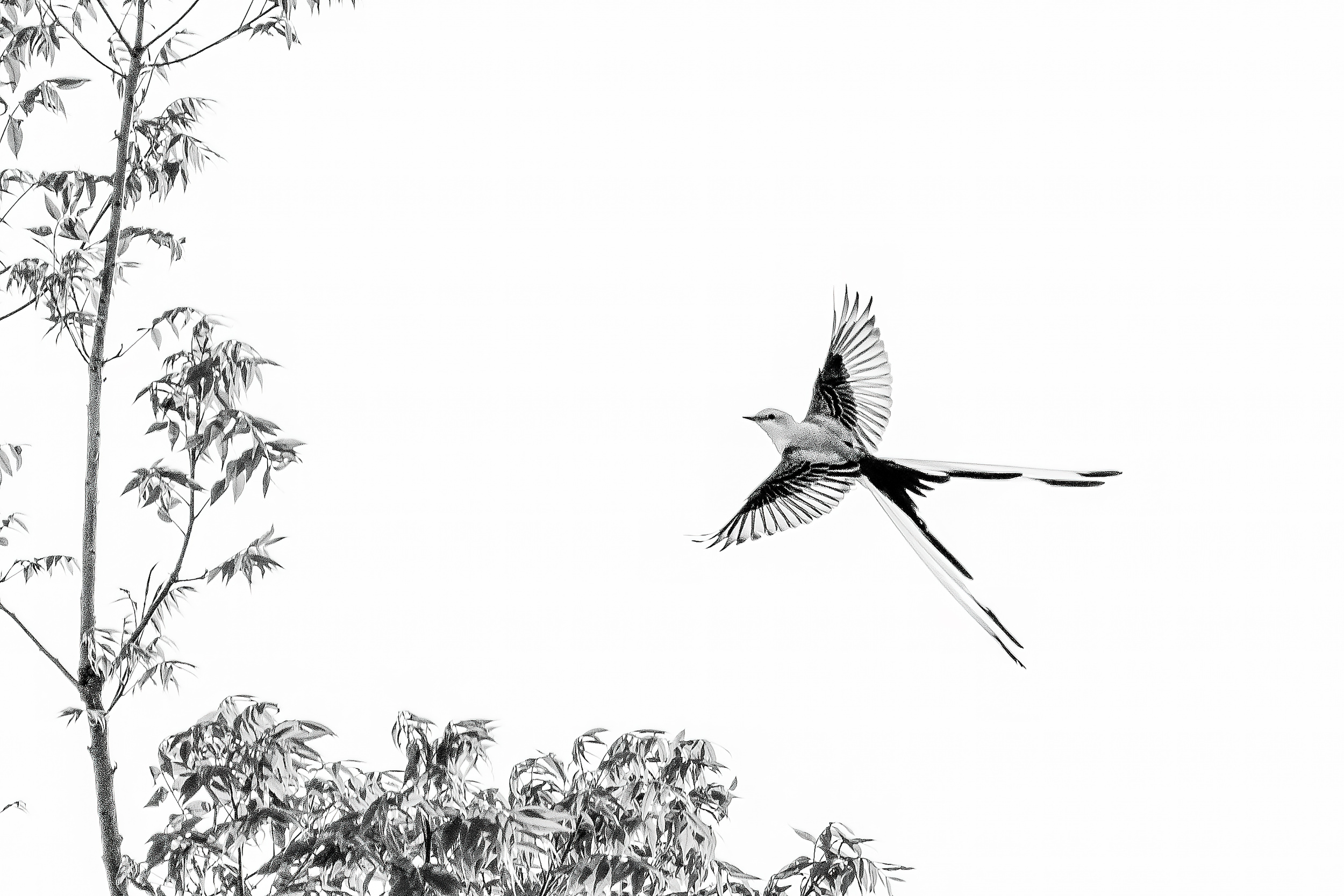
‘Flying’ by Mike He
‘Spring Balance’ by Jacob (Jian) Xu
‘Hydrangea fantasy’ by Teuni
‘美餐’ by Biao Huang
‘Seriwang Asia Bird’ by Rubby Adhisuria
|
| | Agnes PRO Planetary Change is a Chance.
" If you truly love nature, you will find beauty everywhere."
Vincent van Gogh
Beautiful collection. Gongratulation to all Authors. |
| | DonnaHom APA PRO A. Collection of highly technical and artistic birds. Congratulations to all authors. Thanks to the editors. |
| | Yaping Zhang PRO 谢谢分享一篇精美绝伦的照片令人赏心悦目和精湛有趣鼓舞人心的文章。让我受益匪浅。祝贺所有摄影大师们!谢谢你,雅各布和伊薇特。 |
 | Alex Li PRO I greatly appreciate the 1x platform, where I can improve my photography skills by sharing with and learning from fellow photographers around the world. Thank you, Jian, for selecting one of my photos in the Painterly Bird Photography and the Art of Interpretation collection. It's truly an honor for me. |
| | Miro Susta CREW Wonderful interesting article complemented with lovely bird photos, well done, thank you Jacob and Yvette |
 | Ruiqing P. PRO Such a brilliant collection and inspiring article. It brightens my day! Thank you Jacob and Yvette. Congratulations to all the photographers. |
 | Jacob (Jian) Xu CREW Thank you very much for your feedback and glad you enjoyed the article and images, dear Ruiqing! |
 | Shikha Kumawat PRO Just wow!! These are brilliant shots, so clean, well composed and detailed ! |
 | Izabella Végh PRO Un articolo e fotografie sono veramente meravigliosi. Complimenti ai fotografi e Yvette. Grazie mille. |
 | An excellent compilation, Ivette |
 | Yanny Liu PRO Such a wonderful collection of cute birds. And really a great honor for me. |
 | Tom Meier PRO Thank you for choosing one of my photos. I feel very honored, being part of this exceptional collection. |
 | Hiro Tanaka PRO Thank you for selecting my work for this beautiful article. It is a great honor to be included. My sincere thanks to Jacob and the 1x team. |
 | X-FlyingKN PRO A truly inspiring and insightful article, it offered a fresh perspective on creative interpretation in bird photography, and I learned a great deal from it :-)
Many thanks to Jacob / Yvette ! |
| Jacob (Jian) Xu CREW Thank you very much, dear Ken! |
 | joanaduenas PRO A masterful article, Jacob (Jian) Xu! Congratulations on the idea and its development.
Visiting your gallery is an inspiration to all of us who enjoy observing the different birds of the universe, both those in our local area and those we see when we travel to other regions or countries.
Your explanations on various artistic aspects are fantastic. I'm very happy to know that this gallery provides a space for us to let our creativity soar in all areas.
Thank you and thank you to Ivette for including one of my images in the article. |
| Jacob (Jian) Xu CREW Thank you so much, Joanaduenas! I truly appreciate your kind and encouraging feedback! I love your bird images and am glad this article resonates with you! |
 | Massimo Chiodini PRO Thank you for choosing one of my photos,
it is a great honor for me." |
 | Marco Mattei PRO Immagini splendide, complimenti a tutti e alla organizzazione che le ha condivise |
 | Raad Btoush PRO I’m grateful that you put together and shared this inspiring presentation. The collection of beautiful images was a pleasure to see, and I picked up so much by exploring everyone’s contributions. It also sparked plenty of fresh inspiration for my own editing techniques. I’m especially thankful that one of my photos was included—it means a lot to me. |
 | Izak Katz PRO First-class images !! .
|
 | Mike He PRO Thank you for sharing such a valuable presentation with so many wonderful photos. I really enjoyed it and learned a great deal from everyone's work. It also gave me many new ideas for photo editing. Thank you as well for selecting one of my photos—I truly appreciate it.
|
 | I could frame each and every one of these wonderful photos and display them on a dedicated wall. Exceptional gallery, my sincere congratulations to all the featured photographers!! |
 | David Manusevich PRO Very beautiful gallery |
 | Tore Johansson PRO Gorgeous photos, congrats to everyone. |
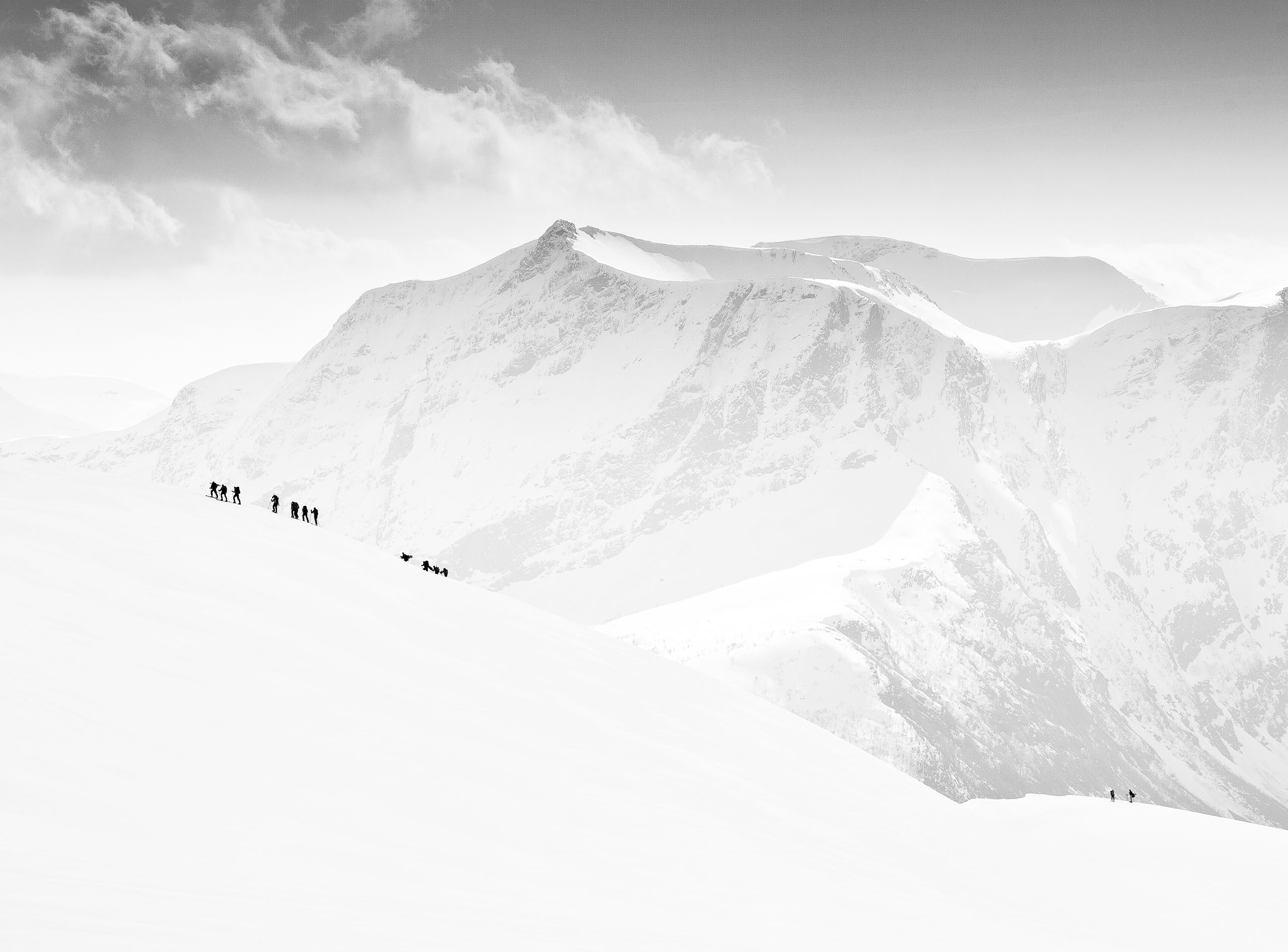
by Yvette Depaepe
Published the 1st of July 2026
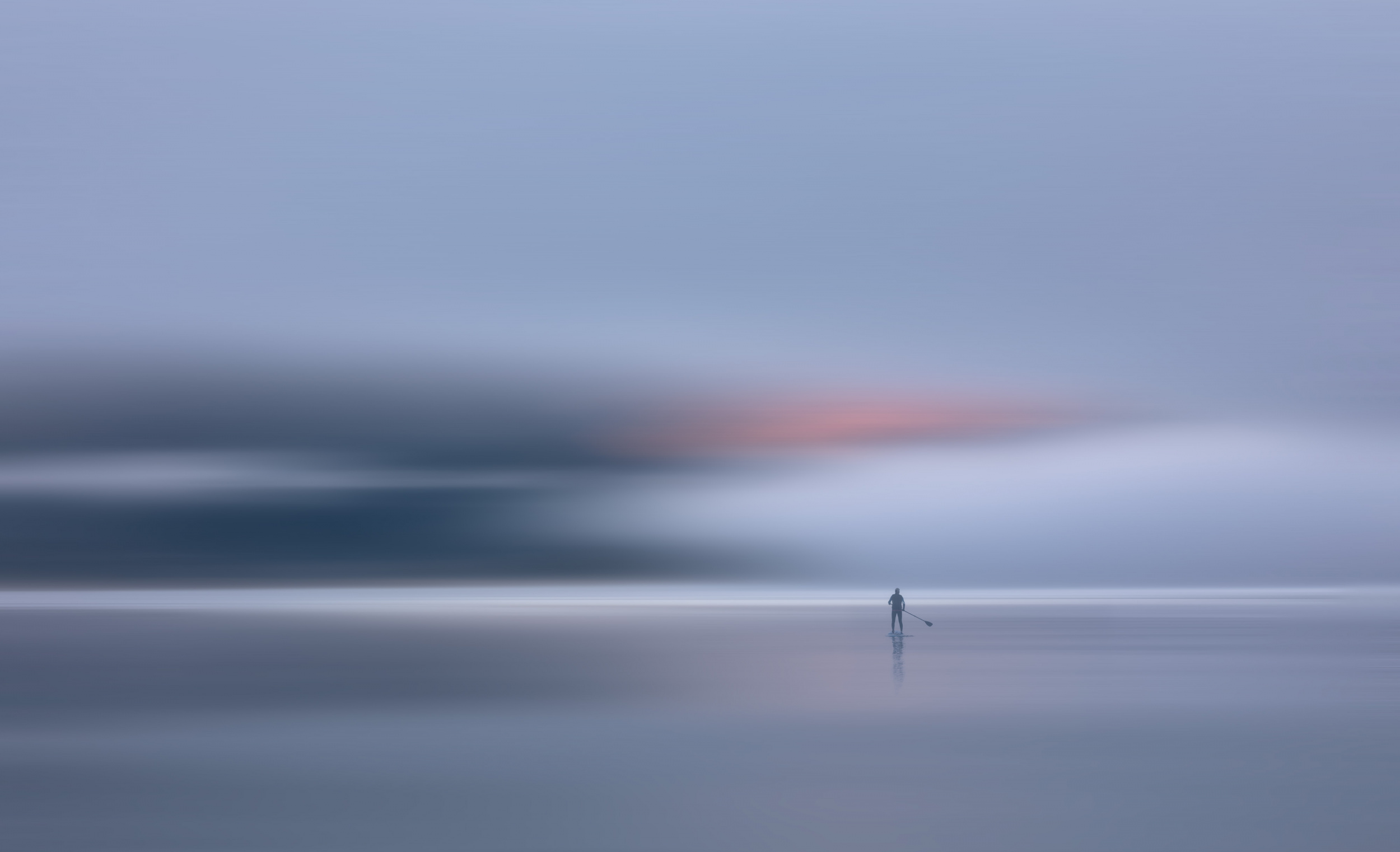
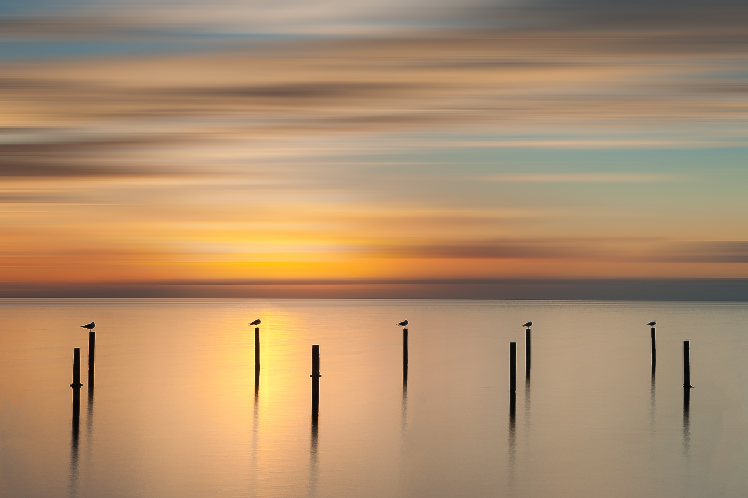
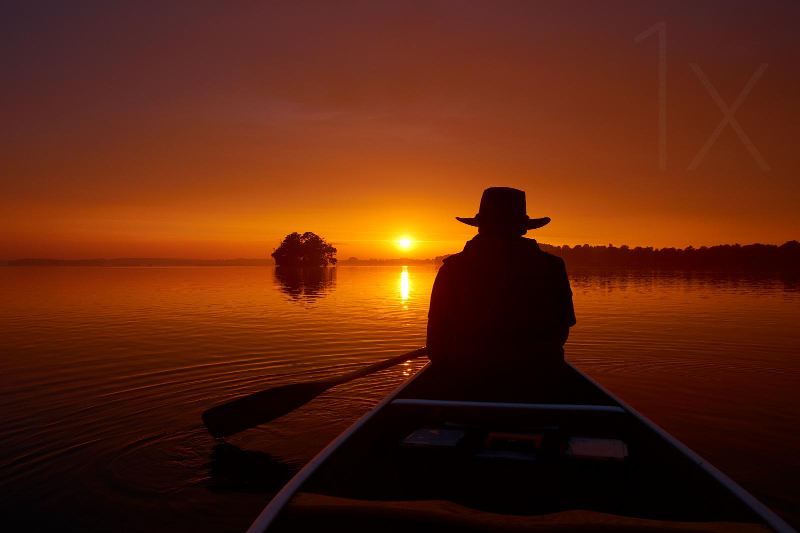
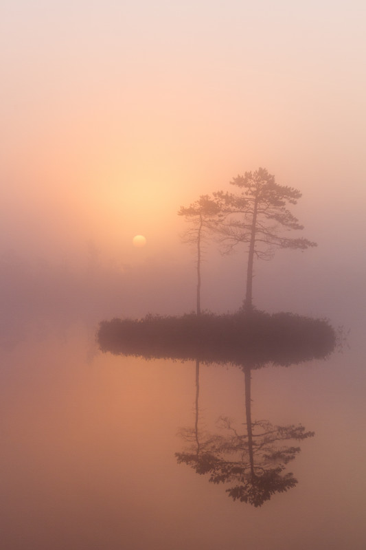
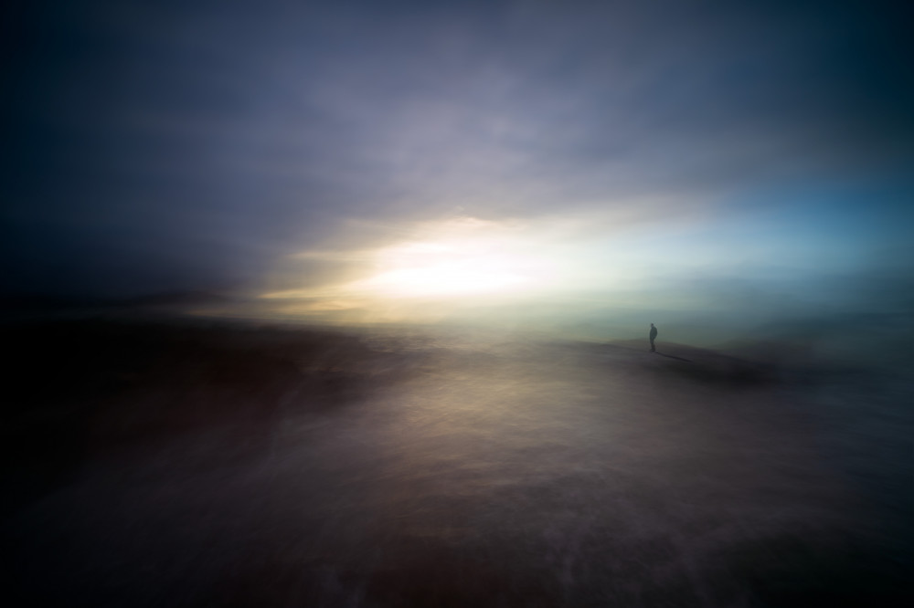
'Stillness'
Stillness in photography is the art of letting silence speak. Through minimal composition, soft tones, long exposures, or solitary subjects, stillness can express peace, tension, intimacy, or contemplation. In a world of constant motion, stillness becomes powerful — it transforms a simple moment into something timeless.
A beautiful diversity is to be seen in the submissions.
The winners with the most votes are:
1st place : Uschi Hermann
2nd place: Piet Haaksma
3rd place : Hadi Malijani (Malenjani)
Congratulations to the winners and honourable mentions.
Thanks to all the participants in the contest 'Stillness'
The currently running theme is 'Eccentric Photography'
For photographers a free spirited pursuit can lead to the most original and memorable photographs. Leaving the comfort of familiar subjects is a challenge, yet an exciting way to grow as an artist.
This contest will end on Tuesday the 14th of July 2026 in the afternoon.
The sooner you upload your submission the more chance you have to gather the most votes.
If you haven't uploaded your photo yet, click here.
 by Juan Carlos Hervás Martínez
 by Santiago Pascual Buye
 |
| | Yaping Zhang PRO 喜欢这些精美的照片,受益匪浅。祝贺所有才华横溢的摄影师! |
| | X-FlyingKN PRO A truly inspiring and insightful article, it offered a fresh perspective on creative interpretation in bird photography, and I learned a great deal from it.
Many thanks to Jacob / Yvette :-) |
 | Jianping Yang PRO Thank you, Jacob, for this inspiring article. I’m honored to have one of my images featured. Congratulations to all the photographers, and thanks to Yvette and the 1x team! |
 | Ed Williams PRO These are both beautiful and inspiring, congrats to these very talented photographers. |
| | DonnaHom APA PRO Love the mood of those images. Congratulations to all winners. |
| | Miro Susta CREW Beautiful photo selection, congratulations to all winners and thank you Yvette for your excellent work |
 | A special thank you to the entire 1x team and the organizers for their dedication, passion, and hard work in creating such an inspiring platform for photographers worldwide. I am truly grateful for the opportunity to share my work among so many talented artists. Your continued support of fine art photography is deeply appreciated |
| | Outstanding collection of photos, they bring peace to my soul. Many congratulations to the winners and runner ups! |
 | Vasil Nanev PRO Congratulations to the winners, beautiful photos! |
| | yein PRO The moment I see it, I can feel the silence. It's so cool. Congratulations |
by Editor Jane Lyons
Edited and published by Yvette Depaepe, the 29th of June 2026
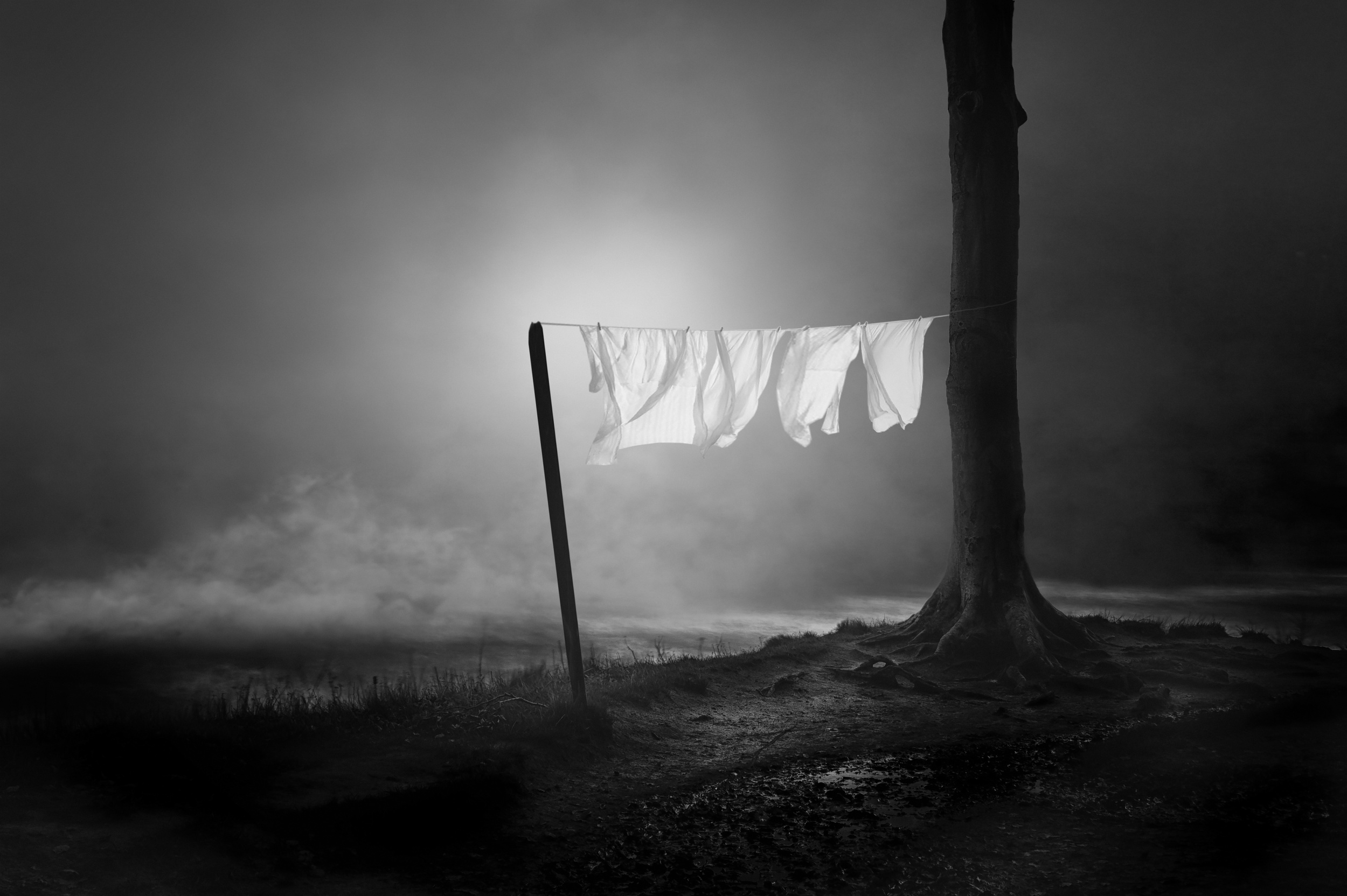
“We should all do what, in the long run, gives us joy, even if it is only picking grapes or sorting the laundry.”
~E. B. White~
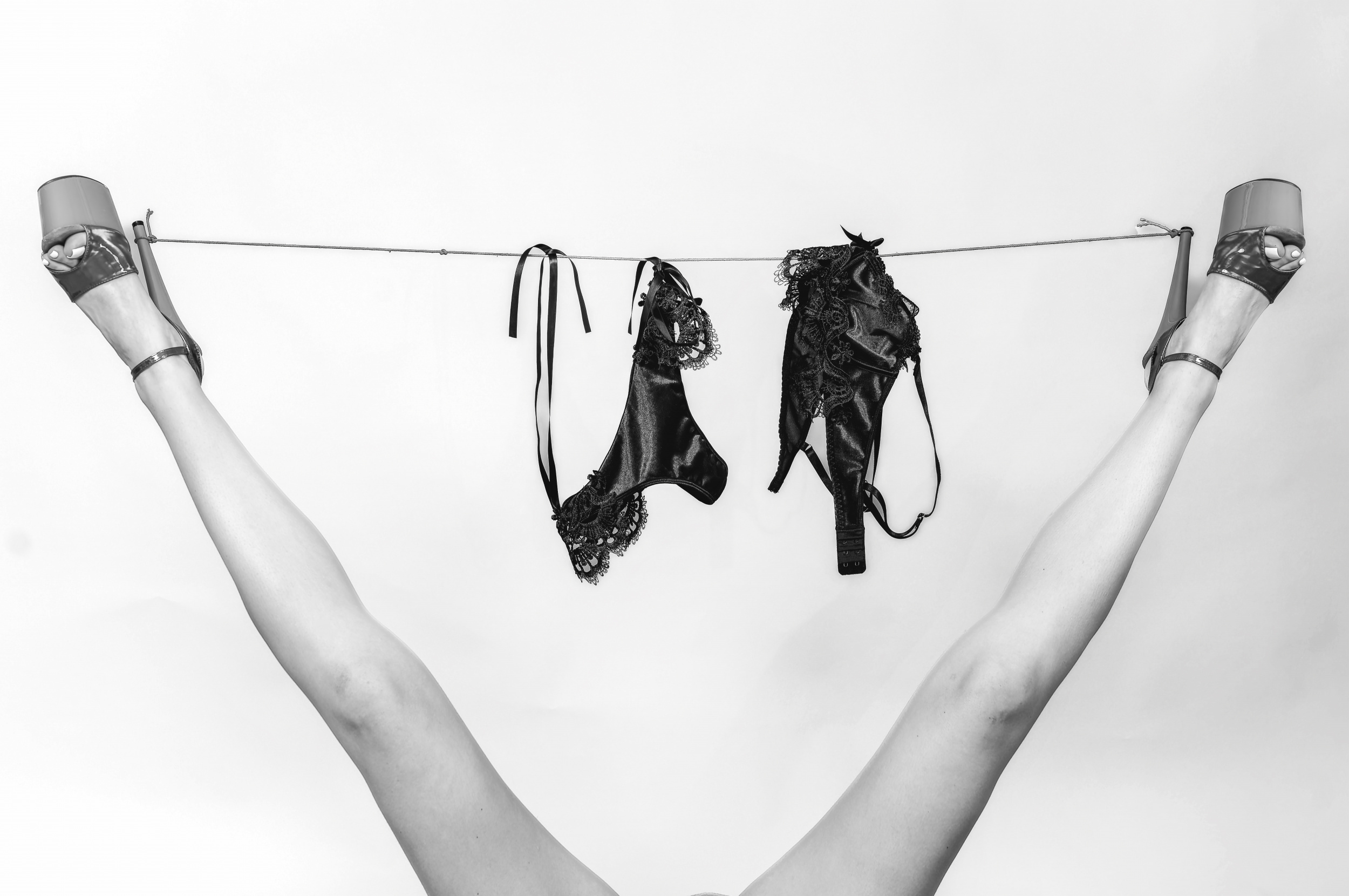
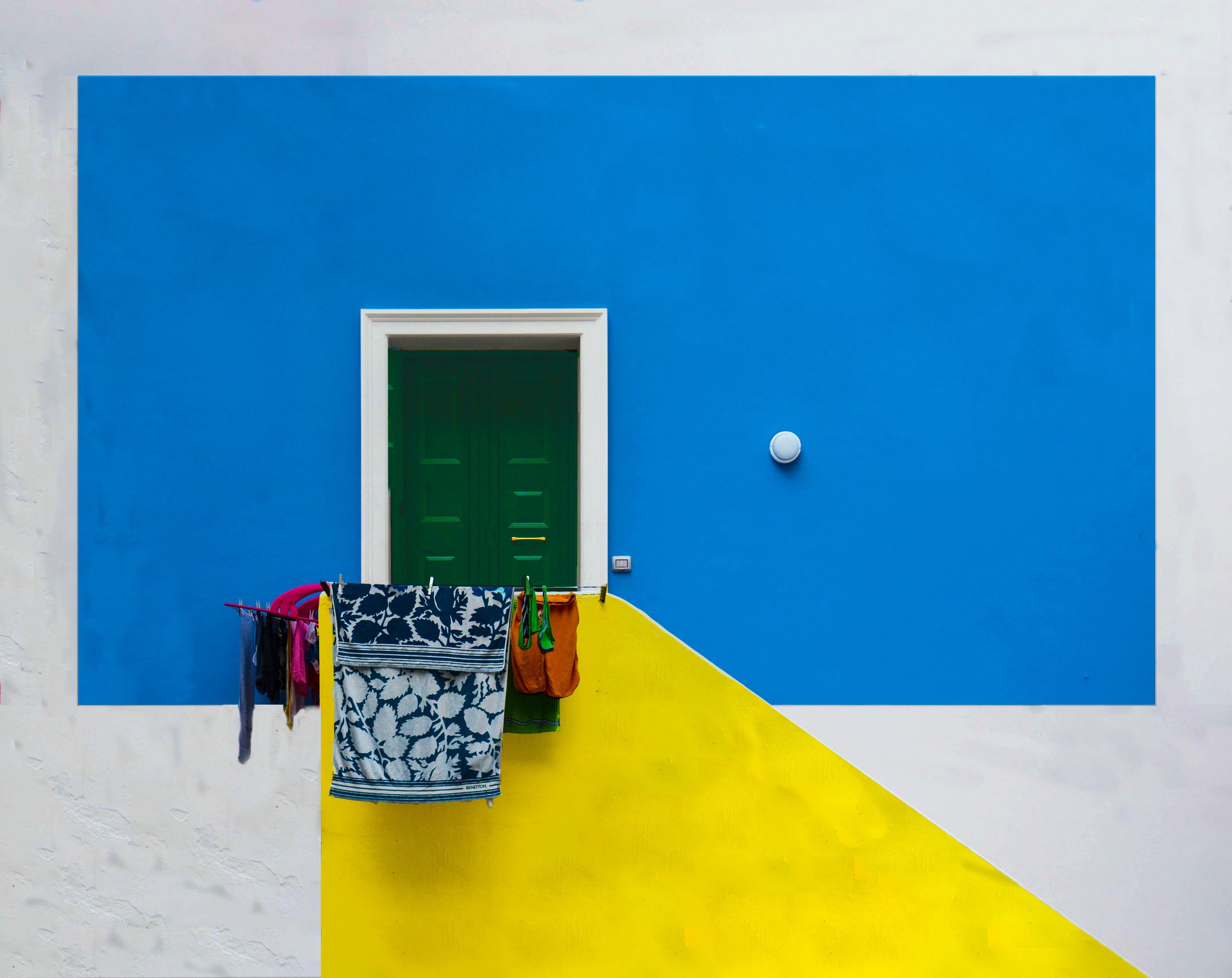
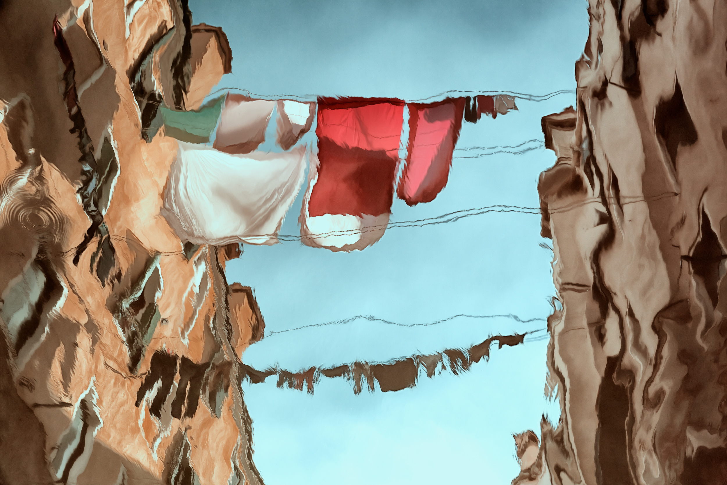
“Laundry” by Phillipe Godfroid
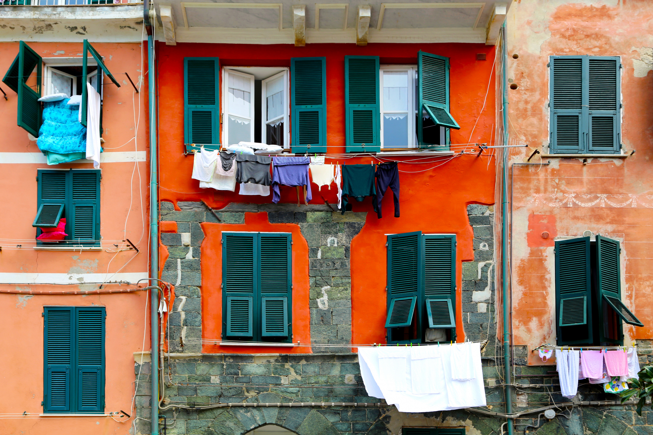
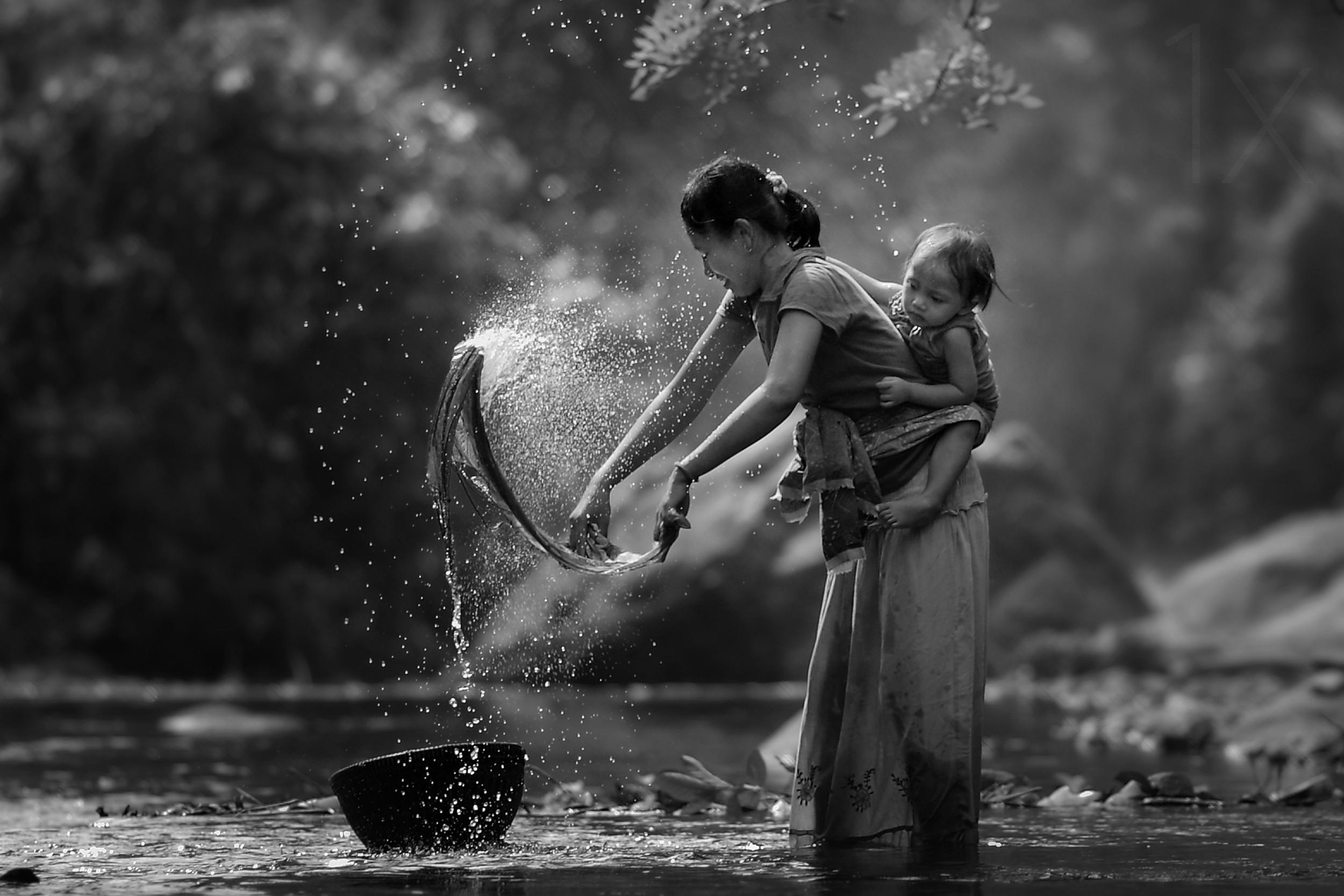
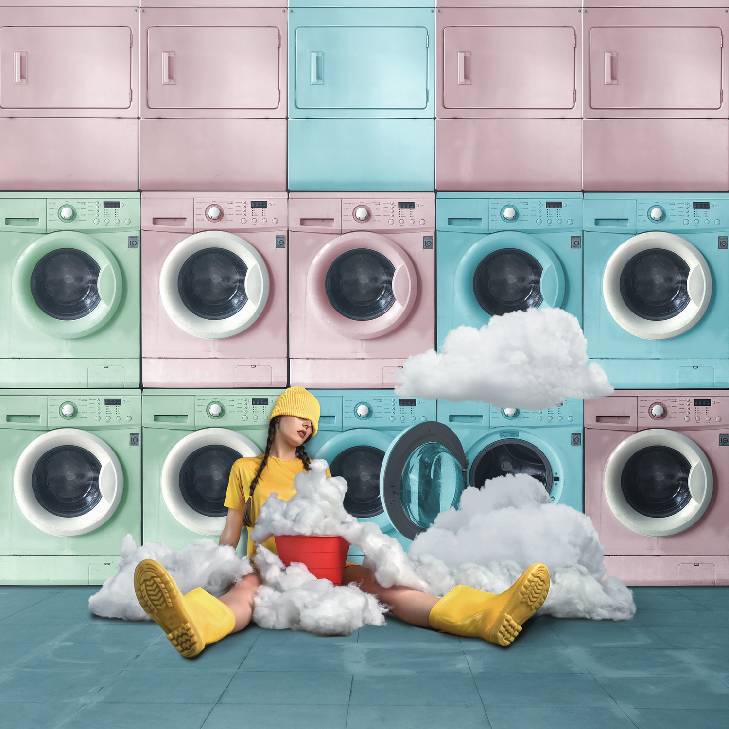
In photography, both clotheslines and laundromats offer a compelling blend of visual contrast, texture, and shared human experience. They combine the ordinary with the unexpected, transforming a daily chore into a subject rich with artistic possibility.
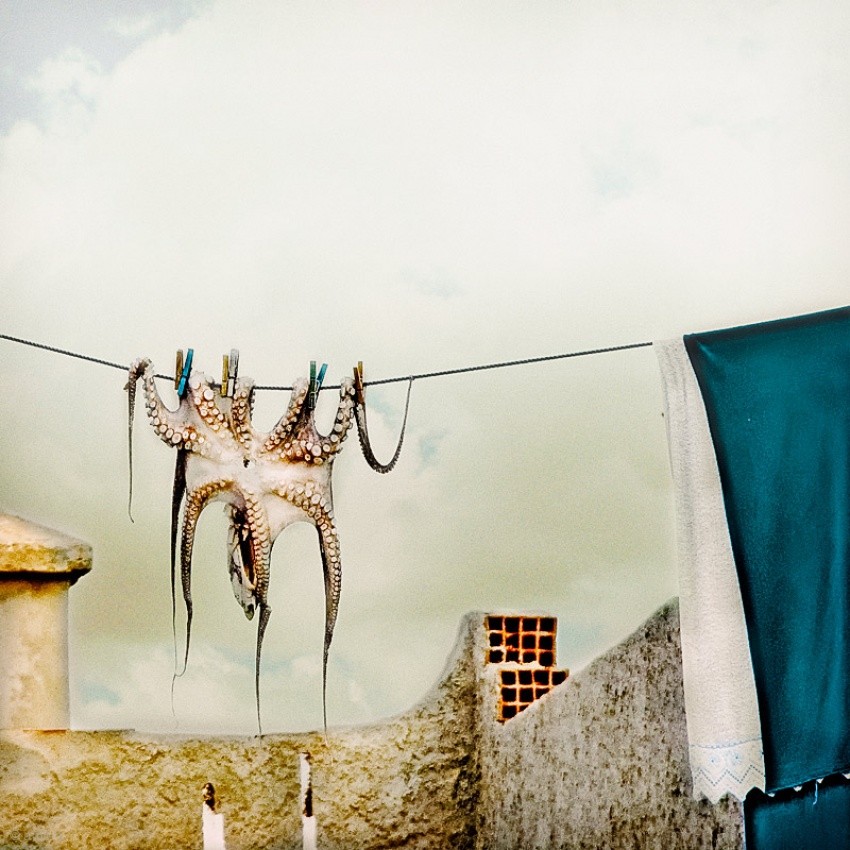
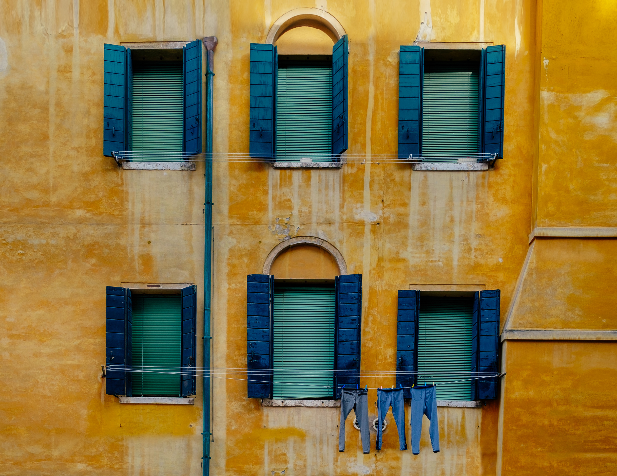
Rows of hanging garments create rhythm, movement, and geometry, while organic shapes and vibrant colors stand out against gritty urban streetscapes, weathered buildings, or the stark machinery of a laundromat. Sunlight filtering through fabric, the repetition of washing machines, and the interplay of line, pattern, and form all provide endless opportunities for creative color combinations and expression.
“Colorful Living” by Arnon Orbach
“s/t” by Carlos Lopes Franco
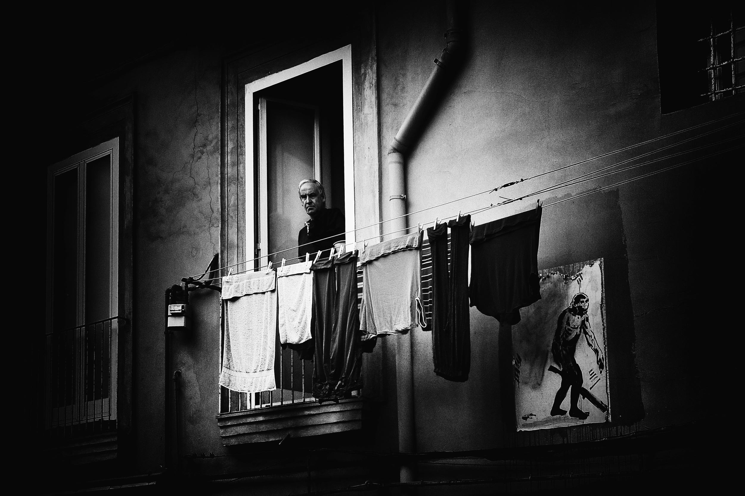
“Washing day” by Benjamine Hullot Scalvenzi
“Turtle lady sunbathing in her backyard” by Yvette Depaepe
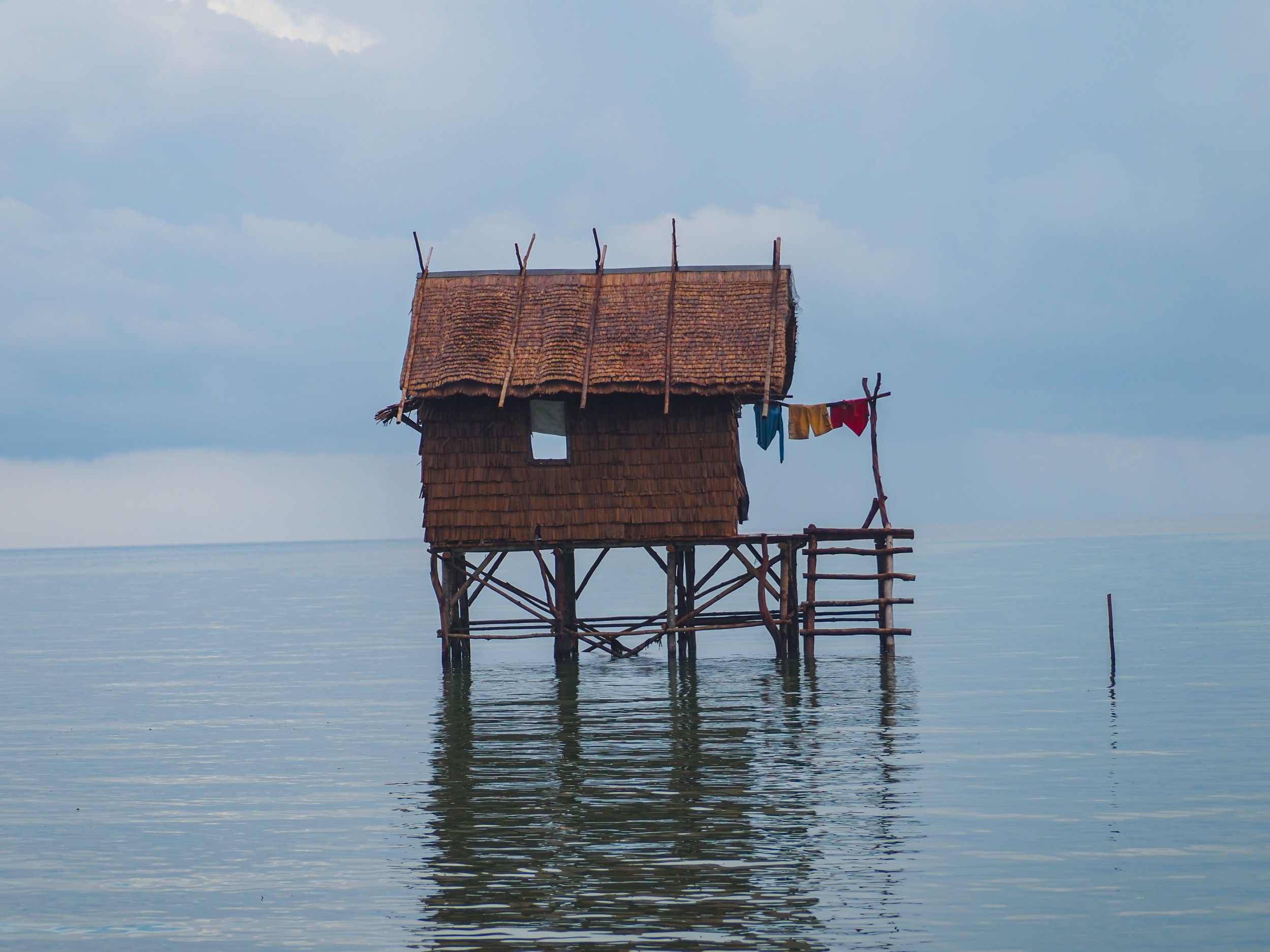
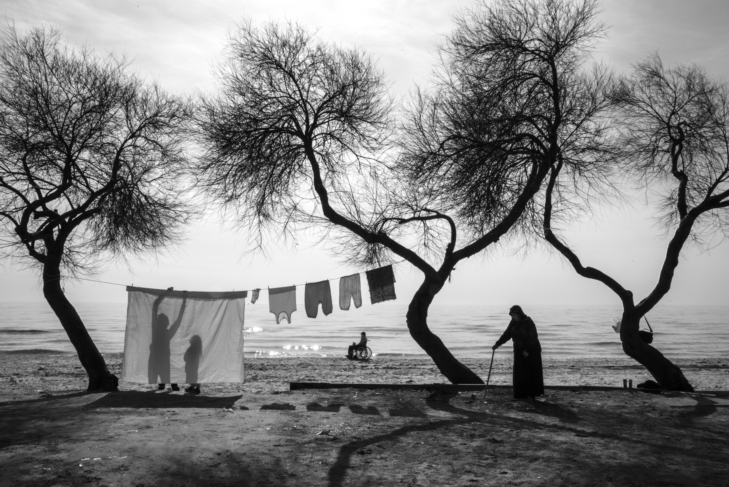
“Floating Shack” by David Chia FF
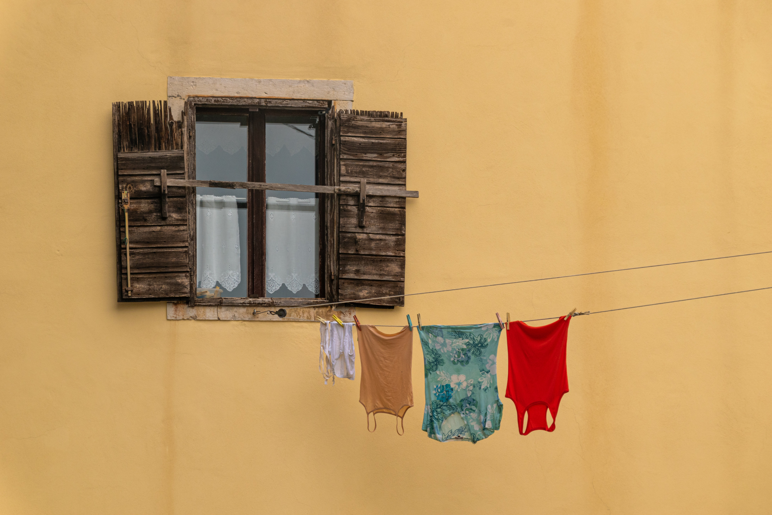
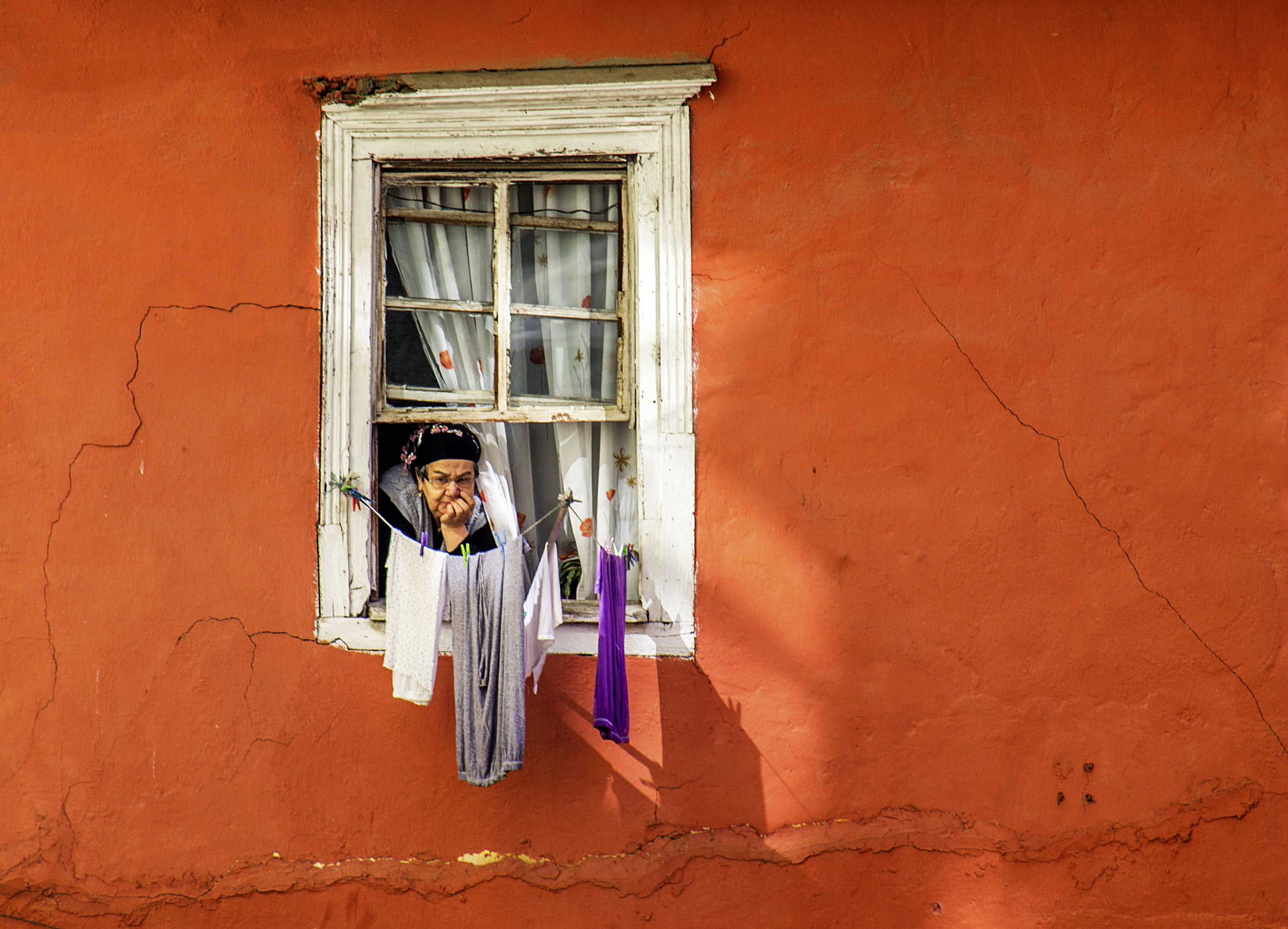
“Window” by Marija Kordic
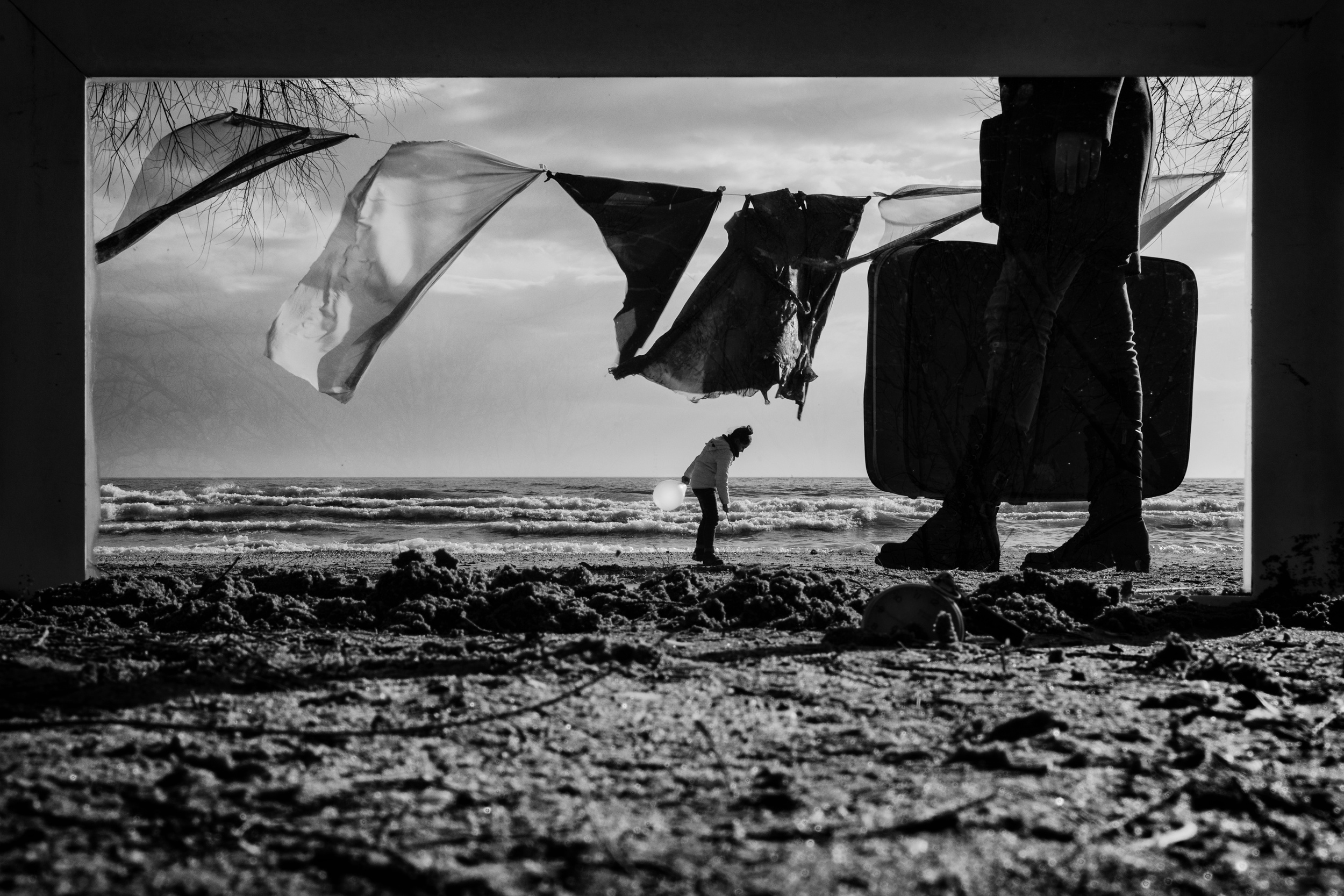
“frame life” by S. Aktrk
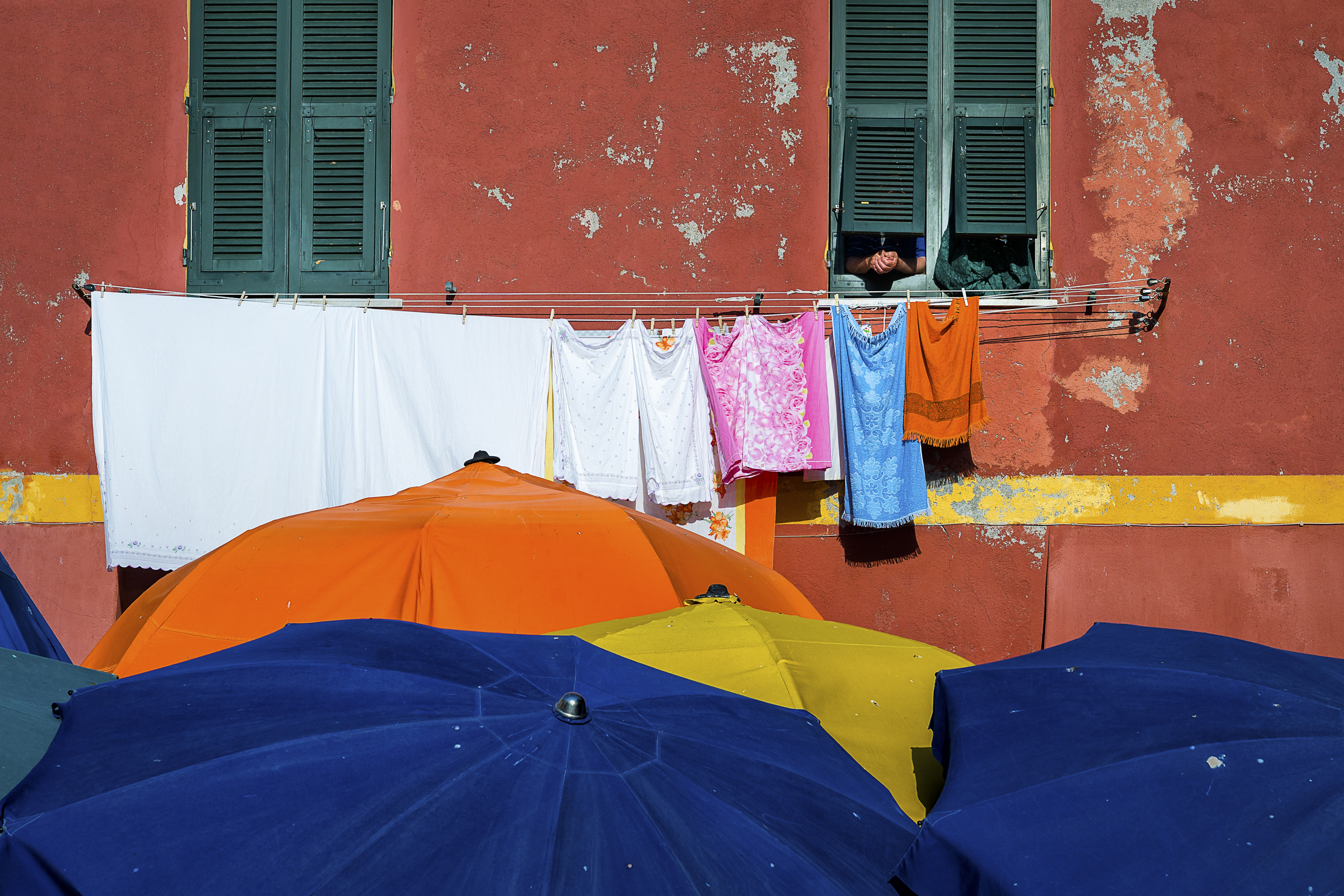
“Colors of the Mediterranean” by Diana Junakovic
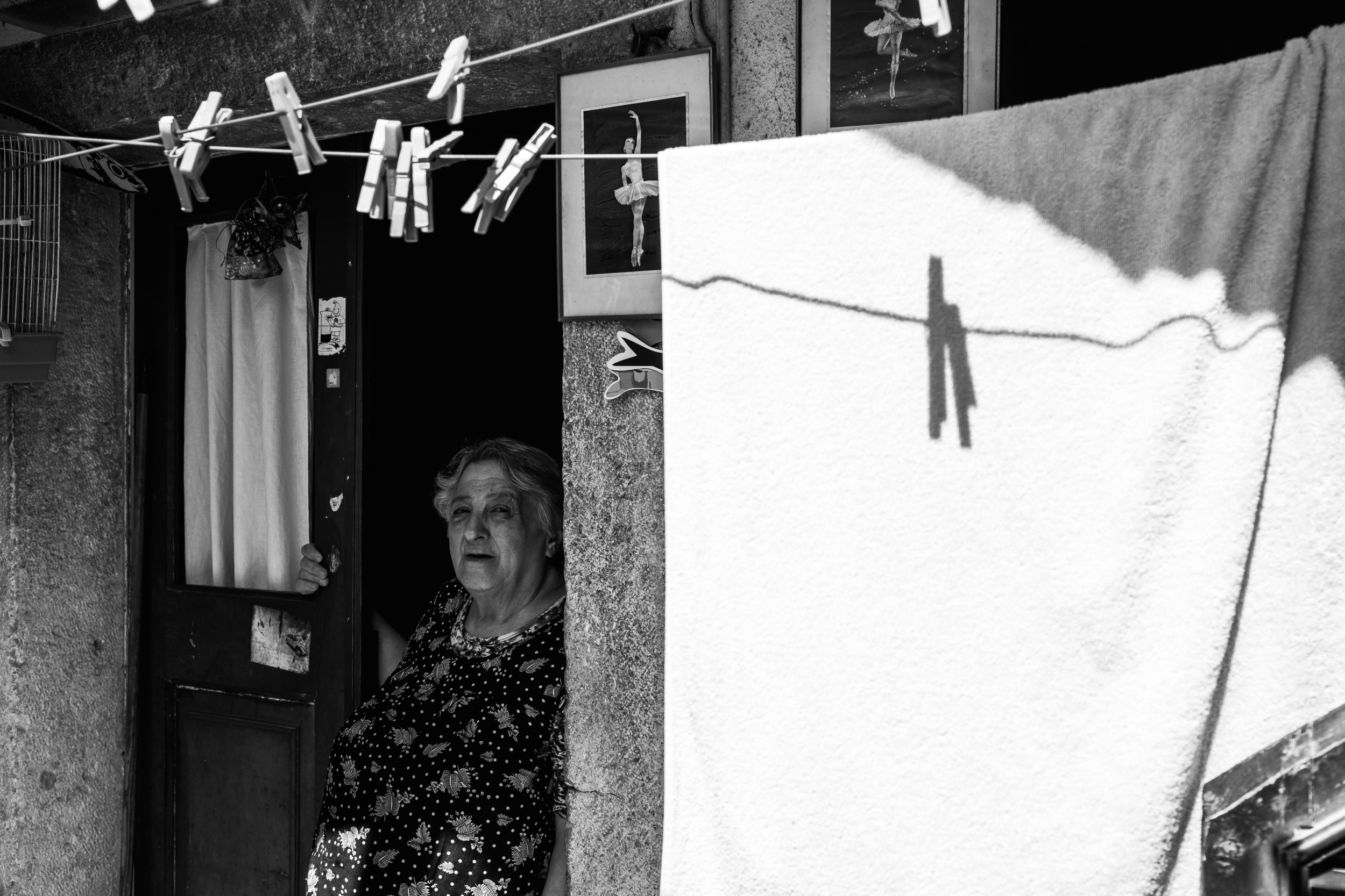
“Alfama Ballerinas” by Antonio Zarcó
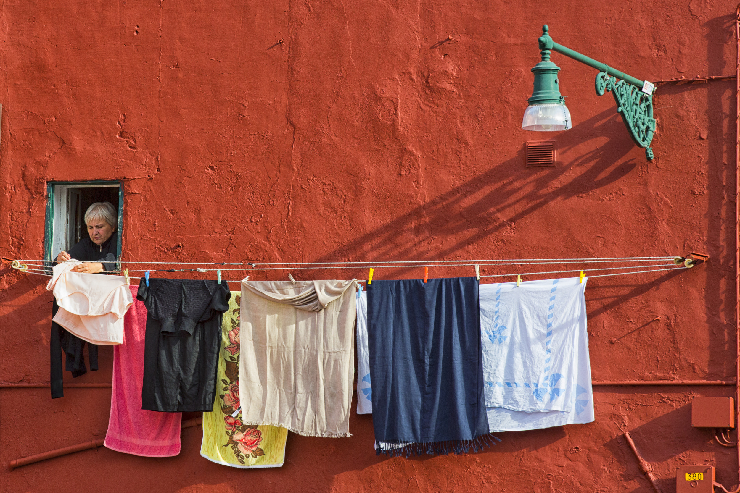
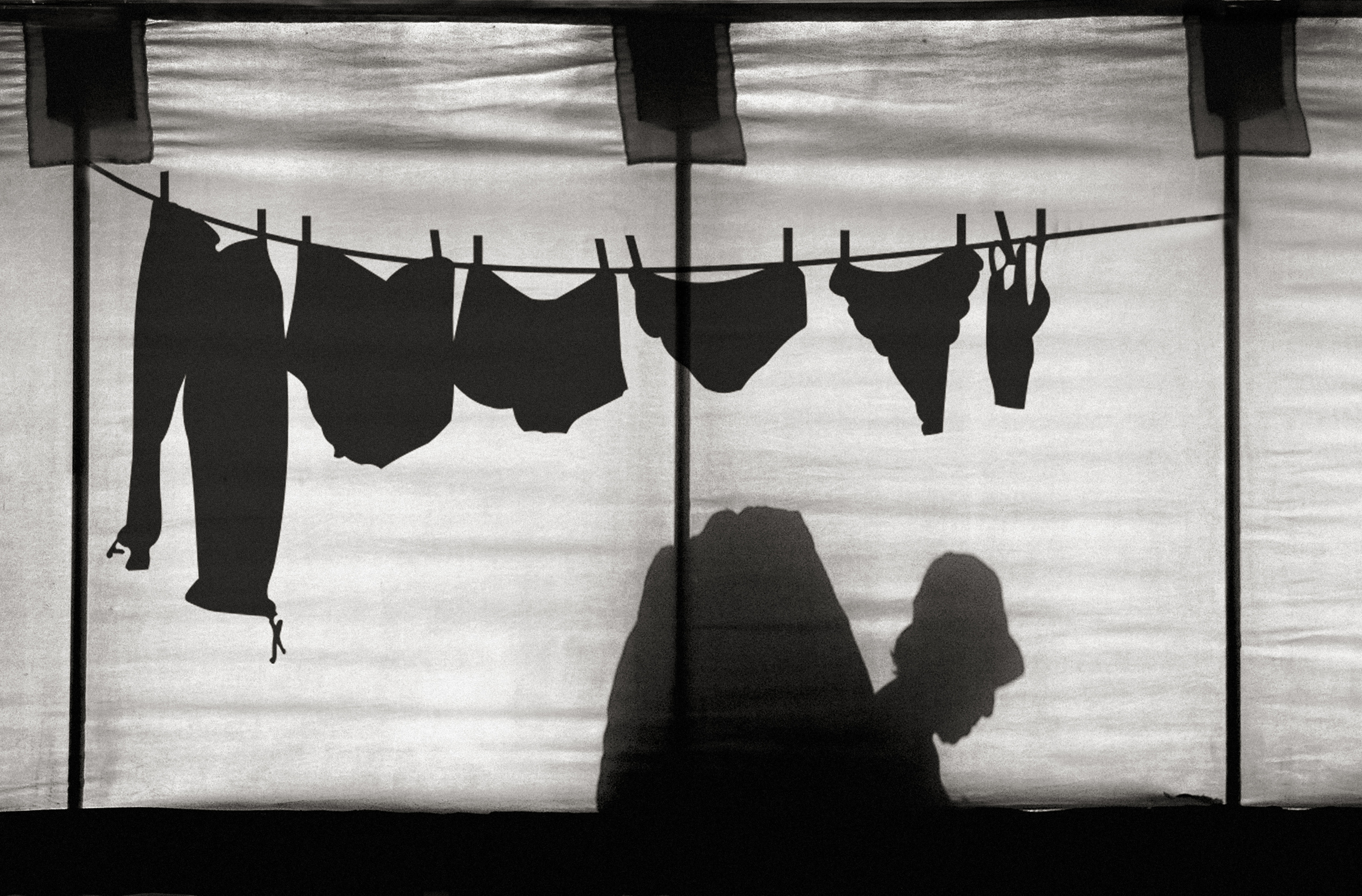
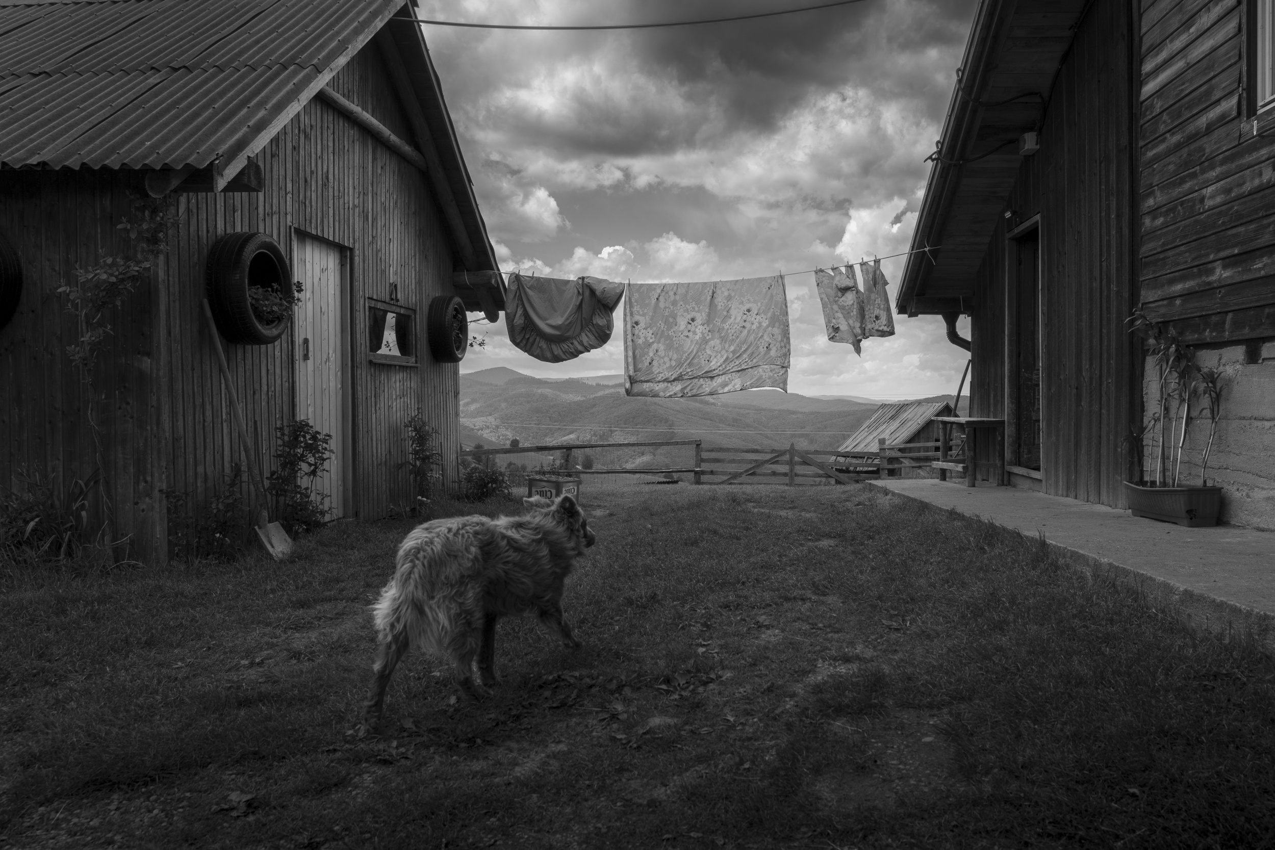
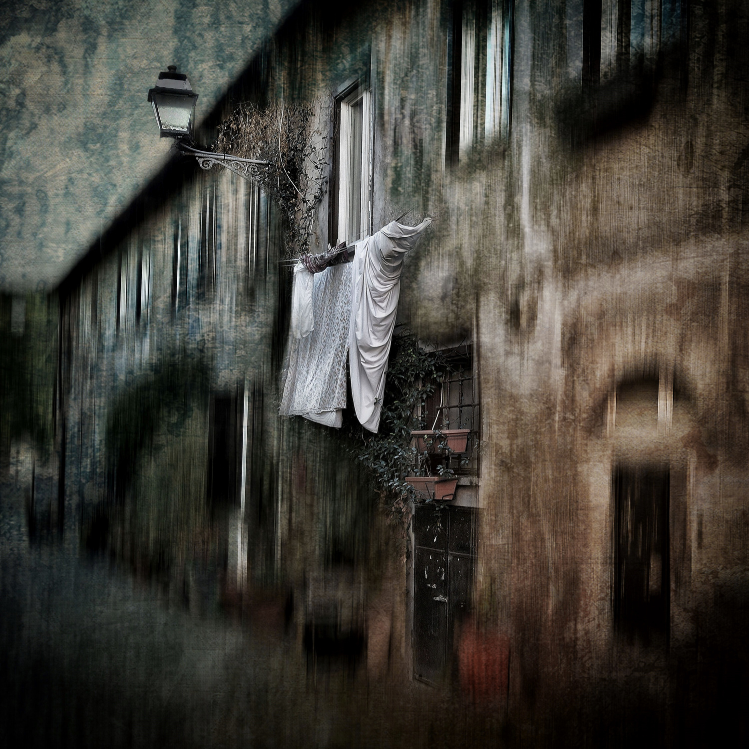
Beyond their visual appeal, laundry scenes evoke universal themes of home, work, community, and routine.
They tell quiet stories about the people who wear the clothes and the lives that unfold around them. Whether photographed on a rural clothesline swaying in the breeze or beneath the fluorescent glow of a neighborhood laundromat, laundry has the power to transform the mundane into visual poetry.
“Life” by Alp Yetimoglu
“Laundry” by Tahsin Gun
“467” by Antonio Grambone
“city mirror” by Roswitha Schleicher-Schwarz
“Laundry Day” by Alin Federiga
“Italian Facade 4” by Igor Shrayer
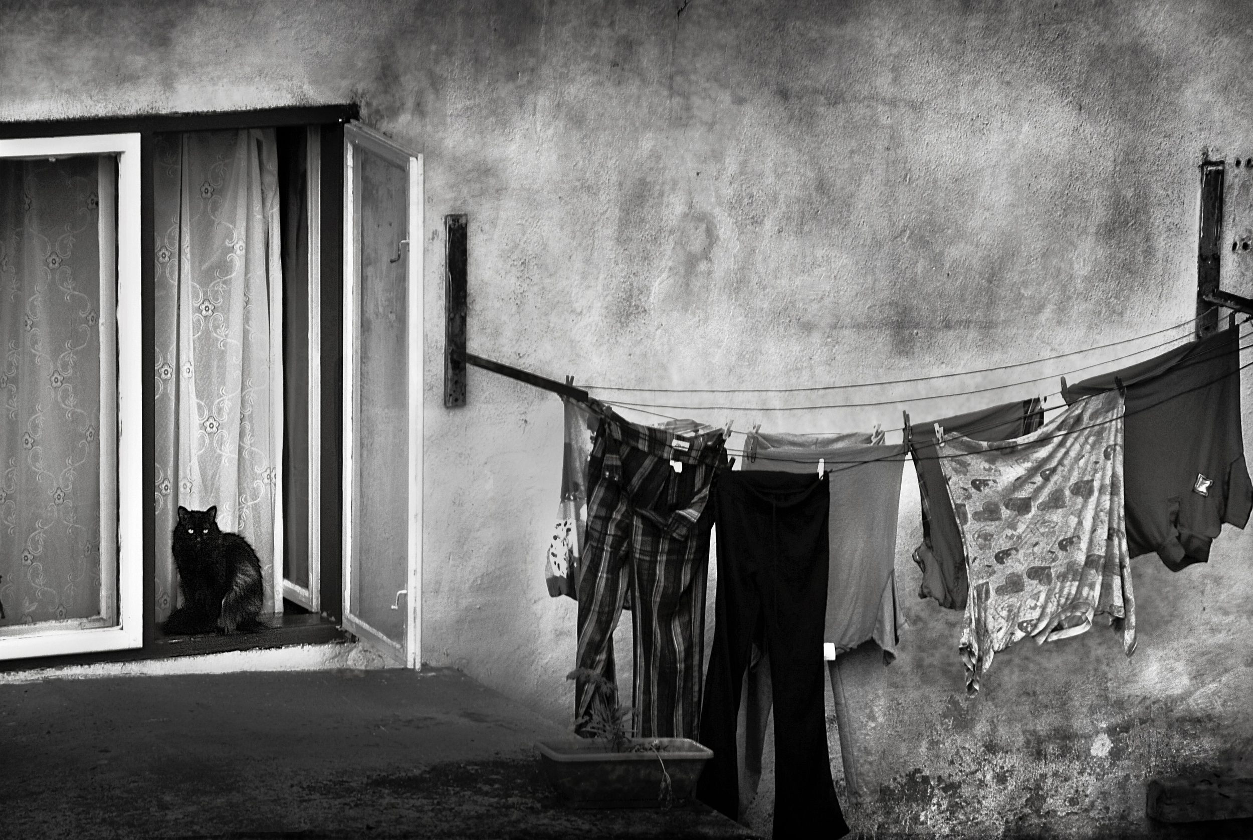
“The Watchcat” by Nicoleta Gabor
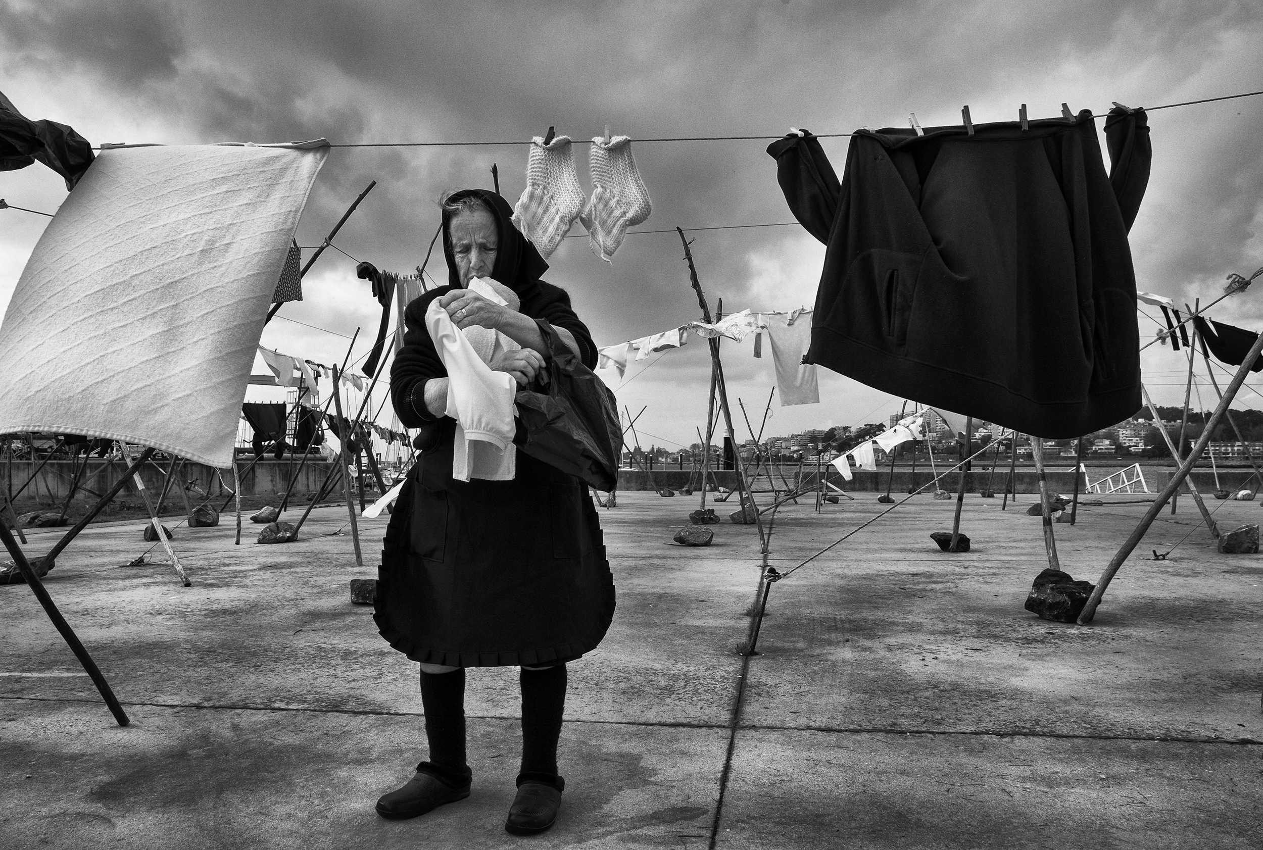
Lens Culture did a series on “laundry art” by the photographer Wing Ka Ho who documents the challenge of finding space to dry clothes in highly dense Hong Kong. Quoting Wing Ka Ho. “In the "laundry art" series, the photographs are neither landscapes nor documentation, but a hybrid of the two. I have been trying to bring together two elements which seem opposed into one picture although these photographs may appear surreal, they are actual documentation of use of laundry from Hong Kong public space.
In the “laundry art” series of photographs, citizens respond to their own needs and discover, create and utilize the public spaces that belong to them. The art of clothes drying can be seen everywhere in Hong Kong. Some people carry their own clothes lines by skillfully using ropes and lamp posts, or ingenious use of the environment. It is inadvertently adding vitality to public spaces. Although drying clothes in public places still have grey areas in the law. I sincerely admire the laundry skills and adaptability of Hong Kong residents.”
It’s a fascinating series and well worth a look.
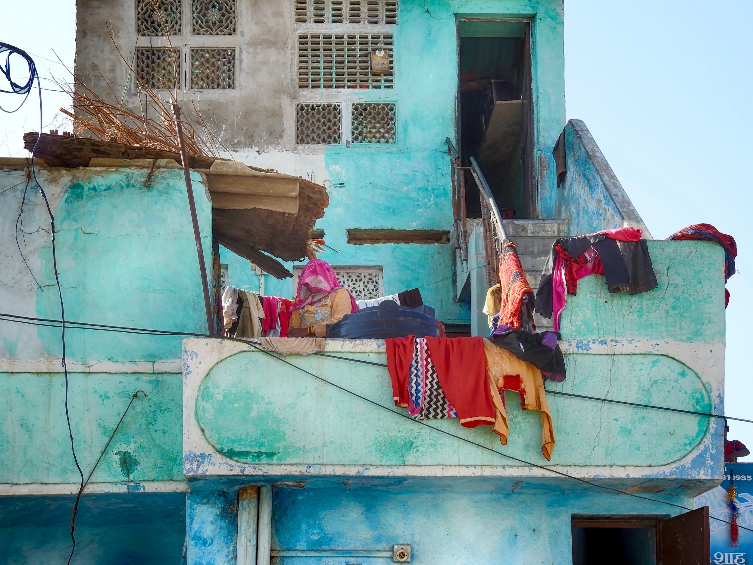
“Pali” (Rajasthan) by Roxana Labagnara
“laundry” asit
“Tote Hose” by ambra
“3-6-1” by Mustafa Tarik Olmez
“Hope” by Christoph Hessel
“Till The Clouds Roll By” by hardibudi
“Il bucato” by Raffaele Corte
|
 | Roxana Labagnara PRO So honored to see one of my photos among these fantastic works!!! Thank you Jane and Yvette and congratulations to the creators!!! |
 | Lucie Gagnon CREW I have always loved seeing laundry hung up outside windows when travelling abroad since we don’t generally see that in Canada. I like the graphic effect. So I really enjoyed this article and the fine and diverse images. Thank you to both Jane and Yvette for your great work! |
 | Jane Lyons CREW Thanks very much for your comments, Lucie! |
 | Jim Signorelli PRO It's fascinating how something we might otherwise ignore can become scroll-stopping. Thanks! |
| Jane Lyons CREW Thank you for checking in, Jim. |
| | Miro Susta CREW Very interesting and very well presented subject with excellent selection of beautiful photographs, thank you ladies, Jane and Yvette for compiling and publishing it, and congratulations to all selected photo authors to wonderful photo work |
| Jane Lyons CREW Thanks for your comments, Miro! |
 | Great collection ! |
| Jane Lyons CREW Thanks, Frank! |
 | Igor Shrayer PRO Many thanks dear Jane and Yvette for the wonderful selection of artworks! Thank you for including my photo and congratulations to all the featured artists! |
| Jane Lyons CREW Thanks for your wonderful photograph, Igor! |
 | Jo Chaney PRO I have always loved the graphics of laundry images and this collection shows the wonderful ways and means of creating some outstanding art. Jane, your text was superb in revealing the creative subtleties of such a common theme. Thanks so much for this great article! |
| Jane Lyons CREW Thanks for your comments, Jo! |
| | DonnaHom APA PRO A very good collection of the theme. Well done. Congratulations to those whose images had been selected. Thank you to the editors who had put so much effort to edit this collection. |
| Jane Lyons CREW Thanks very much, Donna |
 | Susan Beausang PRO What an interesting article! So well done and the images are exceptional. Well done! |
| Jane Lyons CREW Thanks for checking in Susan !!! |
| | Exceptional collection of images that wonderfully illustrate the theme for this article. Kudos to the featured photographers and to Jane and Yvette for composing this colorful article. |
| Jane Lyons CREW Thanks for taking the time to comment Carolina! |
| | Yaping Zhang PRO 非常有艺术特色的题材,平凡中见精彩,精彩中见美妙!感谢所有入选优秀摄影师们的分享,并恭喜你们取得优秀成绩! |
| Jane Lyons CREW 并恭喜你们取得优秀成绩! |
 | Arnon Orbach CREW Thanks so much Jane and Yvette for this beautiful article and gallery on laundry which add colors and nostalgia to our environments. And thanks so much for including one of my photos, it’s always great honor. Greatly appreciated. Have a good week🙏🏽😊 |
| Jane Lyons CREW Thank you so much, Arnon! |
 | Absolutely lovely!!! |
| Jane Lyons CREW Thank you Christine! |
 | Many thanks dear Jane and Yvette for the nice theme and the fine selection of works. I feel honoured to find one of mine. |
| Jane Lyons CREW Thank you, Roswitha! |
 | Raffaele Corte PRO A topic with a strong anthropological impact addressed thanks to the images of excellent artists, among whom I am proud to have been included with one of my photographs that I love the most. Thanks so much to Jane and Yvette! |
| Jane Lyons CREW Thanks for the use of your fabulous photo, Raffaele! |